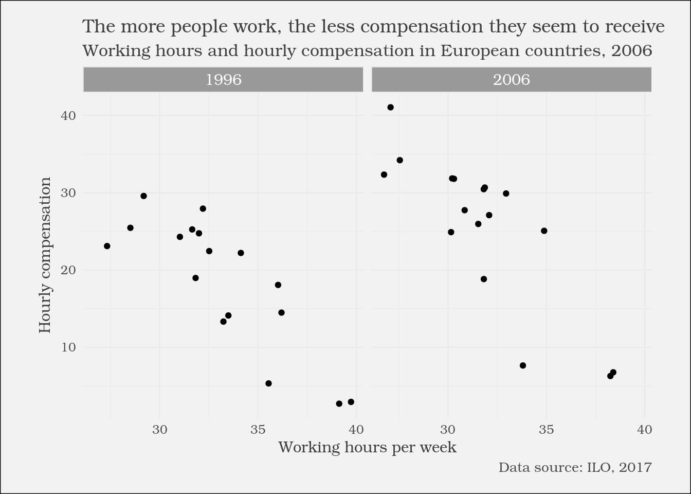
A custom plot to emphasize change
Communicating with Data in the Tidyverse

Timo Grossenbacher
Data Journalist
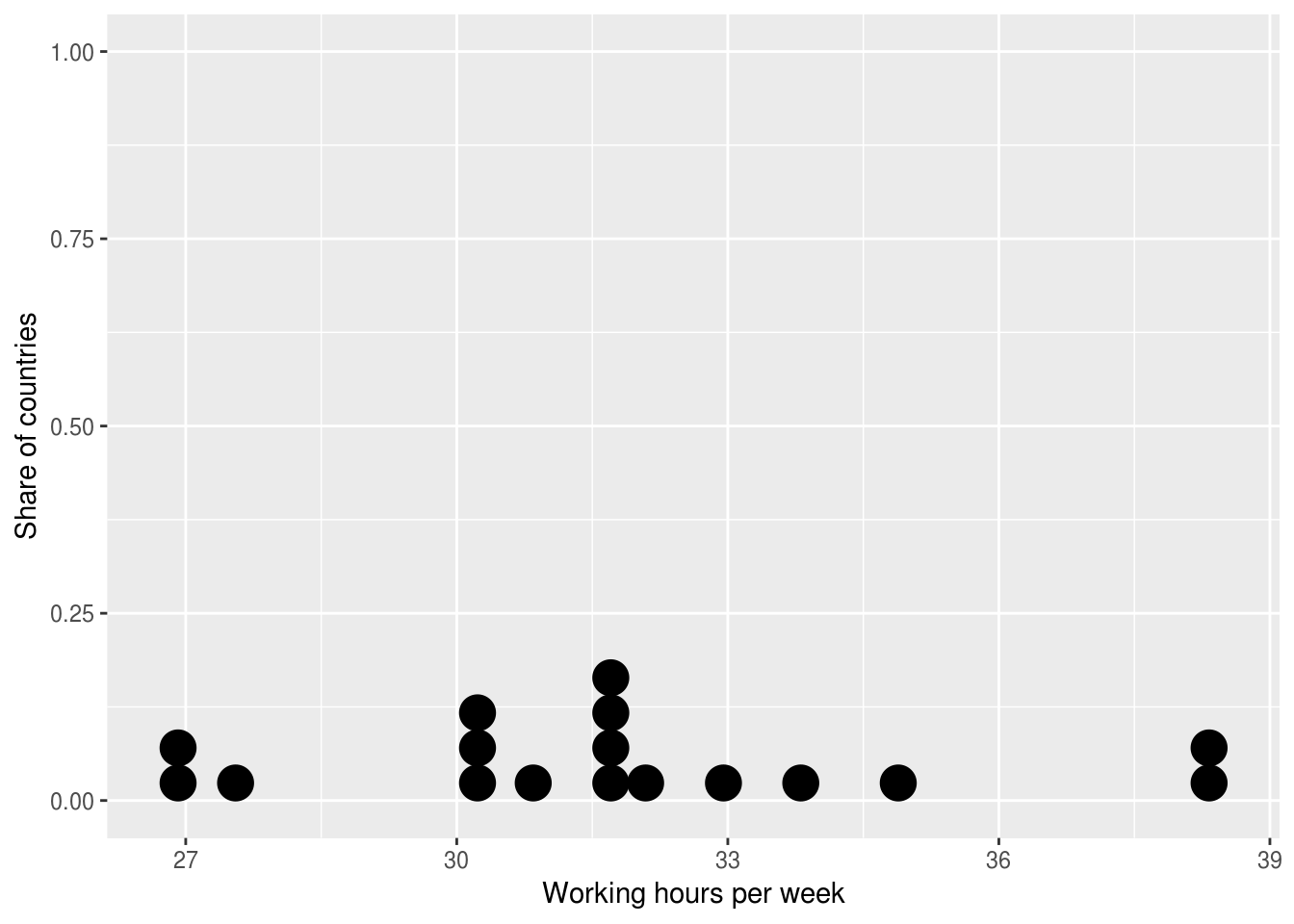
The dot plot
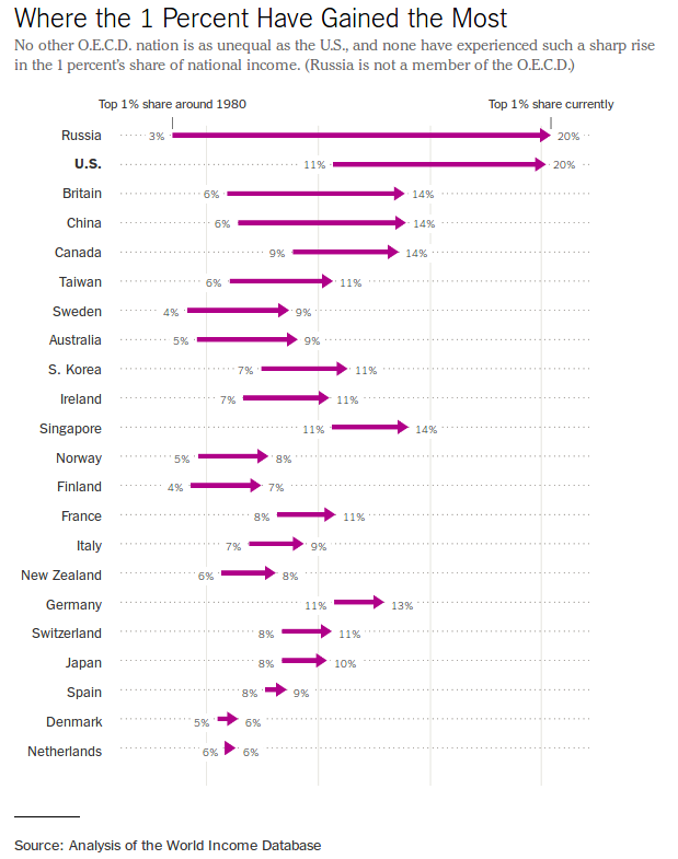
1 New York Times (https://www.nytimes.com/2017/11/17/upshot/income-inequality-united-states.html){{0}}
Dot plots with ggplot2
ggplot((ilo_data %>% filter(year == 2006))) +
  geom_dotplot(aes(x = working_hours)) +
  labs(x = "Working hours per week",
       y = "Share of countries")