Введение в визуализацию данных с Plotly на Python
Alex Scriven
Data Scientist
Как настраивать графики:
color)update_layout()fig.update_layout({"title":{"text":"A New Title"}})
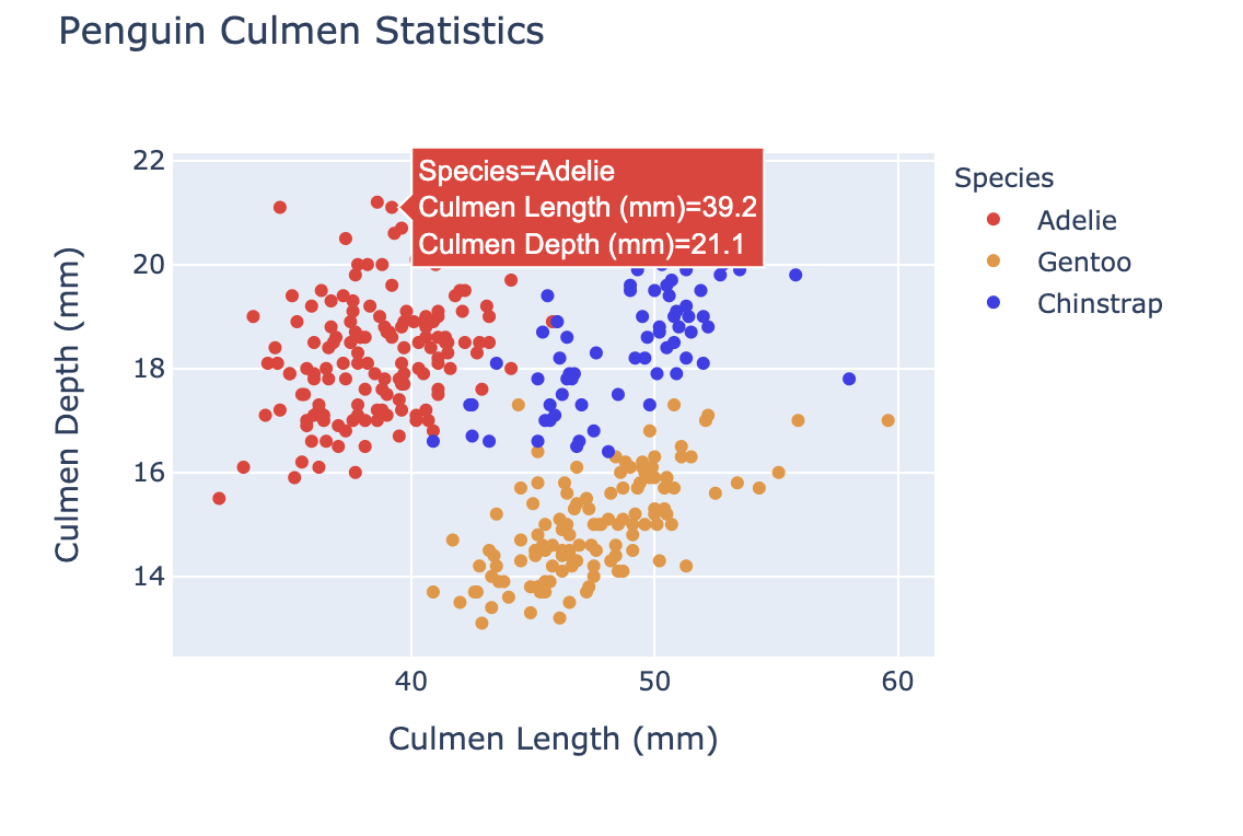
Настройка цвета помогает:

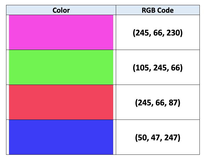
Компьютеры используют RGB-кодирование для задания цветов:
$$
$$
Подробнее — в этой статье

color (столбец DataFrame)
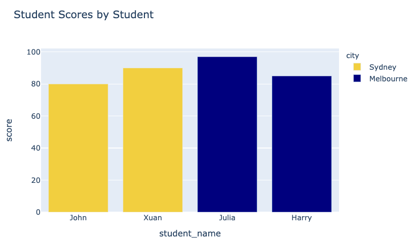
fig = px.bar(data_frame=student_scores,
x="student_name",
y="score",
title="Student Scores by Student"
color="city")
fig.show()
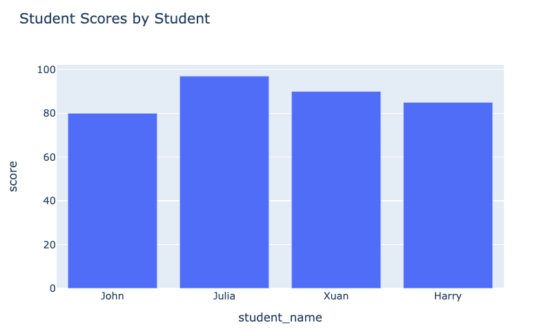
График до:

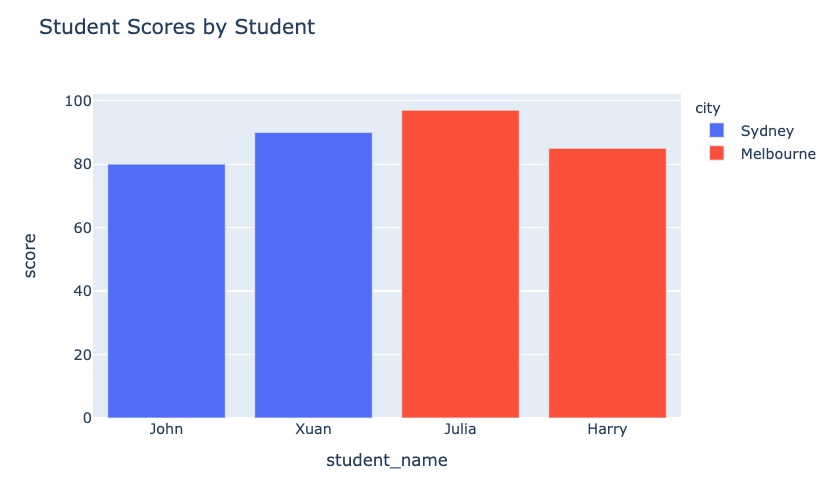
График после:

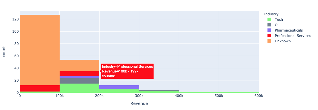
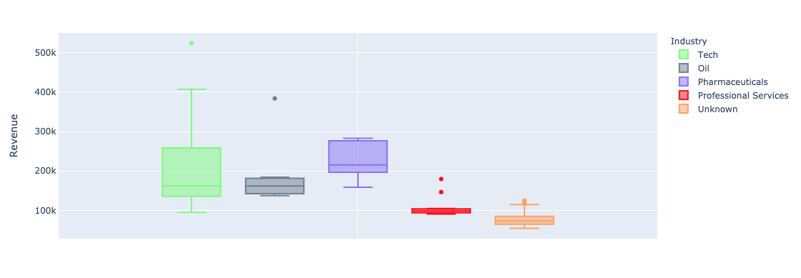
Использование аргумента color в plotly.express для одномерных графиков (столбчатых, гистограмм):


color_discrete_map: словарь, сопоставляющий категориальные значения с цветами"red", "green" и т. д.$$
fig = px.bar( data_frame=student_scores, x="student_name", y="score", title="Student Scores by Student",color_discrete_map={ "Melbourne": "rgb(0,0,128)", "Sydney": "rgb(235, 207, 52)"},color="city")


$$
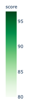
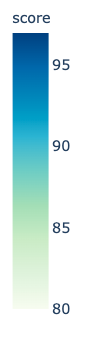
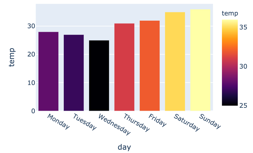
color_continuous_scale для цветовых шкал.
fig = px.bar(data_frame=weekly_temps,
x="day", y="temp",
color="temp",
color_continuous_scale="inferno")
fig.show()
$$

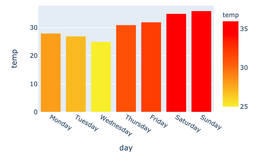
my_scale=[("rgb(242, 238, 10)"), ("rgb(242, 95, 10)"), ("rgb(255,0,0)")]fig = px.bar(data_frame=weekly_temps, x="day", y="temp",color_continuous_scale=my_scale, color="temp")

Введение в визуализацию данных с Plotly на Python