Визуализация данных в Tidyverse
Timo Grossenbacher
Data Journalist


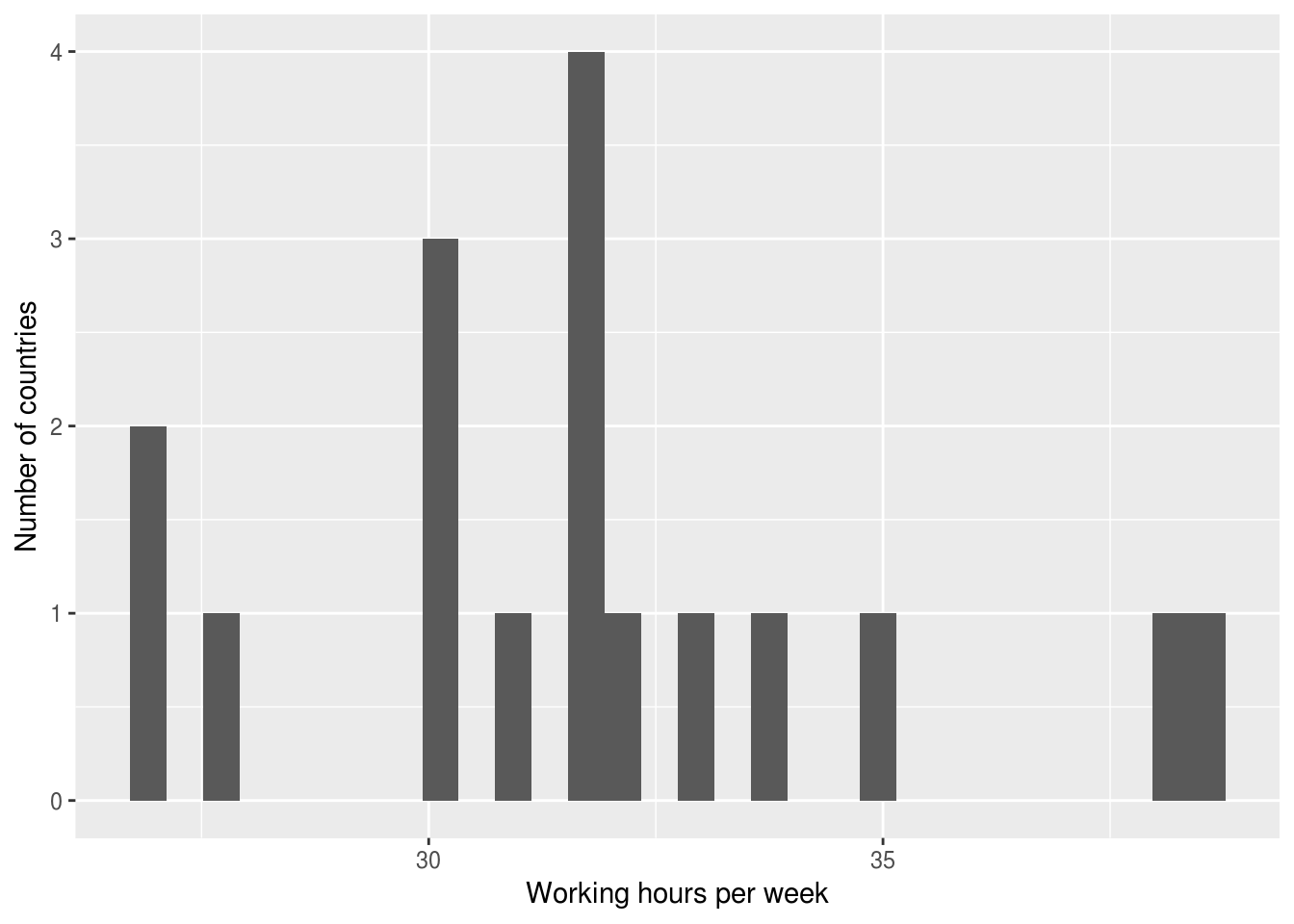
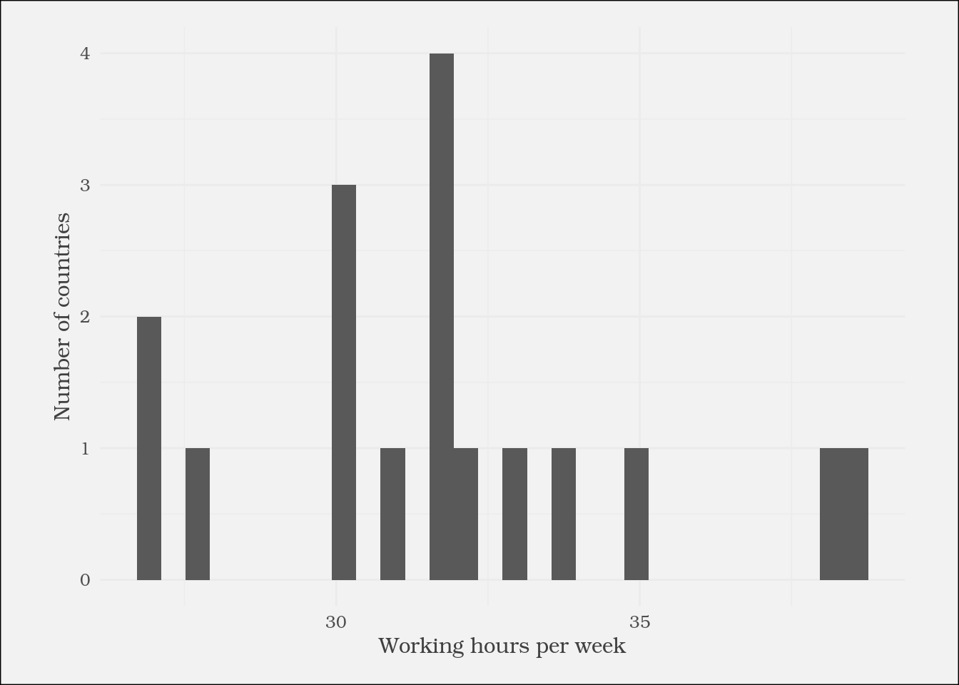
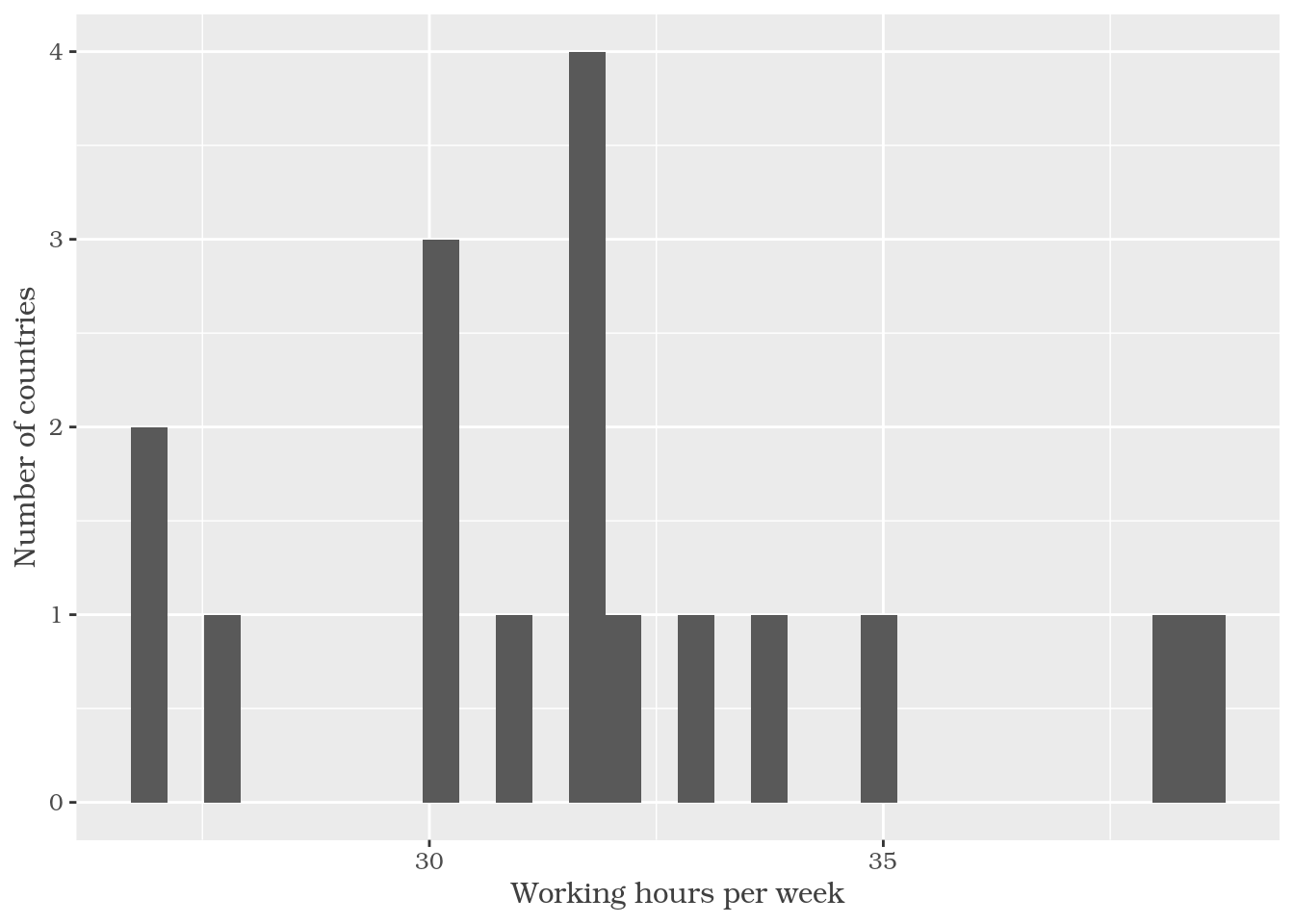
ggplot(plot_data) +
geom_histogram(aes(
x = working_hours)) +
labs(x = "Working hours per week",
y = "Number of countries") +
theme(
text = element_text(
family = "Bookman",
color = "gray25")
)

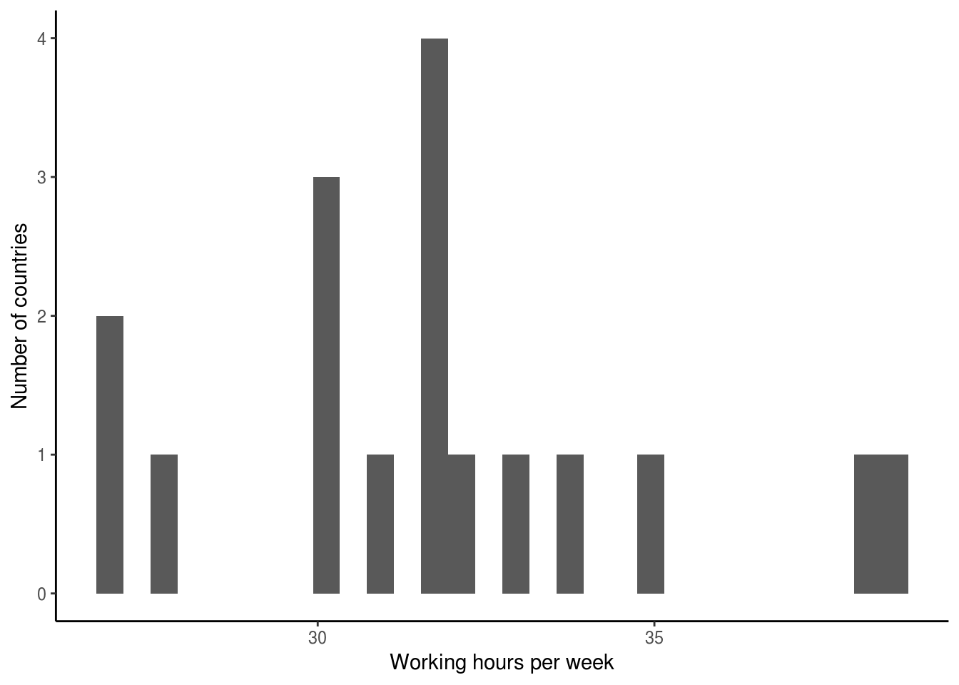
ggplot(plot_data) +
geom_histogram(aes(
x = working_hours)) +
labs(x = "Working hours per week",
y = "Number of countries") +
theme_classic()

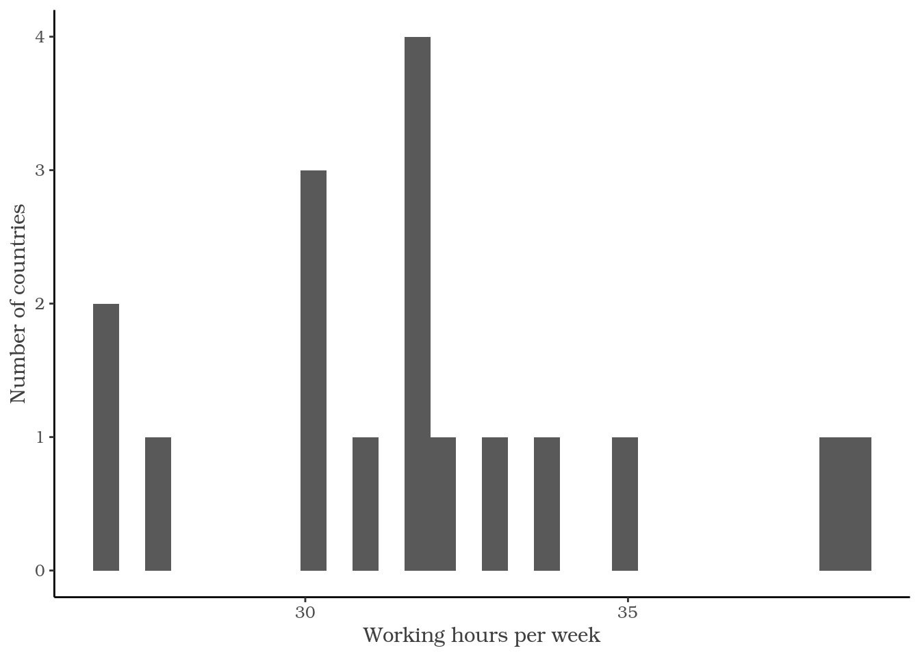
ggplot(plot_data) +
geom_histogram(aes(
x = working_hours)) +
labs(x = "Working hours per week",
y = "Number of countries") +
theme_classic() +
theme(
text = element_text(
family = "Bookman",
color = "gray25")
)

?theme
axis.title
подпись осей (element_text; наследует от text)
axis.title.x
подпись оси x (element_text; наследует от axis.title)
axis.title.x.top
подпись оси x сверху (element_text; наследует от axis.title.x)
axis.title.x.bottom
подпись оси x снизу (element_text; наследует от axis.title.x)
element_text()
element_rect()
element_line()
element_blank()
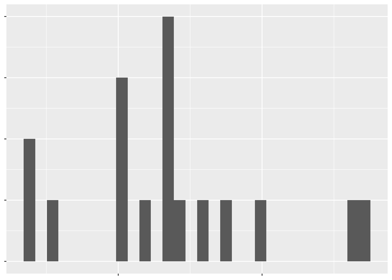
ggplot(plot_data) +
geom_histogram(aes(
x = working_hours)) +
labs(x = "Working hours per week",
y = "Number of countries") +
theme(
text = element_blank()
)

Визуализация данных в Tidyverse