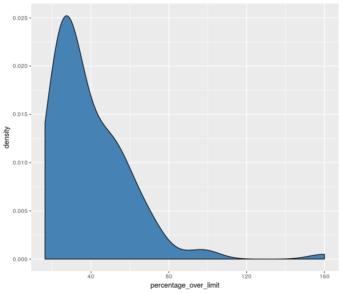
The kernel density estimator

Visualization Best Practices in R

Nick Strayer

Instructor

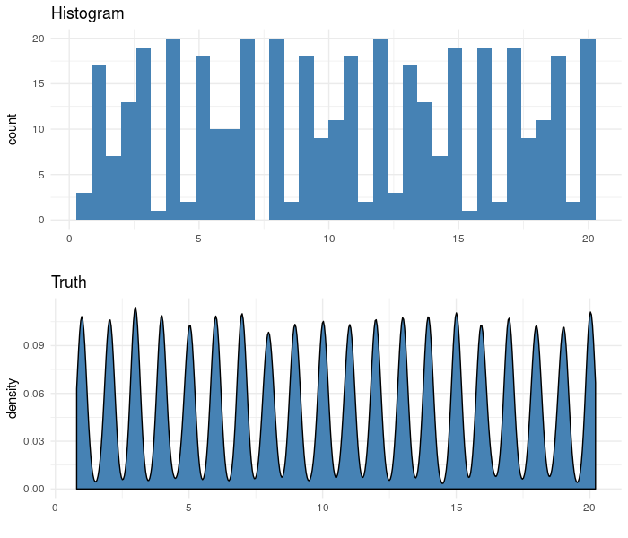
Where histograms struggle

  • Data with multiple strong peaks
  • Small data

Visualization Best Practices in R

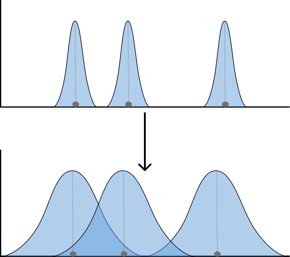
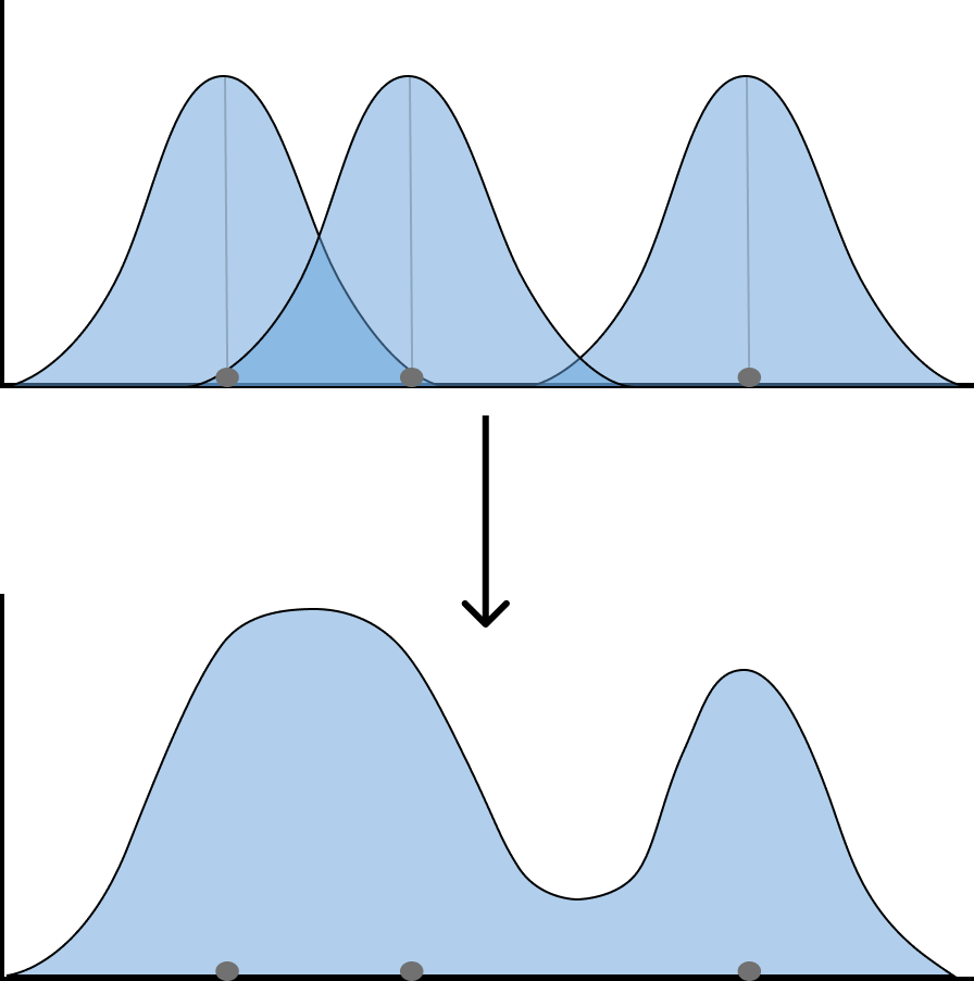
Kernel density plots

  • Place "kernel" on top of every data point
  • Add up heights of all overlapping kernels

Visualization Best Practices in R

Making a KDE in ggplot

  • Just swap geom_histogram() for geom_density()
sample_n(md_speeding, 100) %>%
  ggplot(aes(x = percentage_over_limit)) +
  # Swap out geom_histogram() 
    geom_density(
      # Fill in curve with color
      fill = 'steelblue',
      # Standard deviation of kernel
      bw = 8 
    )
Visualization Best Practices in R

Visualization Best Practices in R

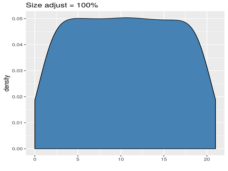
A new width to worry about

  • Need to adjust the standard deviation of the kernel placed on each point

Visualization Best Practices in R

Visualization Best Practices in R

Show all the data

Use geom_rug() to show all data below KDE with lines

p <-sample_n(md_speeding, 100) %>%
  ggplot(aes(x = percentage_over_limit)) +
  geom_density(
    fill = 'steelblue', # fill in curve with color
    bw = 8 # standard deviation of kernel
  ) 

p + geom_rug(alpha = 0.4)
Visualization Best Practices in R

Visualization Best Practices in R

Let's stack some gaussians!

Visualization Best Practices in R

Preparing Video For Download...