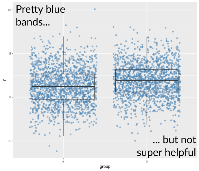
Boxplot alternatives
Visualization Best Practices in R

Nick Strayer
Instructor
Limitations of the boxplot with jitter
- Jostling points can only deal with so much overlap
- Hard to get an idea of data density
What are some other options?
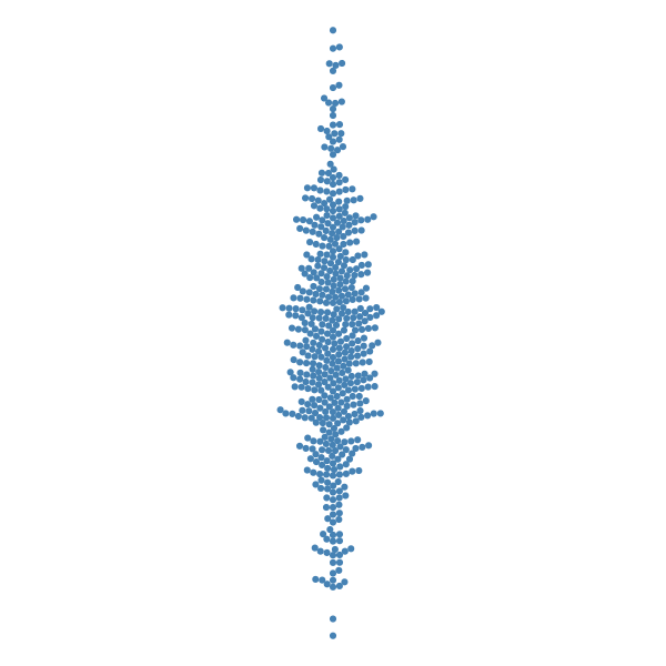
Beeswarm plots
Violin plots

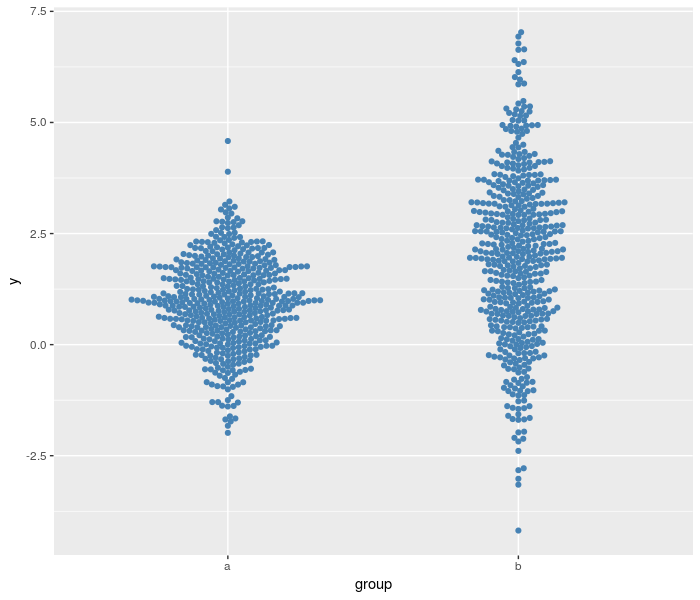
Beeswarm pros
- Individual data points
- Distributional shape
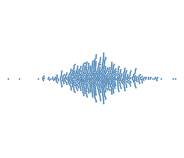
Beeswarm cons
- Get hard with lots of data
- Arbitrary stacking

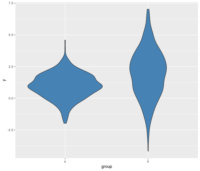
Violin pros
- Every data point is heard
- Not every data point is seen, so good for lots of data.
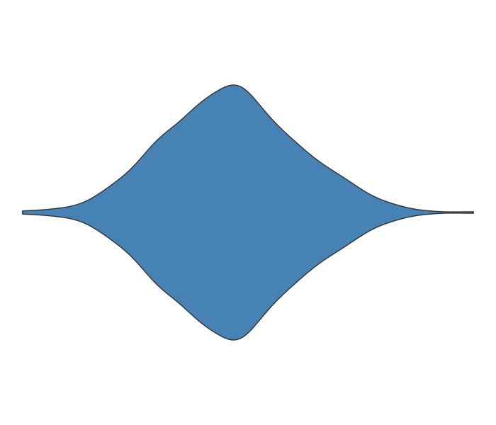
Violin cons
- Kernel width choice
- Not every data point is seen