Point charts

Visualization Best Practices in R

Nick Strayer

Instructor

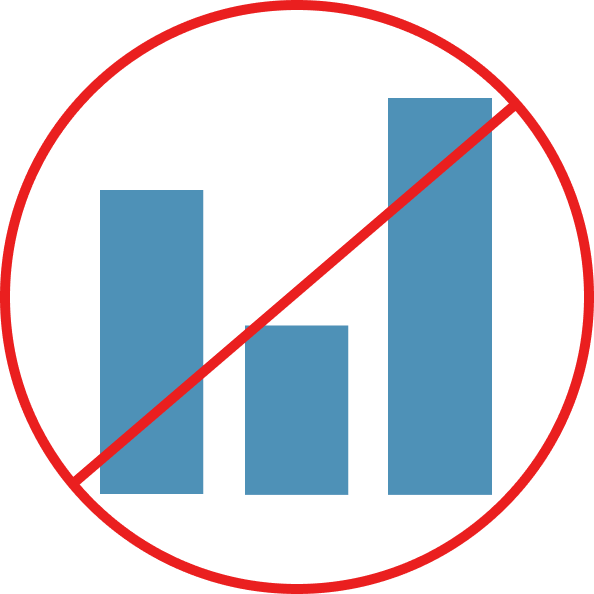
When a bar chart isn't ideal
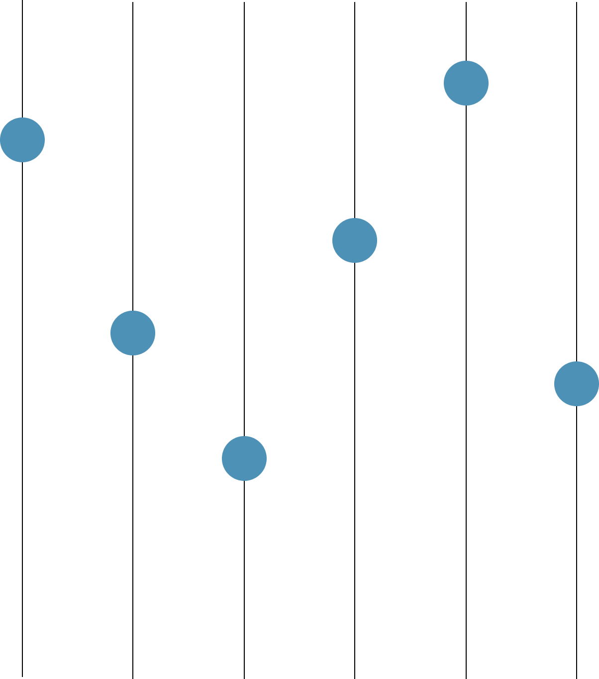
  • Not a quantity
  • Non-linear transformations

Visualization Best Practices in R

Point charts

  • Simply replace bar with a point
  • Sometimes called point charts or dot plots

Visualization Best Practices in R

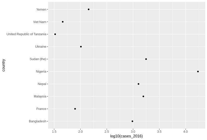
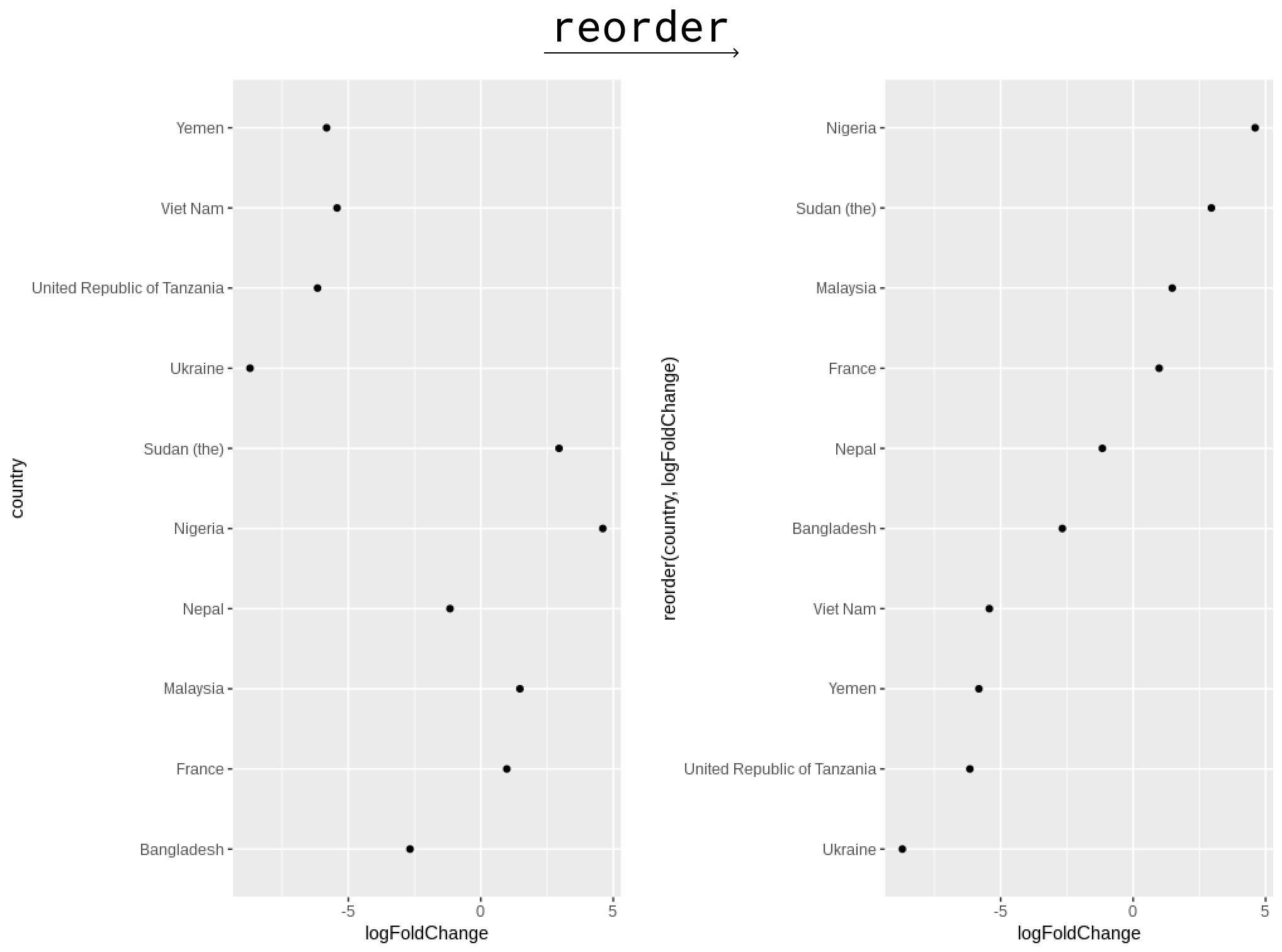
Benefits of point charts

  • High precision
  • Efficient representation
  • Simple

Visualization Best Practices in R

Data for lesson

  • Working with a subset of WHO data
  • Countries are an 'interesting' subset -- let's see if we can find out why
interestingCountries <- c("NGA", "SDN", "FRA", "NPL", "MYS", "TZA", "YEM", "UKR", "BGD", "VNM")

who_subset <- who_disease %>%
  filter(
    countryCode %in% interestingCountries,
    disease == 'measles',
    year %in% c(2006, 2016)) %>% 
  mutate(year = paste0('cases_', year)) %>% 
  arrange(year, region) %>%
  pivot_wider(names_from = year, values_from = cases)
Visualization Best Practices in R

who_subset

who_subset
# A tibble: 10 x 6
   region countryCode country     disease cases_2006 cases_2016
   <chr>  <chr>       <chr>       <chr>        <dbl>      <dbl>
 1 AFR    NGA         Nigeria     measles        704      17136
 2 AFR    TZA         Tanzania    measles       2362         33
 3 EMR    SDN         Sudan (the) measles        228       1767
 4 EMR    YEM         Yemen       measles       8079        143
 5 EUR    FRA         France      measles         40         79
 6 EUR    UKR         Ukraine     measles      42724        102
 7 SEAR   BGD         Bangladesh  measles       6192        972
 8 SEAR   NPL         Nepal       measles       2838       1269
 9 WPR    MYS         Malaysia    measles        564       1569
10 WPR    VNM         Viet Nam    measles       1978         46
Visualization Best Practices in R

Code for point charts

  • geom_point() with one categorical and one numerical axis
who_subset %>% 
  # We log transform our values here so bars are not appropriate
  ggplot(aes(y = country, x = log10(cases_2016))) +
  # Simple geom_point()
  geom_point()
Visualization Best Practices in R

Visualization Best Practices in R

Ordering your point charts

  • Ordering can vastly help legibility
  • Use the reorder() function in the aesthetic assignment
who_subset %>% 
  # calculate the log fold change between 2016 and 2006
  mutate(logFoldChange = log2(cases_2016/cases_2006)) %>% 
  ggplot(aes(x = logFoldChange, y = reorder(country, logFoldChange))) +
  geom_point()
Visualization Best Practices in R

Visualization Best Practices in R

Let's practice!

Visualization Best Practices in R

Preparing Video For Download...