When to use bars
Visualization Best Practices in R

Nick Strayer
Instructor
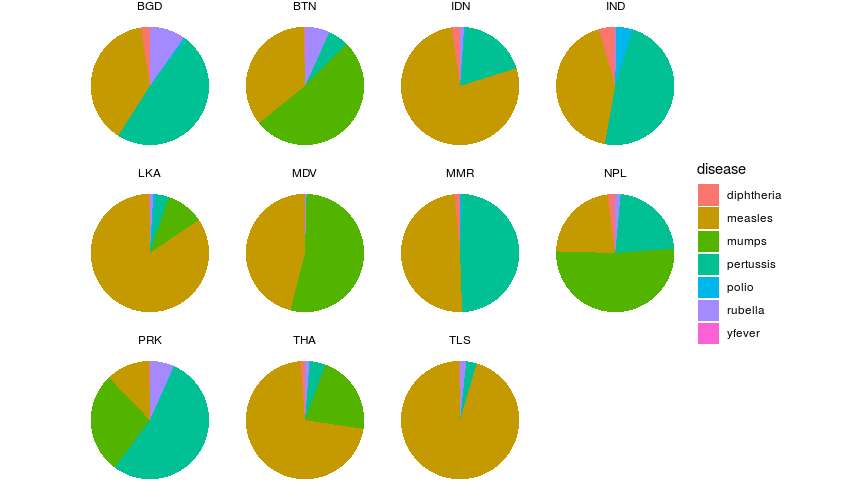
Why not use faceting?
- Almost impossible to compare
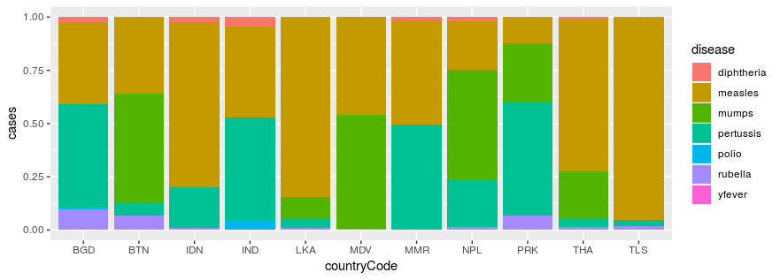
The stacked bar chart
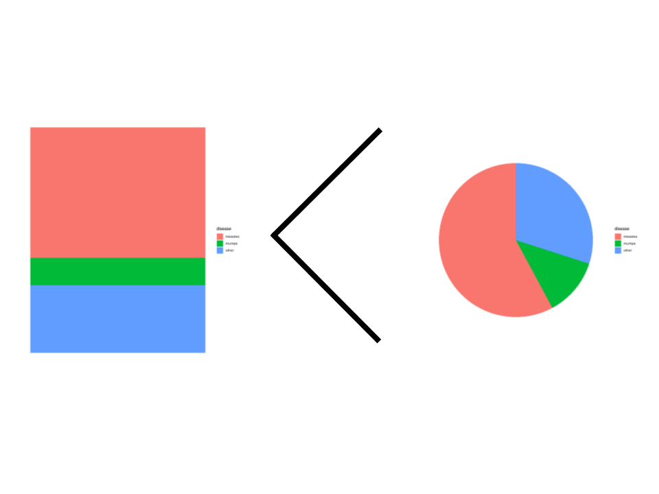
Caveats
- Worse in isolation than pie or waffle charts
- Accuracy degrades rapidly after 3 classes
Chapter recap
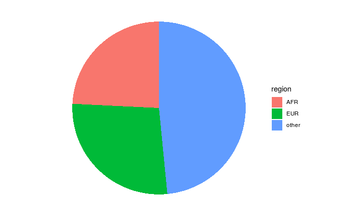
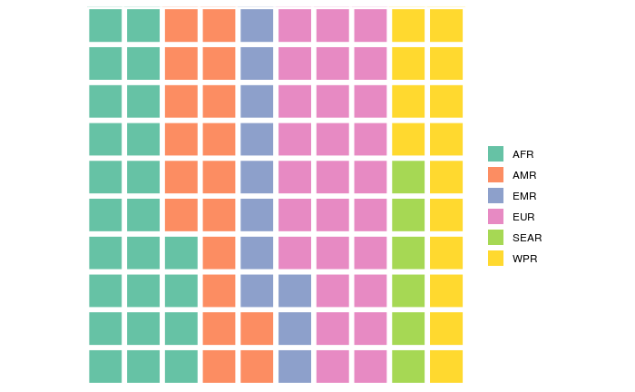
Proportions:
Pie charts:
Waffle charts:
Stacked bars:

