Tuning your bar and point charts
Visualization Best Practices in R

Nick Strayer
Instructor
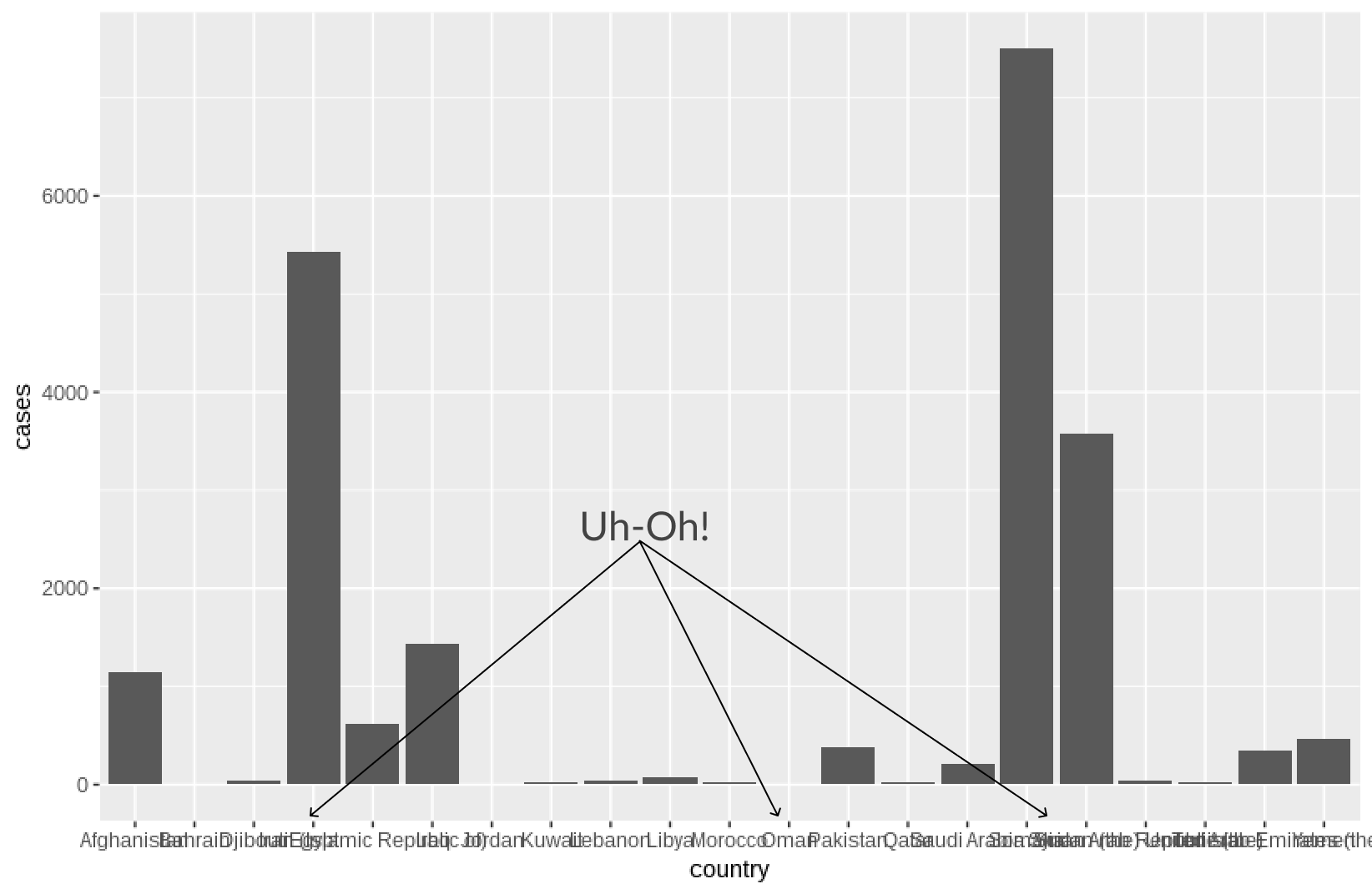
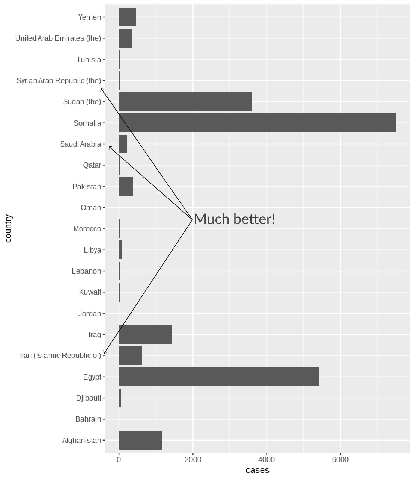
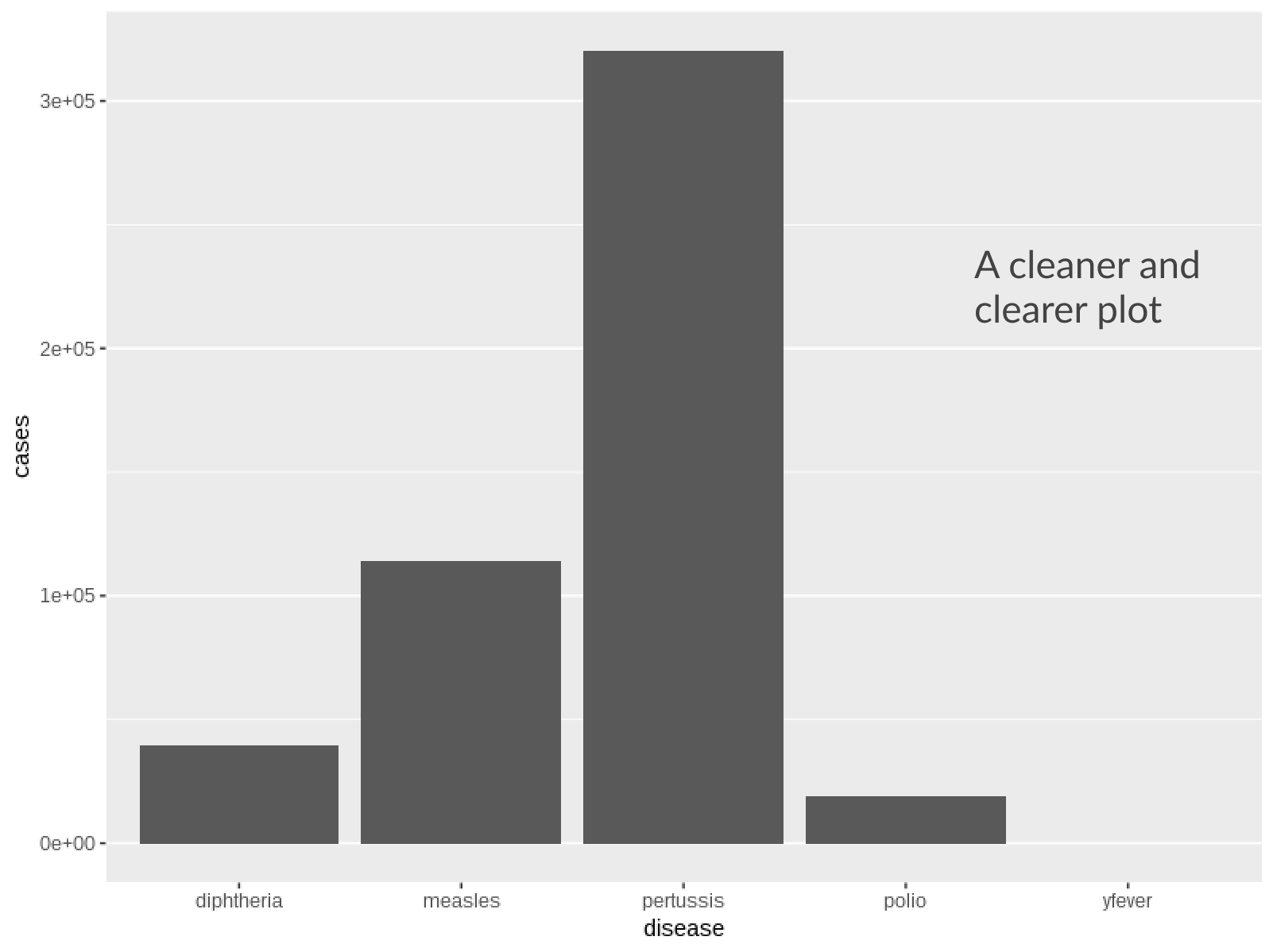
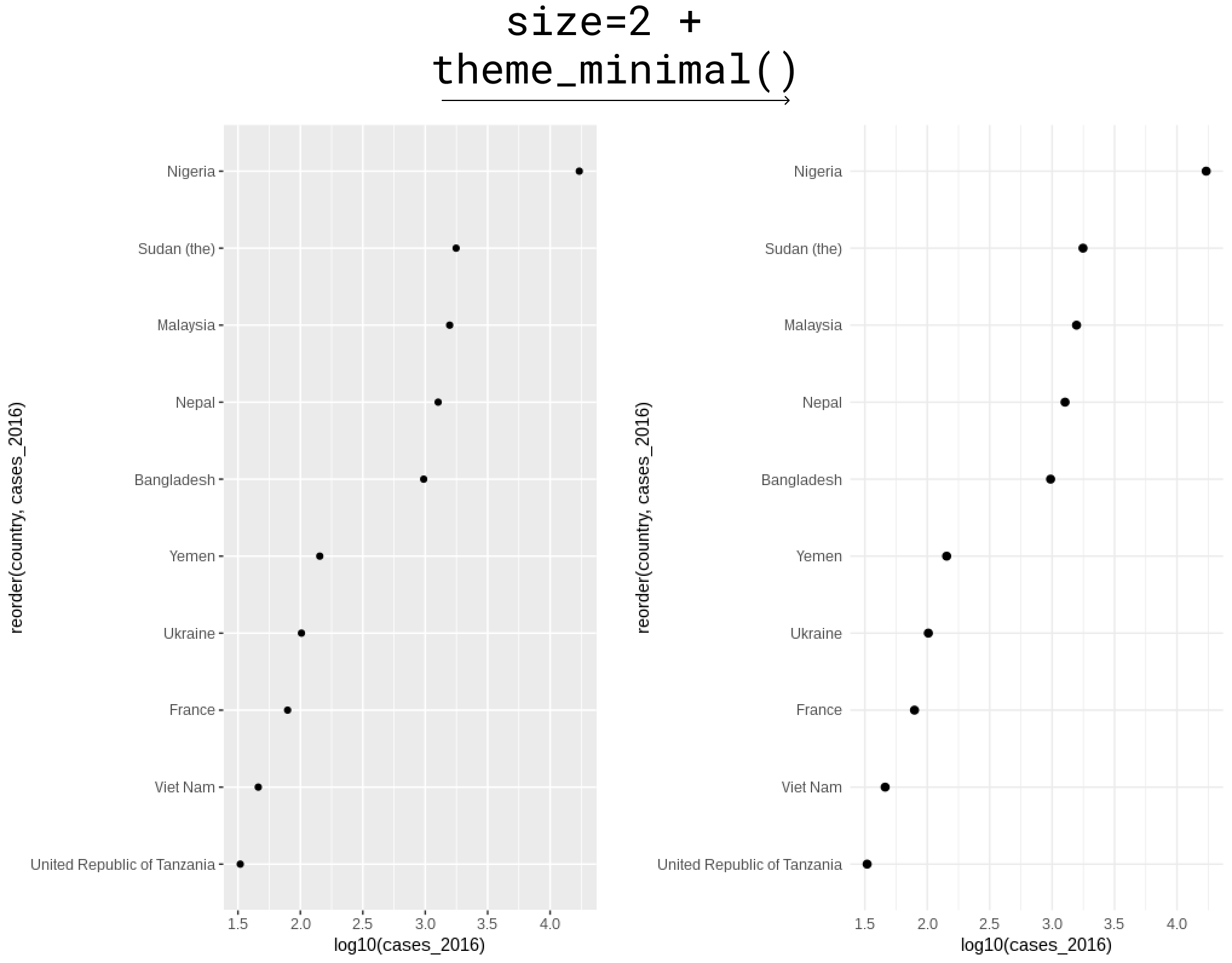
Excess grid
- No need for parallel grid lines in bars
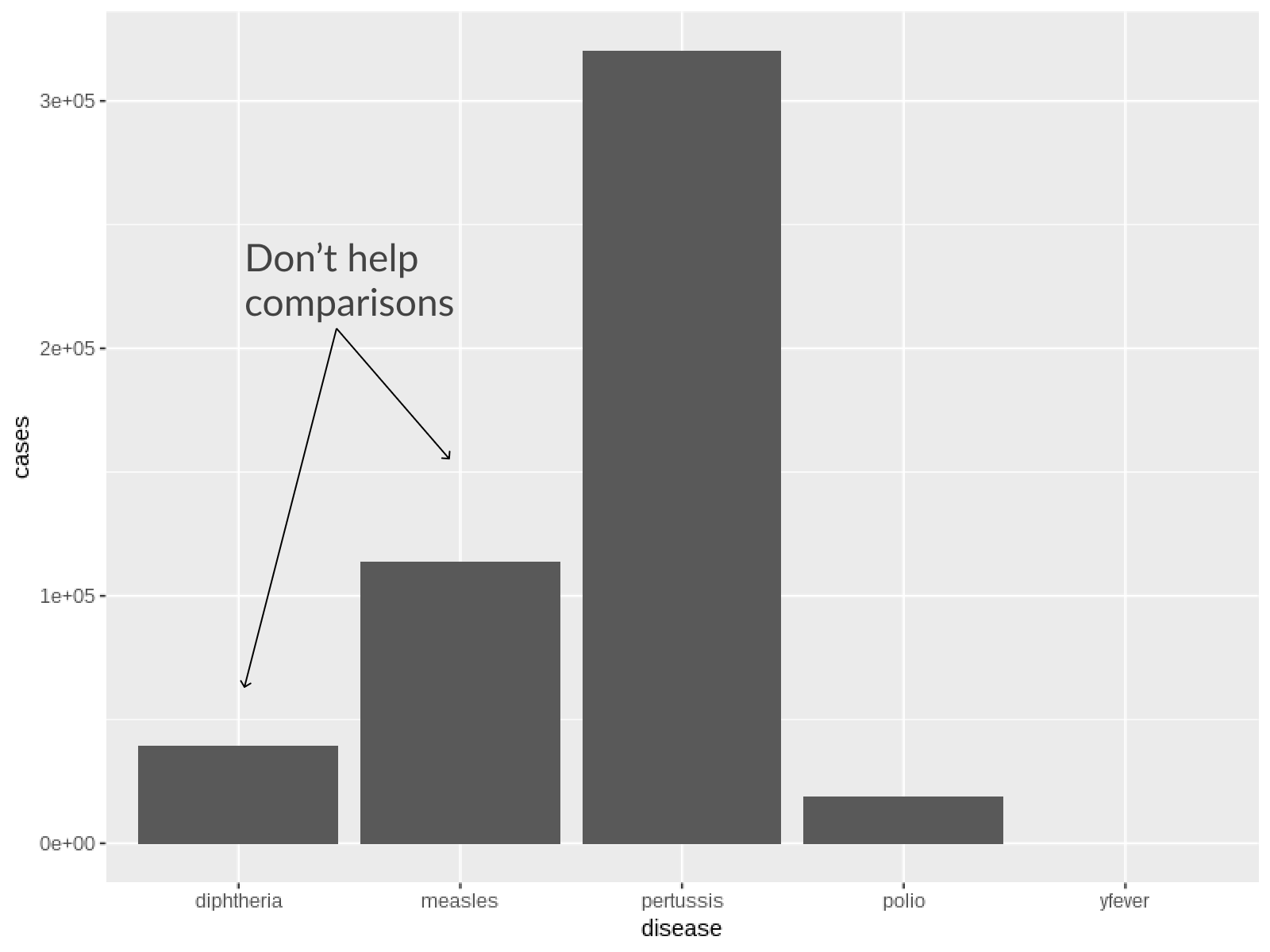
- In point charts, only grids in line with point locations are needed
Visualization Best Practices in R
Nick Strayer
Instructor

