Bars and dots: point data
Visualization Best Practices in R

Nick Strayer
Instructor
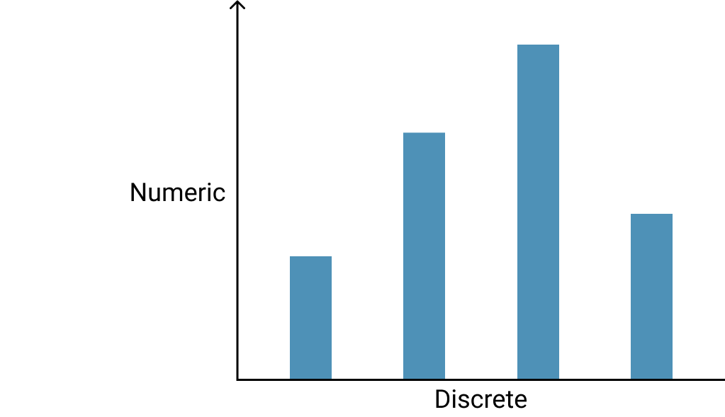
What is point data?
- One categorical axis, one numeric
- Counts, averages, rates, etc.
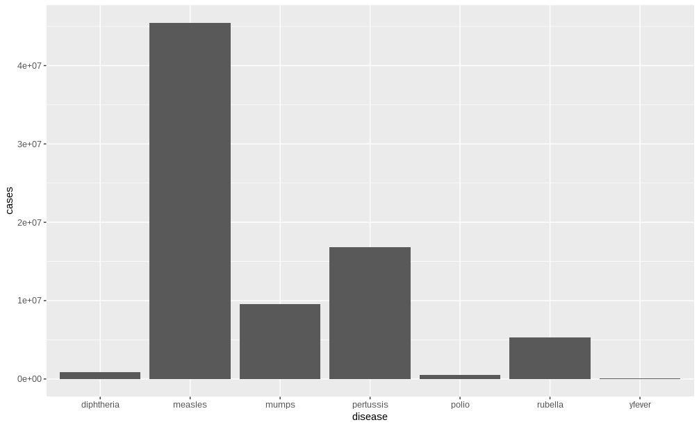
A single observation
- Represents a singular observation of something
- E.g. population of a state, rate of cell growth

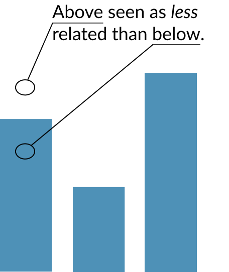
Not always the best
- Bar charts are frequently used when other charts are more appropriate
- A few principles can be followed to help avoid this

The stacking principle

Why quantities?
A big deal?


