Visualization Best Practices in R
Nick Strayer
Instructor
What you will learn
How to make better visualizations by thinking deeply about the data at hand.
How you will learn it
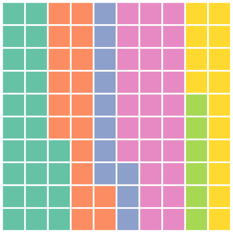
Chapter 1: Proportions of a whole
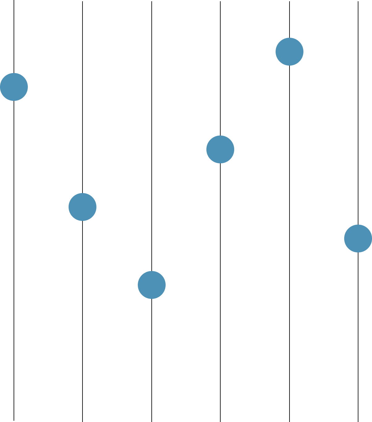
Chapter 2: Point data
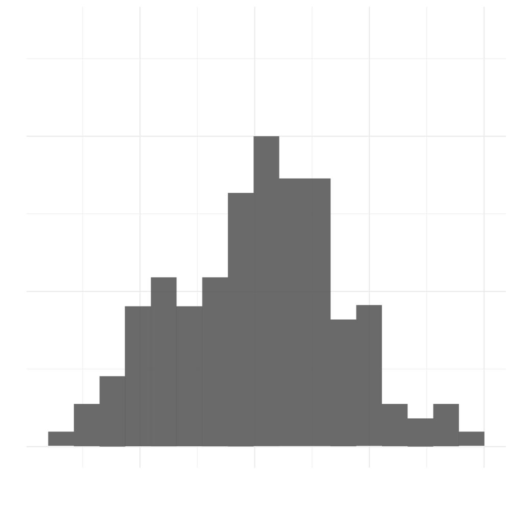
Chapter 3: Single distributions
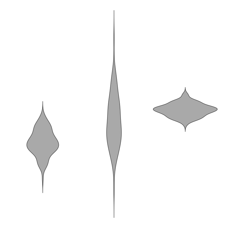
Chapter 4: Multiple(or conditional) distributions
Topics here are not as cut and dry as other programming topics
Every rule will have exceptions
An emphasis on thinking through each problem is given to help you deal with these cases when you get to them
R
The 'Tidyverse'
Ggplot2
who_disease
# A tibble: 43,262 x 6
region countryCode country disease year cases
<chr> <chr> <chr> <chr> <int> <dbl>
1 EMR AFG Afghanistan measles 2016 638
2 EUR ALB Albania measles 2016 17.0
3 AFR DZA Algeria measles 2016 41.0
4 EUR AND Andorra measles 2016 0
5 AFR AGO Angola measles 2016 53.0
6 AMR ATG Antigua and Barbuda measles 2016 0
7 AMR ARG Argentina measles 2016 0
8 EUR ARM Armenia measles 2016 2.00
# ... with 43,254 more rows
# Filter to AMR region
amr_region <- who_disease %>%
filter(region == 'AMR')
# Map x to year and y to cases, color by disease
ggplot(amr_region, aes(x = year, y = cases, color = disease)) +
geom_point(alpha = 0.5)
Visualization Best Practices in R