The pie chart and its friends
Visualization Best Practices in R

Nick Strayer
Instructor
What is a proportion?
- Parts making up a whole
- Often used to understand population

The pie chart
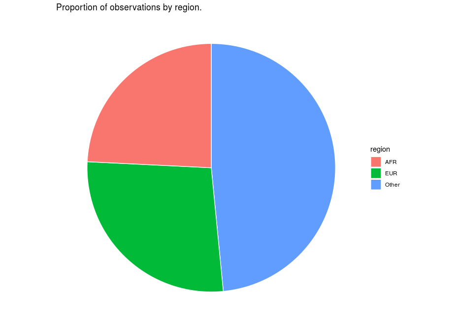
A sour pie

A sweet pie
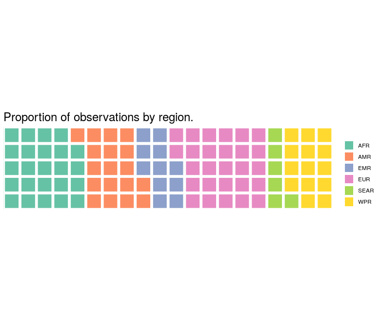
The waffle chart
Visualization Best Practices in R
Nick Strayer
Instructor

