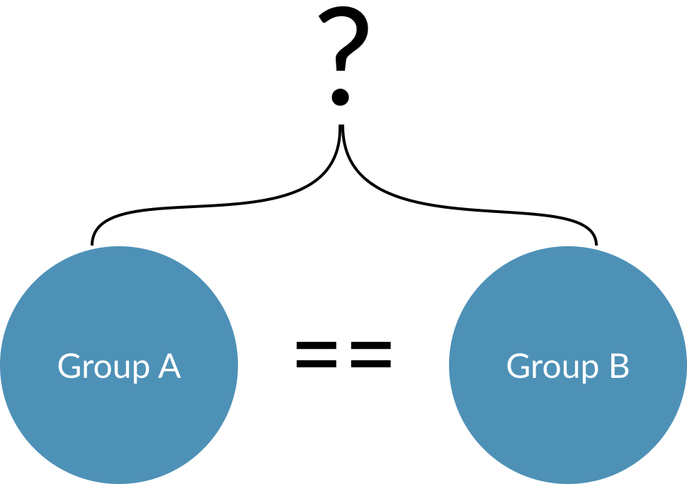
Intro to comparing distributions

Visualization Best Practices in R

Nick Strayer

Instructor

Why compare distributions?

  • Verify balanced groups
  • For comparison's sake

Visualization Best Practices in R

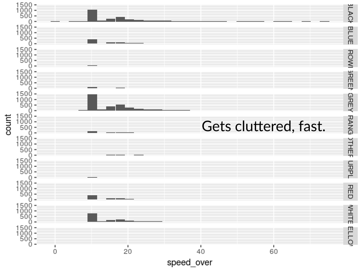
Why not facet histogams?

ggplot(md_speeding, aes(x = speed_over)) + 
  geom_histogram() +
  facet_grid(vehicle_color ~ .)
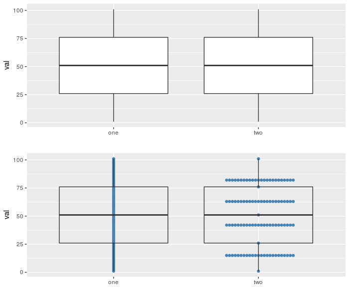
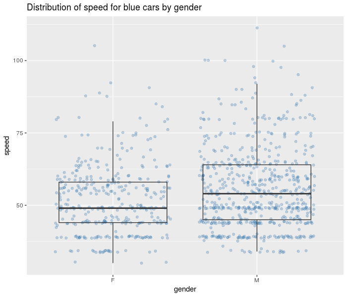
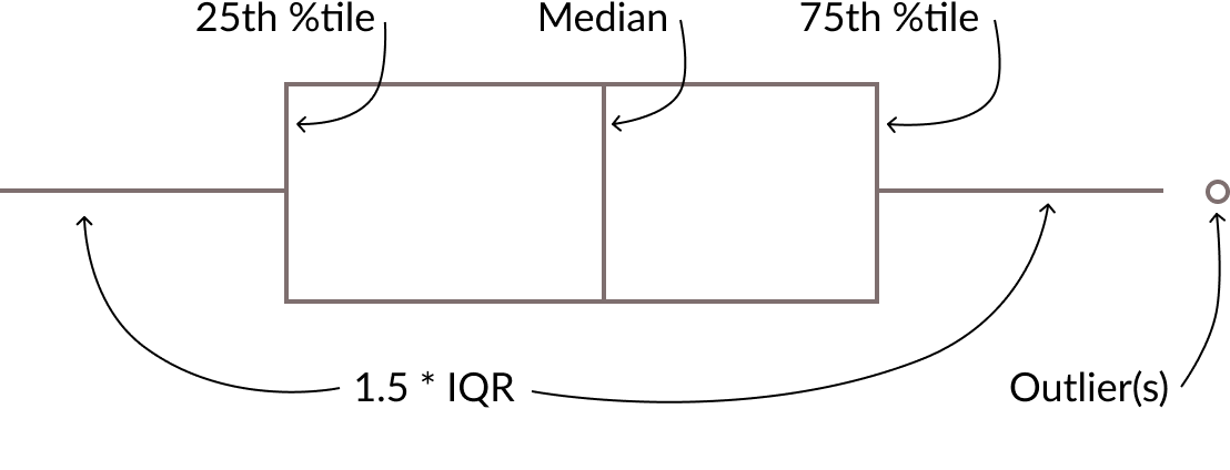
Visualization Best Practices in R

The boxplot


Visualization Best Practices in R

Boxplot pros

  • Familiar
  • Lots of good summary statistics

Visualization Best Practices in R

boxplot cons

  • Show me the data!

Visualization Best Practices in R

A simple addition

  • geom_jitter() shows raw points jostled to avoid overlap.
  • Layer under your geom_boxplot().
md_speeding %>% 
  filter(vehicle_color == 'BLUE') %>%
  ggplot(aes(x = gender, y = speed)) +
    # Draw points behind 
    geom_jitter(alpha = 0.3, color = 'steelblue') + 
    # Make transparent
    geom_boxplot(alpha = 0) + 
    labs(title = 'Distribution of speed for blue cars by gender')
Visualization Best Practices in R

Visualization Best Practices in R

Let's compare some distributions!

Visualization Best Practices in R

Preparing Video For Download...