Tracer le graphique d'analyse du prédicteur

Introduction à l'analytique prédictive en Python

Nele Verbiest, Ph.D

Data Scientist @PythonPredictions

Le graphique d'analyse du prédicteur
Introduction à l'analytique prédictive en Python

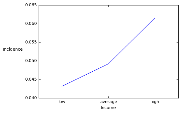
Tracer l'incidence de la cible

import matplotlib.pyplot as plt
import numpy as np

# Tracer le graphique pig_table["Incidence"].plot()
# Afficher les noms des groupes plt.xticks(np.arange(len(pig_table)), pig_table["income"])
# Centrer les noms de groupes width = 0.5 plt.xlim([-width, len(pig_table)-width])
plt.ylabel("Incidence", rotation = 0, rotation_mode="anchor", ha = "right") plt.xlabel("Income") plt.show()

Introduction à l'analytique prédictive en Python

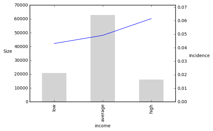
Tracer les tailles

import matplotlib.pyplot as plt
import numpy as np
# Tracer le graphique

plt.ylabel("Size", rotation = 0,rotation_mode="anchor", ha = "right" )
pig_table["Incidence"].plot(secondary_y = True)
pig_table["Size"].plot(kind='bar', width = 0.5, color = "lightgray", edgecolor = "none") ## Ajouter les barres
# Afficher les noms des groupes plt.xticks(np.arange(len(pig_table)), pig_table["income"]) # Centrer les noms de groupes plt.xlim([-0.5, len(pt)-0.5]) plt.ylabel("Incidence", rotation = 0, rotation_mode="anchor", ha = "right" plt.xlabel("Income") plt.show()
Introduction à l'analytique prédictive en Python

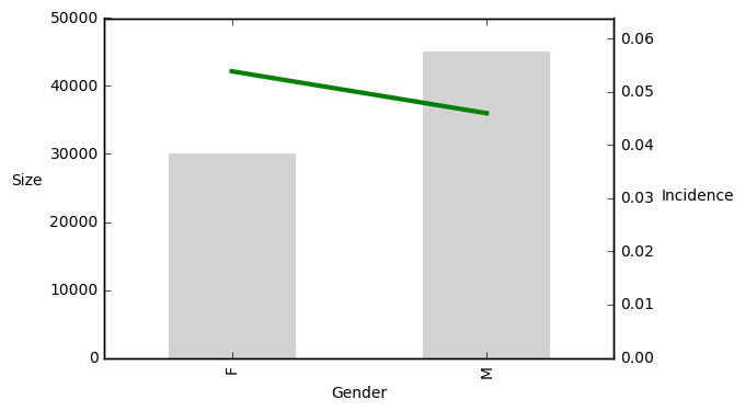
Tracer les tailles

Introduction à l'analytique prédictive en Python

Passons à la pratique !

Introduction à l'analytique prédictive en Python

Preparing Video For Download...