Cartographier des polygones

Cartes interactives avec leaflet en R

Rich Majerus

Vice President of Strategy & Planning, Queens University of Charlotte

Tracer des polygones

shp %>% 
  leaflet() %>% 
  addTiles() %>% 
  addPolygons()
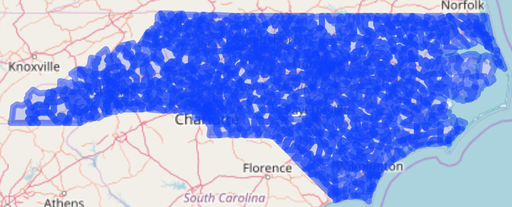
Tous les codes postaux de NC 1

Cartes interactives avec leaflet en R

addPolygons()

  • weight - épaisseur des contours en pixels
  • color - couleur des polygones
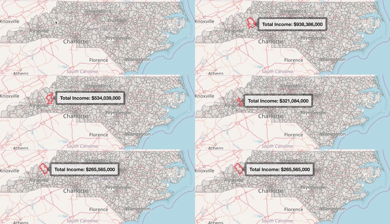
  • label - info affichée au survol
  • highlight - options pour mettre un polygone en évidence au survol
shp %>% 
leaflet() %>% 
addTiles() %>% 
addPolygons(weight = 1,
            color = "grey",
            label = ~paste0("Total Income: " dollar(income)),
            highlight = highlightOptions(weight = 3, color = "red",
                                         bringToFront = TRUE))
Cartes interactives avec leaflet en R

addPolygons()

Tous les codes postaux de NC 2

Cartes interactives avec leaflet en R

Colorer des données numériques

  • colorNumeric

    nc_pal <- colorNumeric(palette = "Blues", 
                           domain = high_inc@data$mean_income)
    
  • colorBin

    nc_pal <- colorBin(palette = "YlGn", bins = 5,
                       domain = high_inc@data$mean_income)
    
  • colorQuantile

    nc_pal <- colorQuantile(palette = "YlGn", n = 4, 
                            domain = high_inc@data$mean_income)
    
Cartes interactives avec leaflet en R

colorNumeric()

nc_pal <- colorNumeric("Blues", domain = high_inc@data$mean_income)

previewColors(pal = nc_pal, values = c(seq(100000, 600000, by = 100000)))
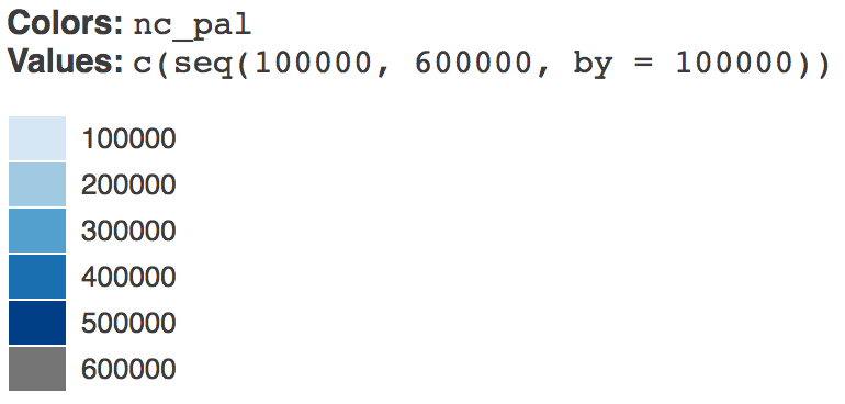
previewColors()

Cartes interactives avec leaflet en R

Carte choroplèthe

nc_pal <- colorNumeric(palette = "Blues", 
                       domain = shp@data$mean_income)

shp %>% leaflet() %>% addTiles() %>% addPolygons(weight = 1, fillOpacity = 1, color = ~nc_pal(mean_income), label = ~paste0("Mean Income: ", dollar(mean_income)), highlight = highlightOptions(weight = 3, color = "red", bringToFront = TRUE))
Cartes interactives avec leaflet en R

Carte choroplèthe

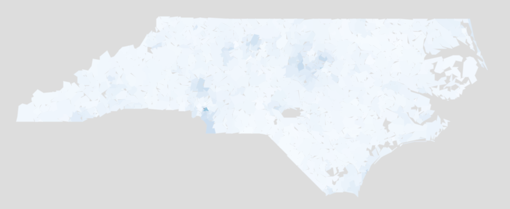
Carte choroplèthe des revenus en NC

Cartes interactives avec leaflet en R

Exemple de choroplèthe

ggplot(shp@data,
       aes(mean_income)) +
  geom_histogram()
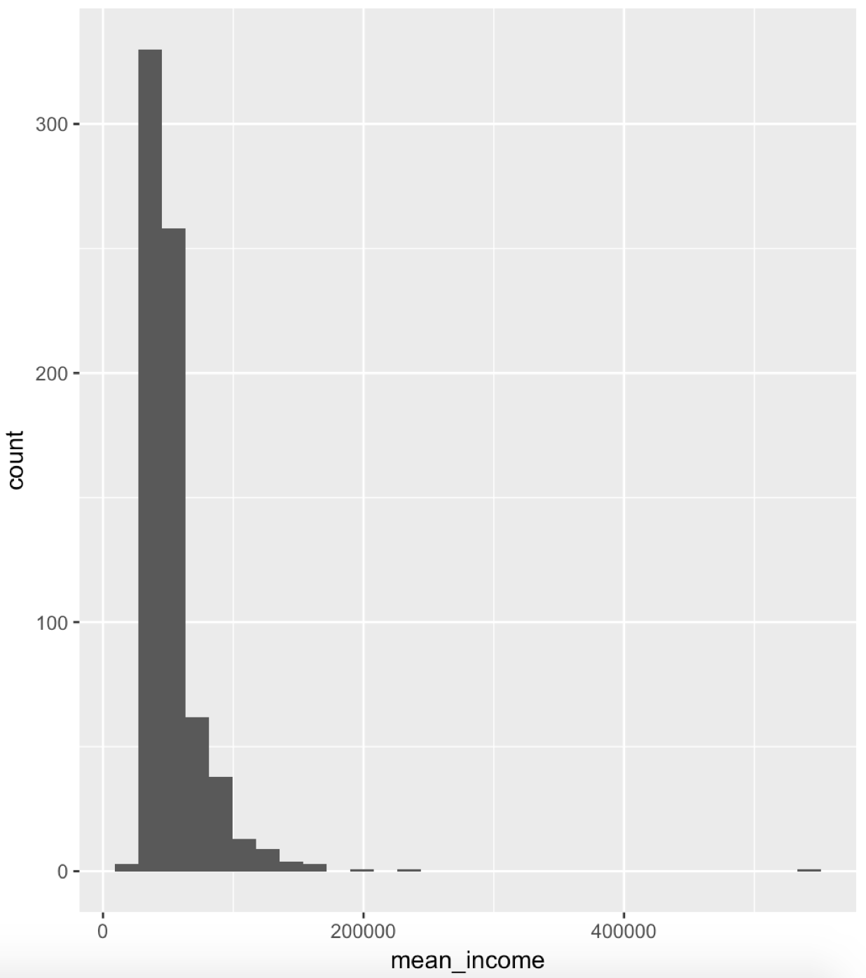
Histogramme des revenus

ggplot(shp@data, 
        aes(log(mean_income))) +
  geom_histogram()
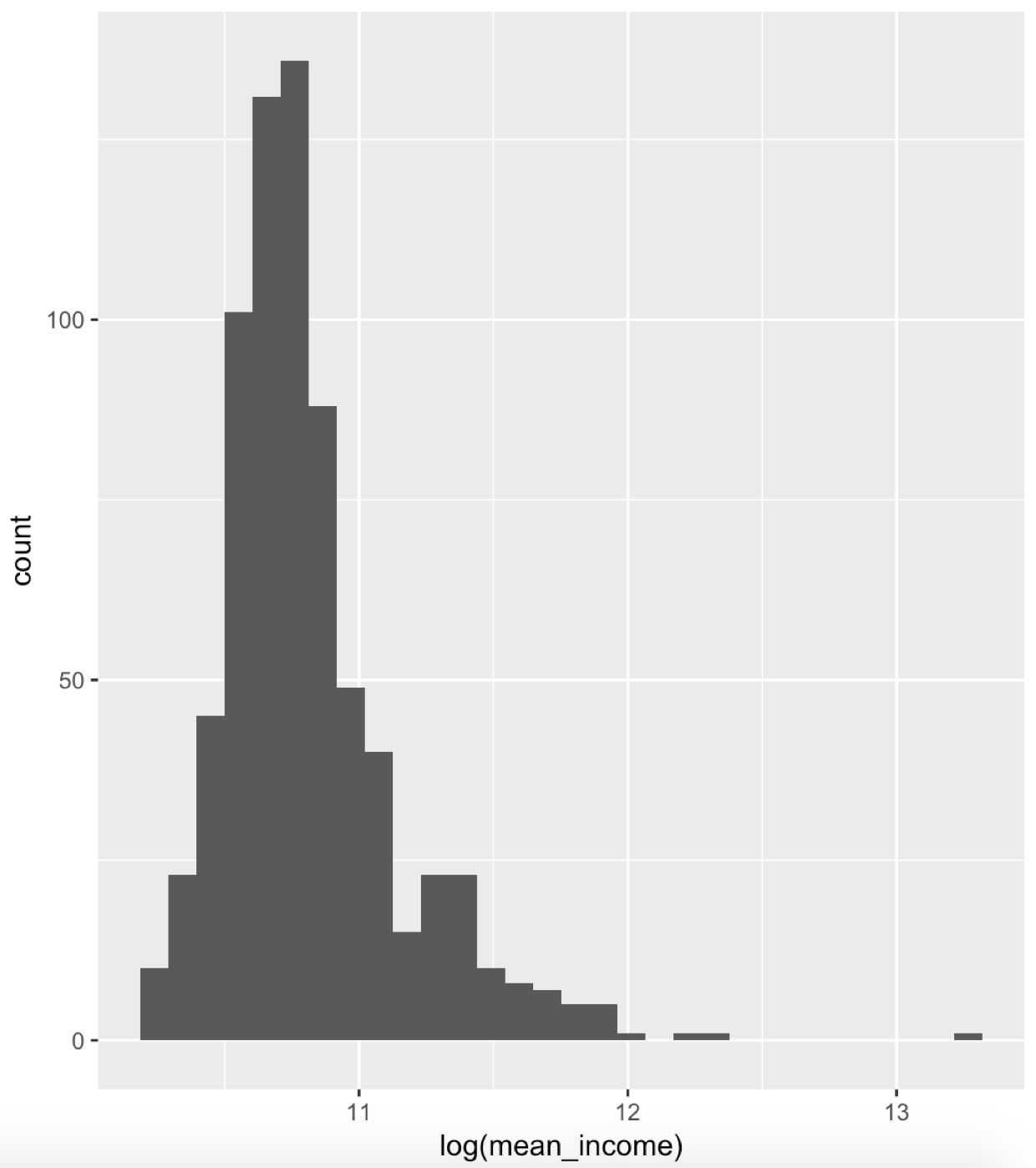
Histogramme des revenus (log)

Cartes interactives avec leaflet en R

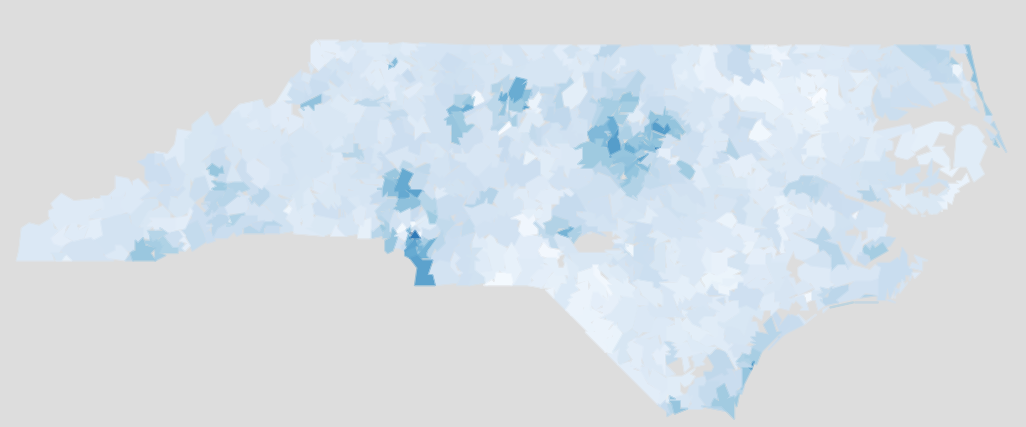
Transformation logarithmique

Choroplèthe des revenus (log) en NC 1

Cartes interactives avec leaflet en R

Passons à la pratique !

Cartes interactives avec leaflet en R

Preparing Video For Download...