Python में Plotly के साथ Data Visualization परिचय
Alex Scriven
Data Scientist
प्लॉट्स को कैसे कस्टमाइज़ करें:
color)update_layout() का उपयोग करेंfig.update_layout({"title":{"text":"A New Title"}})
रंग कस्टमाइज़ करने से मदद मिलती है:

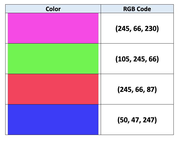
कंप्यूटर रंग बताने के लिए RGB एनकोडिंग इस्तेमाल करते हैं:
$$
$$
और जानें इस लेख में

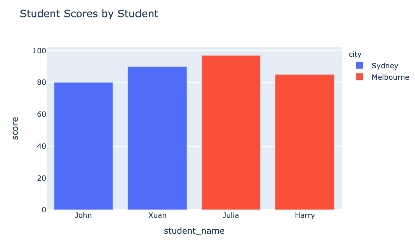
color आर्ग्युमेंट (DataFrame कॉलम)
fig = px.bar(data_frame=student_scores,
x="student_name",
y="score",
title="Student Scores by Student"
color="city")
fig.show()
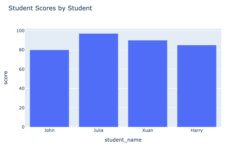
पहले का प्लॉट:

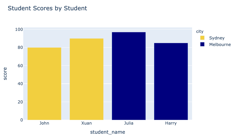
हमारा प्लॉट बाद में:

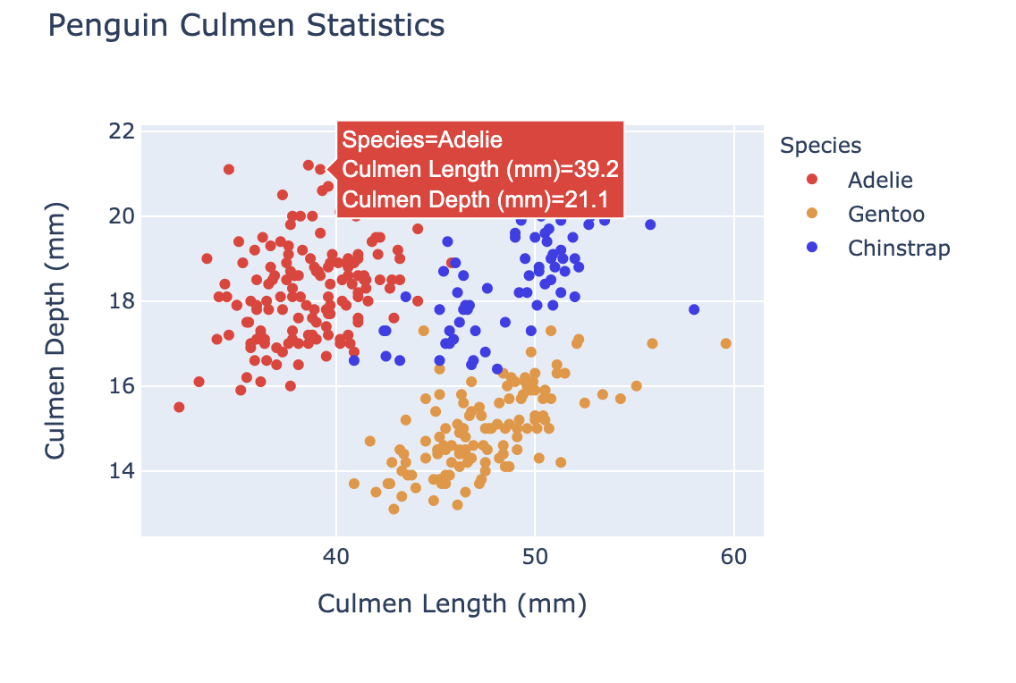
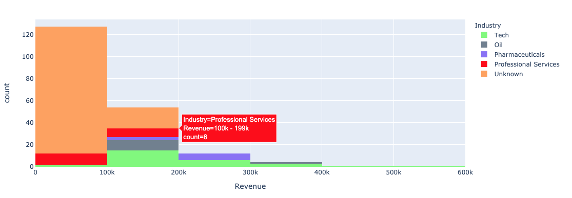
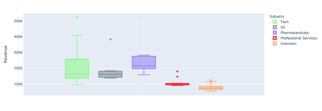
यूनिवेरिएट (बार, हिस्टोग्राम) प्लॉट्स में plotly.express के color आर्ग्युमेंट का उपयोग:


color_discrete_map: एक डिक्शनरी जो केटेगरिकल वैल्यूज़ को रंगों से मैप करती है"red", "green" आदि से भी दे सकते हैं$$
fig = px.bar( data_frame=student_scores, x="student_name", y="score", title="Student Scores by Student",color_discrete_map={ "Melbourne": "rgb(0,0,128)", "Sydney": "rgb(235, 207, 52)"},color="city")


$$
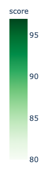
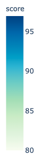
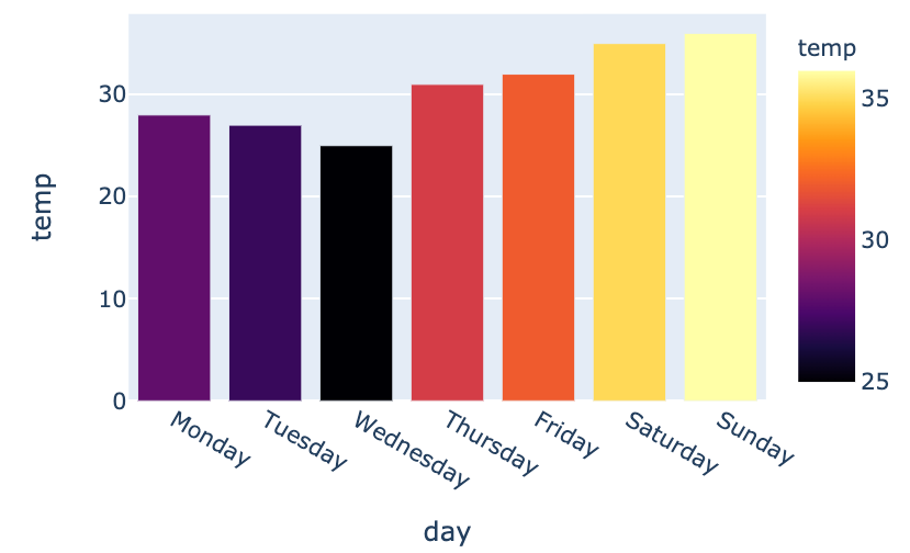
color_continuous_scale आर्ग्युमेंट.
fig = px.bar(data_frame=weekly_temps,
x="day", y="temp",
color="temp",
color_continuous_scale="inferno")
fig.show()
$$

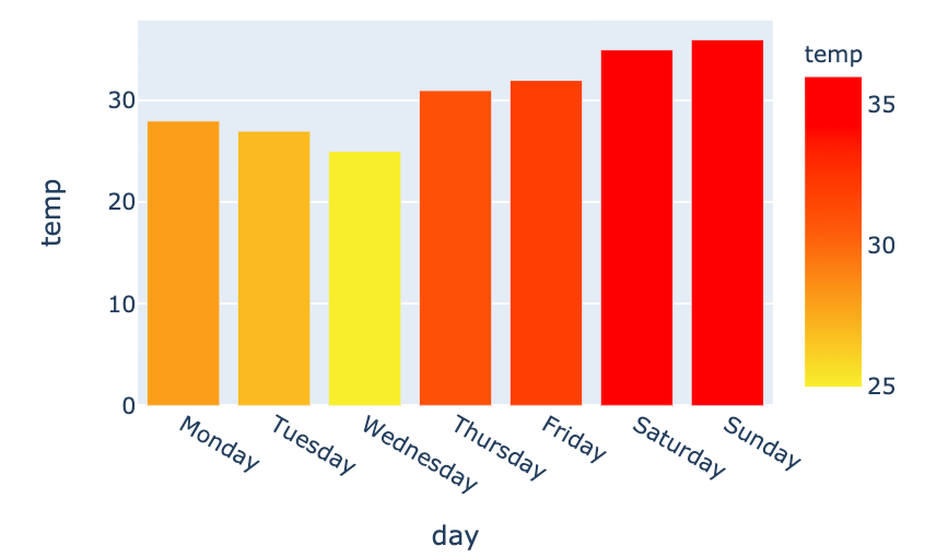
my_scale=[("rgb(242, 238, 10)"), ("rgb(242, 95, 10)"), ("rgb(255,0,0)")]fig = px.bar(data_frame=weekly_temps, x="day", y="temp",color_continuous_scale=my_scale, color="temp")

Python में Plotly के साथ Data Visualization परिचय