Python में Plotly के साथ Data Visualization परिचय
Alex Scriven
Data Scientist
कस्टम बटन ये कर सकते हैं:
प्लॉट के डेटा या लेआउट एलिमेंट अपडेट करें
update_layout() कस्टमाइज़ेशन एक बटन में हो सकती है!एनीमेशन में मदद करें (इस कोर्स के दायरे से बाहर)
updatemenus आर्ग्युमेंट के जरिए जोड़ते हैं, जिनमें होते हैं:
type: buttons या dropdowndirection: बटन की दिशाleft) या ऊपर-नीचे (down) हो सकते हैंx/y: बटन पोजीशन सेट करने के लिए floatsshowactive: True/False ताकि active (बटन का index) दबा दिखे या नहीं।buttons: button ऑब्जेक्ट्स की लिस्ट$$
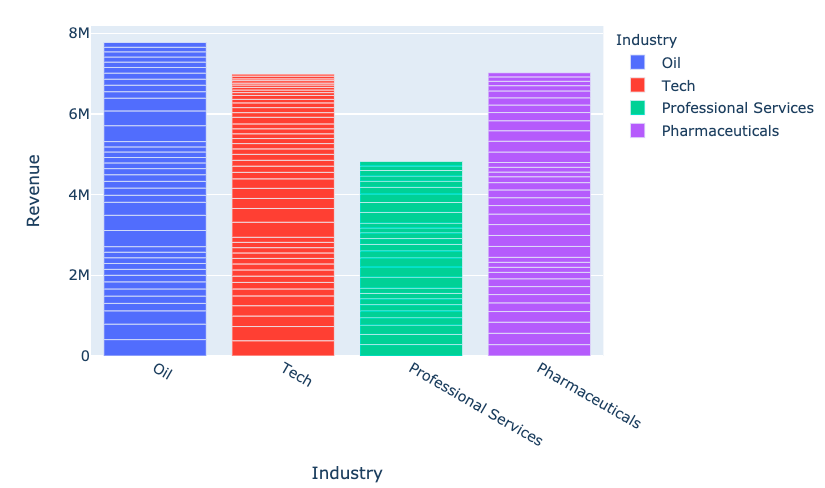
fig = px.bar(
data_frame=revenues,
x='Industry', y='Revenue',
color='Industry')
fig.show()

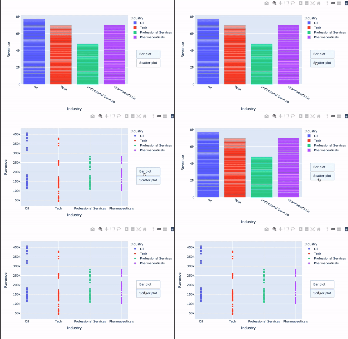
my_buttons = [{'label': "Bar plot",'method': "update",'args': [{"type": "bar"}]},{'label': "scatterplot",'method': "update",'args': [{"type": "scatter", 'mode': 'markers'}]}]
Plotly के सबसे उलझाने वाले हिस्सों में से एक!
[{dictionary to send to data}, {dictionary to send to layout}]

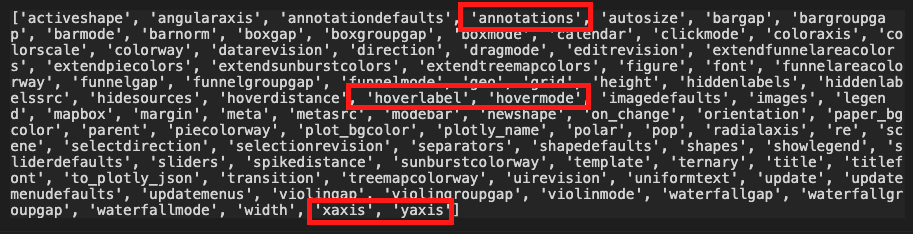
dir(fig.layout)

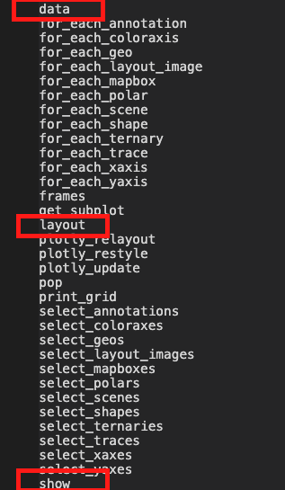
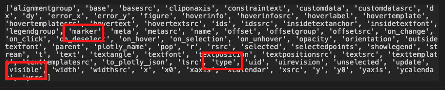
'args' से किसी भी आर्ग्युमेंट को अपडेट करेंdir(fig.data[0])

$$
fig.update_layout({ 'updatemenus': [{'type': "buttons",'direction': 'down', 'x': 1.3, 'y': 0.5,'showactive': True, 'active': 0,'buttons': my_buttons}] }) fig.show()
$$

Python में Plotly के साथ Data Visualization परिचय