geoms के बाहर Stats

इंटरमीडिएट Data Visualization with ggplot2

Rick Scavetta

Founder, Scavetta Academy

बेसिक प्लॉट
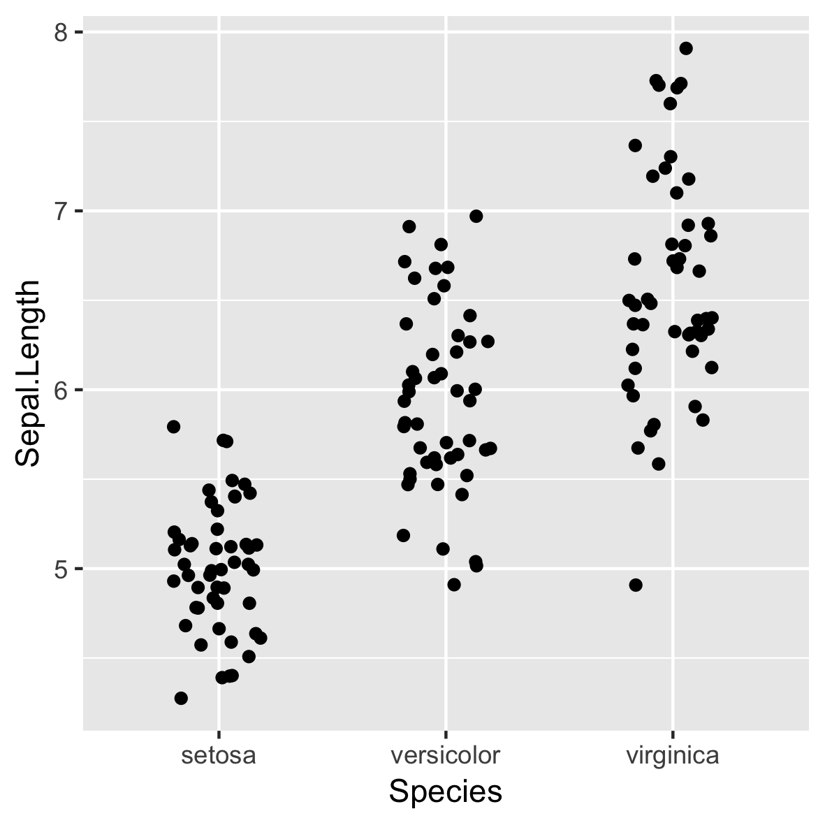
ggplot(iris, aes(x = Species, 
                 y = Sepal.Length)) +
  geom_jitter(width = 0.2)

इंटरमीडिएट Data Visualization with ggplot2

सांख्यिकी गणना

set.seed(123)
xx <- rnorm(100)
mean(xx)
[1] 0.09040591
mean(xx) + (sd(xx) * c(-1, 1))
[1] -0.822410  1.003222
इंटरमीडिएट Data Visualization with ggplot2

सांख्यिकी गणना

set.seed(123)
xx <- rnorm(100)

# Hmisc
library(Hmisc)
smean.sdl(xx, mult = 1)
       Mean       Lower       Upper 
 0.09040591 -0.82240997  1.00322179
# ggplot2
mean_sdl(xx, mult = 1)
           y     ymin     ymax
1 0.09040591 -0.82241 1.003222
इंटरमीडिएट Data Visualization with ggplot2

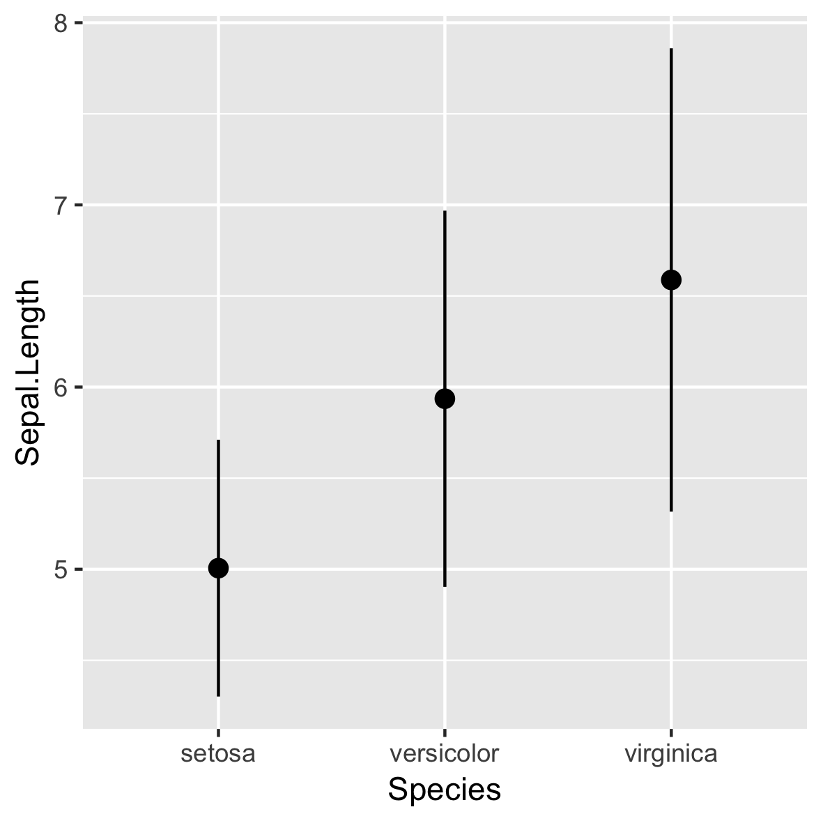
stat_summary()

ggplot(iris, aes(x = Species, 
                 y = Sepal.Length)) +
 stat_summary(fun.data = mean_sdl, 
                fun.args = list(mult = 1))
  • डिफॉल्ट रूप से geom_pointrange() उपयोग करता है

इंटरमीडिएट Data Visualization with ggplot2

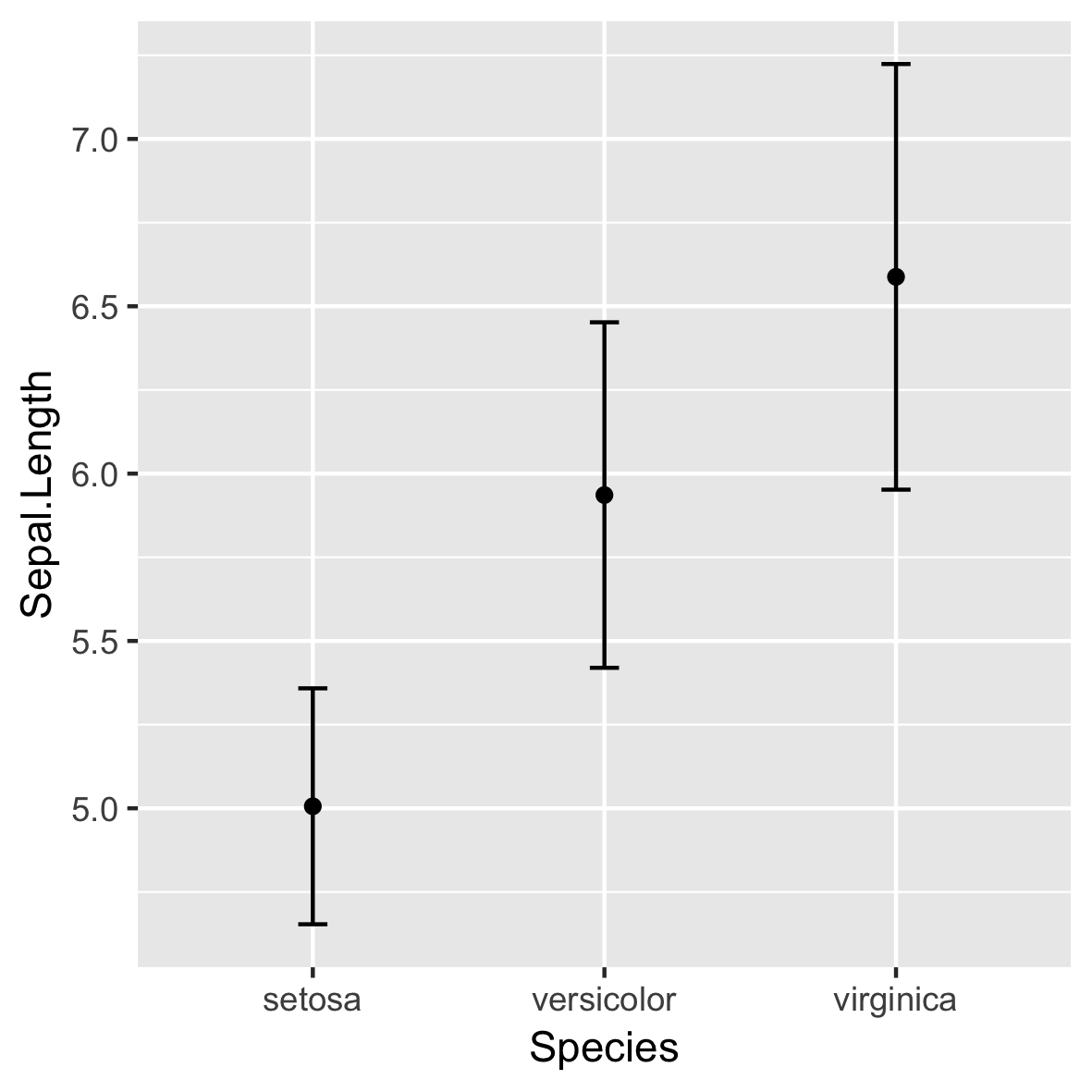
stat_summary()

ggplot(iris, aes(x = Species, 
                 y = Sepal.Length)) +
  stat_summary(fun = mean,
               geom = "point") +
  stat_summary(fun.data = mean_sdl,
               fun.args = list(mult = 1),
               geom = "errorbar",
               width = 0.1)

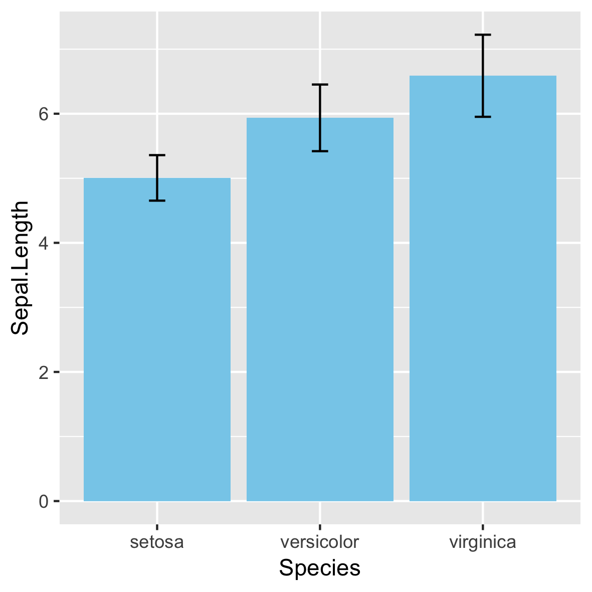
इंटरमीडिएट Data Visualization with ggplot2

अनुशंसित नहीं!

इंटरमीडिएट Data Visualization with ggplot2

95% कॉन्फिडेंस इंटरवल

ERR <- qt(0.975, length(xx) - 1) * (sd(xx) / sqrt(length(xx)))
mean(xx)
0.09040591
mean(xx) + (ERR * c(-1, 1)) # 95% CI
-0.09071657  0.27152838
mean_cl_normal(xx)
           y        ymin      ymax
0.09040591 -0.09071657 0.2715284
इंटरमीडिएट Data Visualization with ggplot2

अन्य stat_ फंक्शन

stat_ विवरण
stat_summary() अलग-अलग x मानों पर y को summarize करें.
stat_function() x के फ़ंक्शन से y मान compute करें.
stat_qq() क्वांटाइल-क्वांटाइल प्लॉट के लिए गणना करें.
इंटरमीडिएट Data Visualization with ggplot2

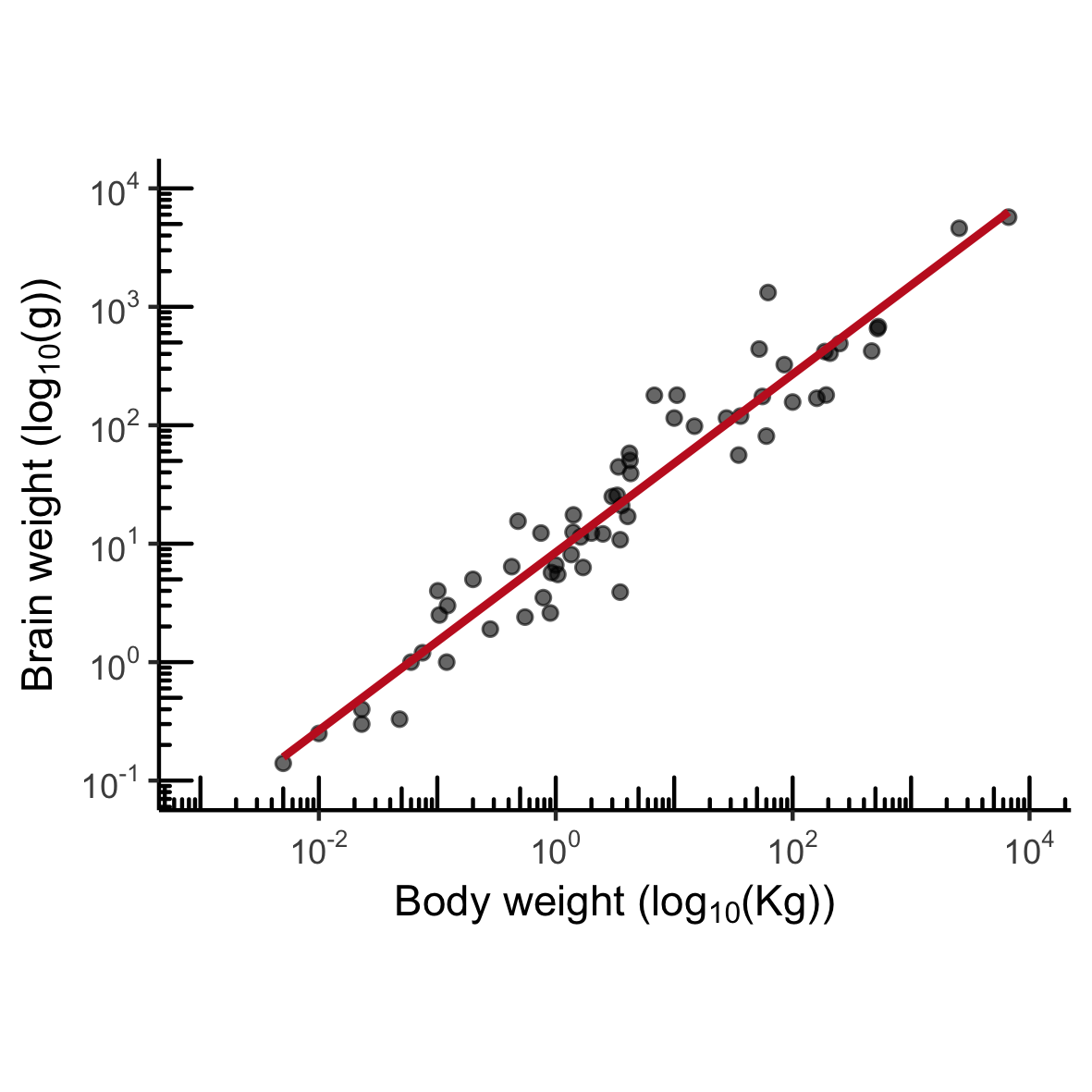
MASS::mammals

इंटरमीडिएट Data Visualization with ggplot2

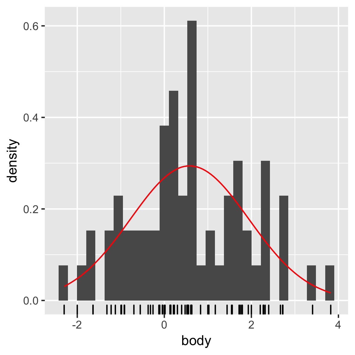
नॉर्मल डिस्ट्रीब्यूशन

mam.new <- data.frame(body = log10(mammals$body))

ggplot(mam.new, aes(x = body)) + 
  geom_histogram(aes( y = ..density..)) +
  geom_rug() +
  stat_function(fun = dnorm, color = "red", 
                args = list(mean = mean(mam.new$body),
                            sd = sd(mam.new$body)))

इंटरमीडिएट Data Visualization with ggplot2

QQ प्लॉट

ggplot(mam.new, aes(sample = body)) + 
  stat_qq() +
  geom_qq_line(col = "red")

इंटरमीडिएट Data Visualization with ggplot2

अब आपकी बारी!

इंटरमीडिएट Data Visualization with ggplot2

Preparing Video For Download...