matplotlib के साथ कस्टमाइज़ करना

इंटरमीडिएट Data Visualization with Seaborn

Chris Moffitt

Instructor

Matplotlib Axes

  • अधिकतर कस्टमाइज़ेशन matplotlib के Axes ऑब्जेक्ट्स से होता है
  • Axes को seaborn फंक्शंस में पास किया जा सकता है
fig, ax = plt.subplots()
sns.histplot(df['Tuition'], ax=ax)
ax.set(xlabel='Tuition 2013-14')
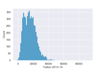
उदाहरण axes प्लॉट

इंटरमीडिएट Data Visualization with Seaborn

और कस्टमाइज़ेशन

  • axes ऑब्जेक्ट कई सामान्य कस्टमाइज़ेशन सपोर्ट करता है
fig, ax = plt.subplots()
sns.histplot(df['Tuition'], ax=ax)
ax.set(xlabel="Tuition 2013-14",
       ylabel="Distribution", xlim=(0, 50000), 
title="2013-14 Tuition and Fees Distribution")
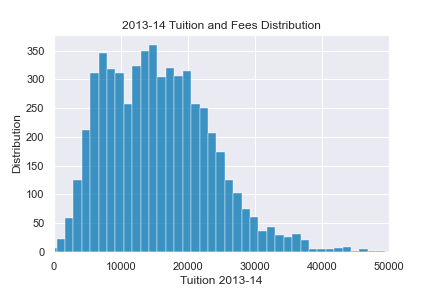
अतिरिक्त axes उदाहरण

इंटरमीडिएट Data Visualization with Seaborn

प्लॉट्स को जोड़ना

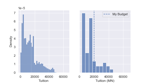
  • आप कई प्लॉट्स को जोड़कर कॉन्फ़िगर कर सकते हैं
fig, (ax0, ax1) = plt.subplots(nrows=1, ncols=2, 
                               sharey=True, figsize=(7,4))

sns.histplot(df['Tuition'], stat='density', ax=ax0)
sns.histplot(df.query('State == "MN"')['Tuition'], stat='density', ax=ax1)

ax1.set(xlabel='Tuition (MN)', xlim=(0, 70000))
ax1.axvline(x=20000, label='My Budget', linestyle='--')
ax1.legend()
इंटरमीडिएट Data Visualization with Seaborn

प्लॉट्स को जोड़ना

साइड बाय साइड प्लॉट्स

इंटरमीडिएट Data Visualization with Seaborn

अभ्यास करते हैं!

इंटरमीडिएट Data Visualization with Seaborn

Preparing Video For Download...