कर्नेल डेंसिटी एस्टीमेटर

R में Visualization की Best Practices

Nick Strayer

Instructor

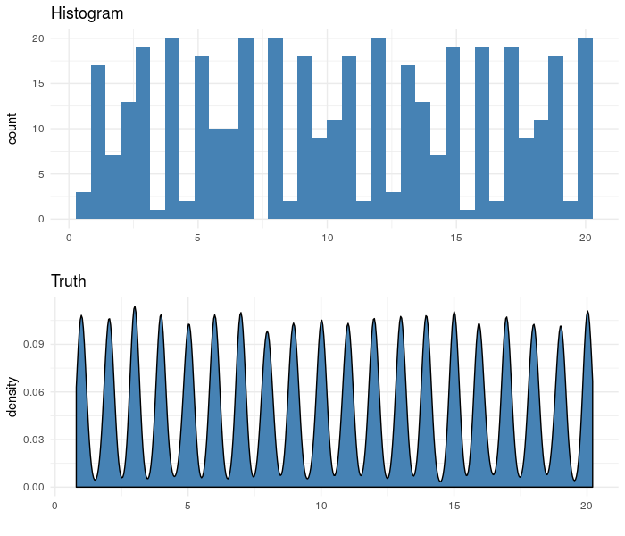
जहाँ हिस्टोग्राम कमजोर पड़ते हैं

  • कई तेज शिखरों वाला डेटा
  • छोटा डेटा

R में Visualization की Best Practices

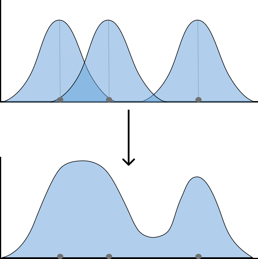
कर्नेल डेंसिटी प्लॉट्स

  • हर डेटा पॉइंट पर "कर्नेल" रखें
  • ओवरलैप होते कर्नेल की ऊँचाइयों को जोड़ें
R में Visualization की Best Practices

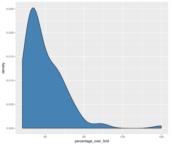
ggplot में KDE बनाना

  • बस geom_histogram() की जगह geom_density() लगाएँ
sample_n(md_speeding, 100) %>%
  ggplot(aes(x = percentage_over_limit)) +
  # Swap out geom_histogram() 
    geom_density(
      # Fill in curve with color
      fill = 'steelblue',
      # Standard deviation of kernel
      bw = 8 
    )
R में Visualization की Best Practices

R में Visualization की Best Practices

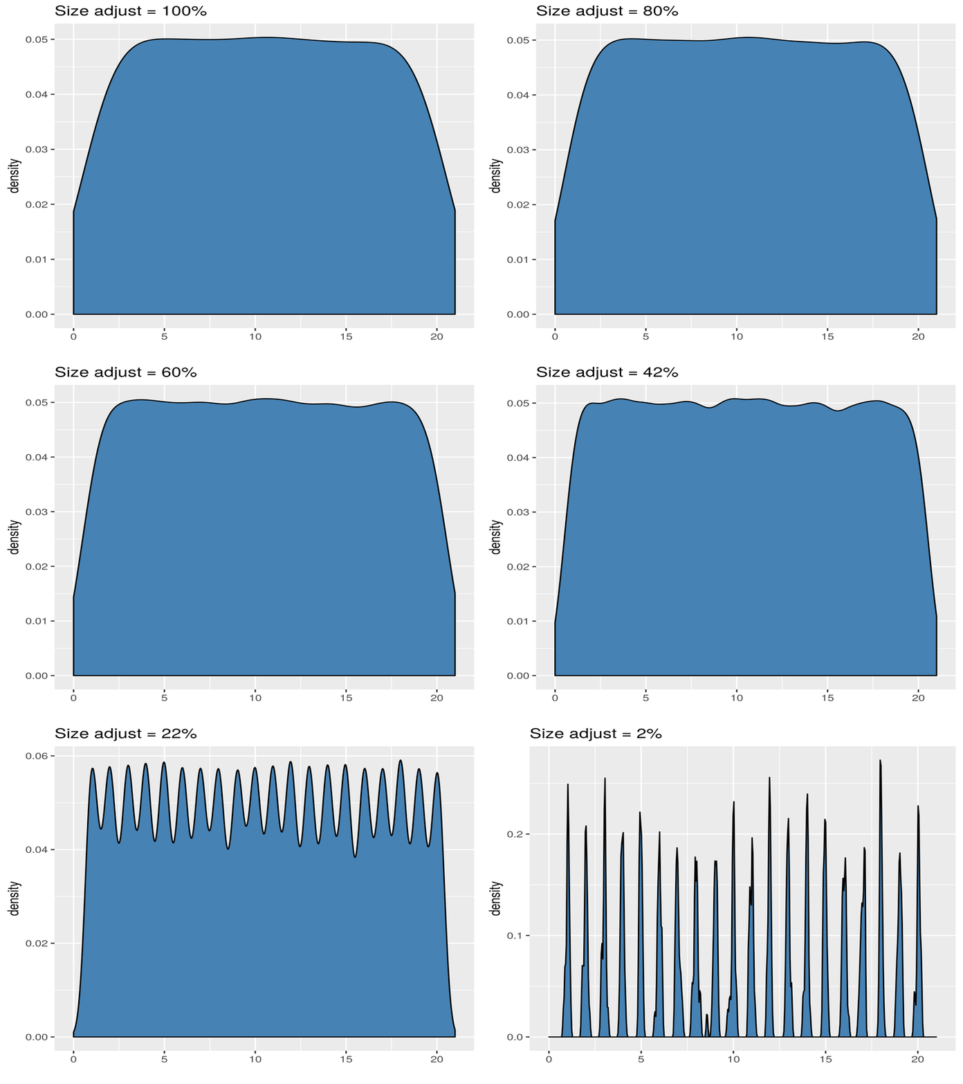
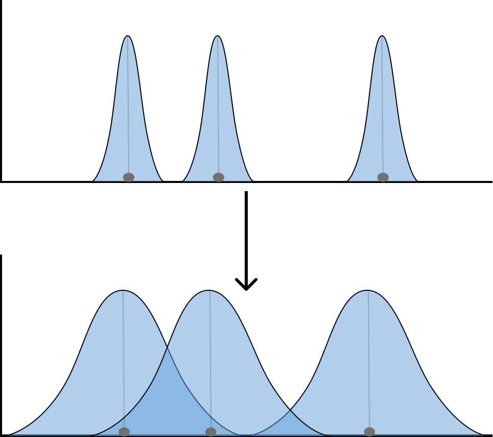
एक नई चौड़ाई की चिंता

  • हर पॉइंट पर रखे कर्नेल का standard deviation समायोजित करना पड़ता है
R में Visualization की Best Practices

R में Visualization की Best Practices

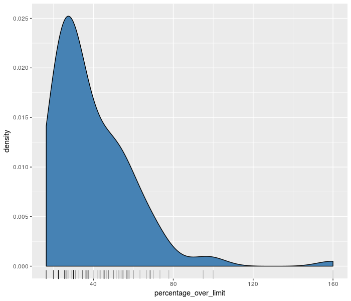
सारा डेटा दिखाएँ

KDE के नीचे सभी डेटा को लाइनों से दिखाने के लिए geom_rug() उपयोग करें

p <-sample_n(md_speeding, 100) %>%
  ggplot(aes(x = percentage_over_limit)) +
  geom_density(
    fill = 'steelblue', # fill in curve with color
    bw = 8 # standard deviation of kernel
  ) 

p + geom_rug(alpha = 0.4)
R में Visualization की Best Practices

R में Visualization की Best Practices

चलें, कुछ Gaussian स्टैक करें!

R में Visualization की Best Practices

Preparing Video For Download...