Boxplot के विकल्प

R में Visualization की Best Practices

Nick Strayer

Instructor

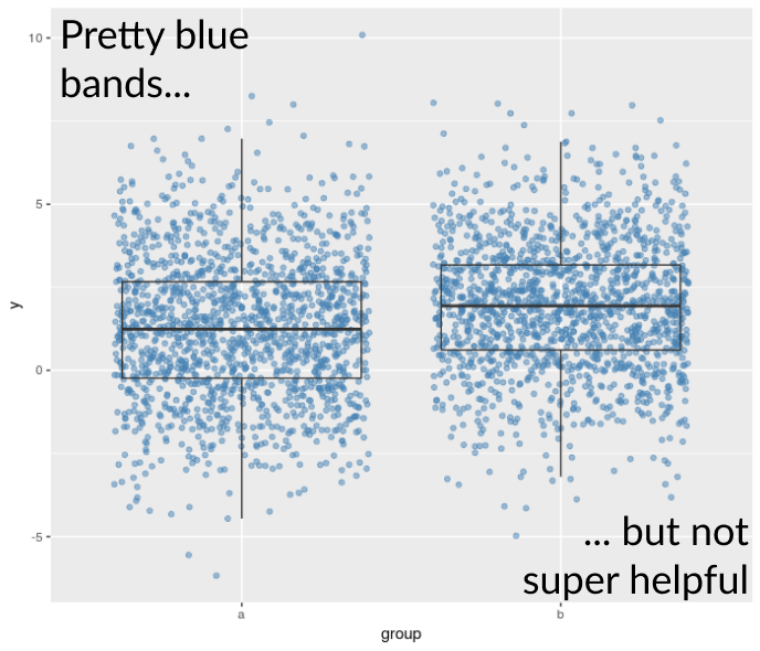
Jitter वाले boxplot की सीमाएँ

  • Jostling points बहुत ओवरलैप संभाल नहीं पाते
  • डेटा की density समझना मुश्किल

R में Visualization की Best Practices

और क्या विकल्प हैं?

Beeswarm plots

Violin plots

R में Visualization की Best Practices

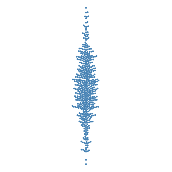
Beeswarm plots

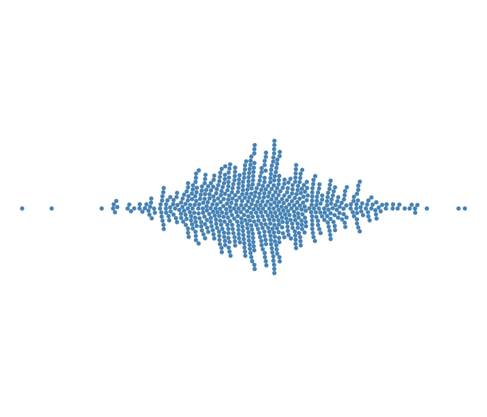
  • 'Smart' jittering
  • Individual points को axis के पास जितना हो सके सटा कर रखा जाता है
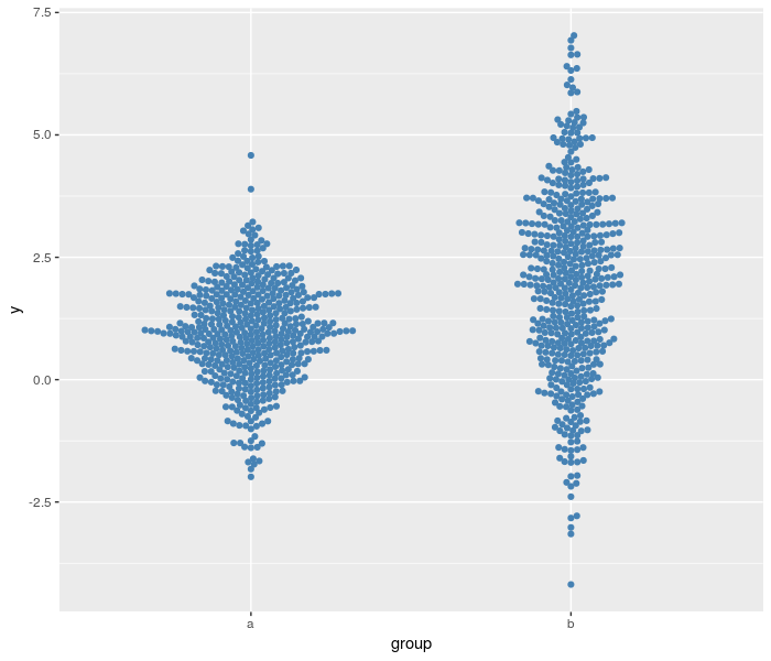
  • ggbeeswarm पैकेज में geom_beeswarm() के रूप में उपलब्ध।
library(ggbeeswarm)
ggplot(data, aes(y = y, x =  group)) + 
  geom_beeswarm(color = 'steelblue')
R में Visualization की Best Practices

R में Visualization की Best Practices

Beeswarm के फायदे

  • Individual data points
  • Distribution की shape

R में Visualization की Best Practices

Beeswarm की कमियाँ

  • बहुत डेटा होने पर मुश्किल
  • मनमानी stacking

R में Visualization की Best Practices

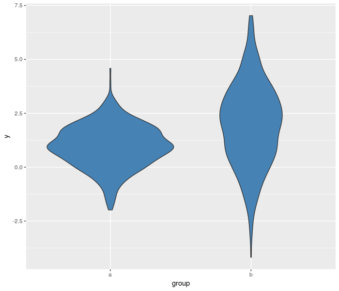
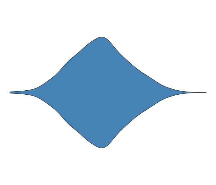
Violin plots

  • KDE को symmetry के लिए reflect किया जाता है
  • बस geom_boxplot() को geom_violin() से बदलें।
ggplot(data, aes(y = y, x = group)) + 
  geom_violin(fill = 'steelblue') 
R में Visualization की Best Practices

R में Visualization की Best Practices

Violin के फायदे

  • हर data point का असर शामिल
  • हर point दिखता नहीं, इसलिए बहुत डेटा के लिए अच्छा।
R में Visualization की Best Practices

Violin की कमियाँ

  • Kernel width चुनना
  • हर data point दिखता नहीं

R में Visualization की Best Practices

चलो कुछ और एडवांस्ड comparisons आज़माएँ!

R में Visualization की Best Practices

Preparing Video For Download...