R में Visualization की Best Practices
Nick Strayer
Instructor

who_disease %>%
filter(region == 'EMR', disease == 'measles', year == 2015) %>%
ggplot(aes(x = country, y = cases)) +
geom_col()

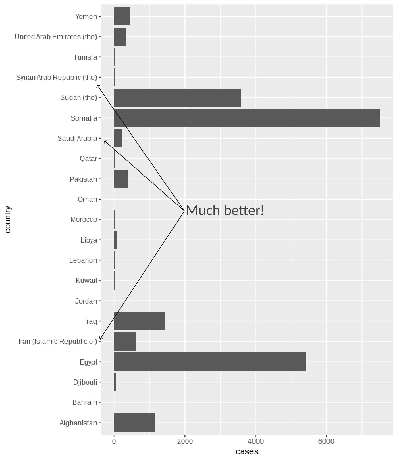
geom_bar() और geom_col() y-axis पर categories नहीं देते हैंbusy_bars <- who_disease %>%
filter(region == 'EMR', disease == 'measles', year == 2015) %>%
ggplot(aes(x = country, y = cases)) +
geom_col()
busy_bars + coord_flip() # x और y axes बदलें!


plot <- who_disease %>%
filter(country == "India", year == 1980) %>%
ggplot(aes(x = disease, y = cases)) +
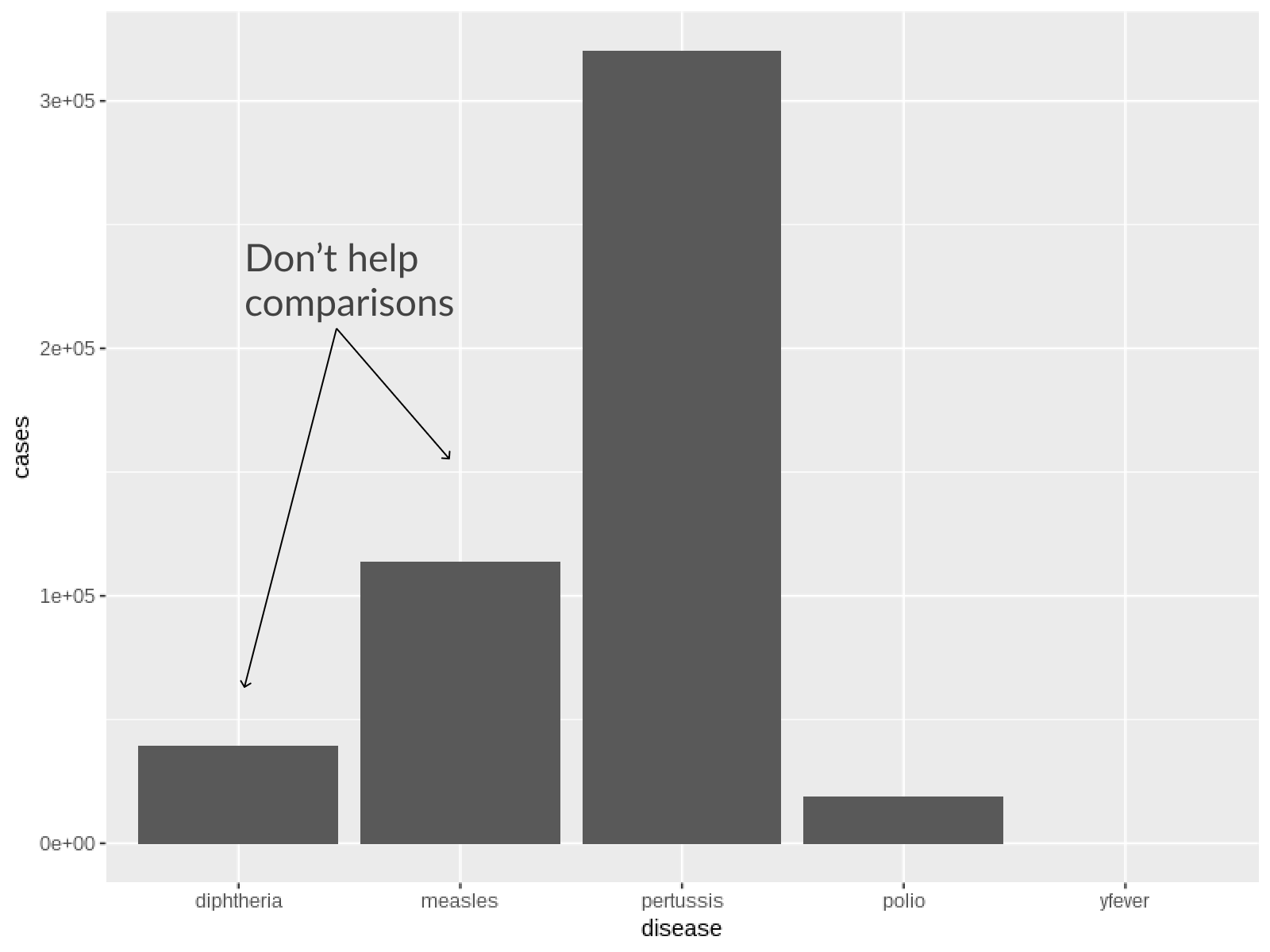
geom_col()
# वर्टिकल grid lines हटाएँ
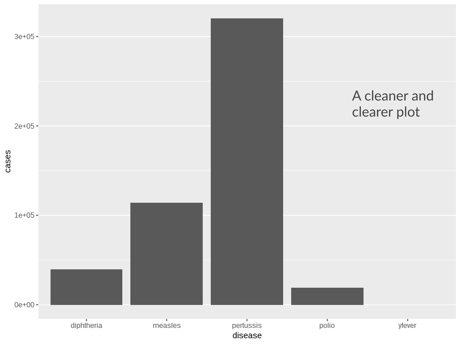
plot + theme(
panel.grid.major.x = element_blank()
)

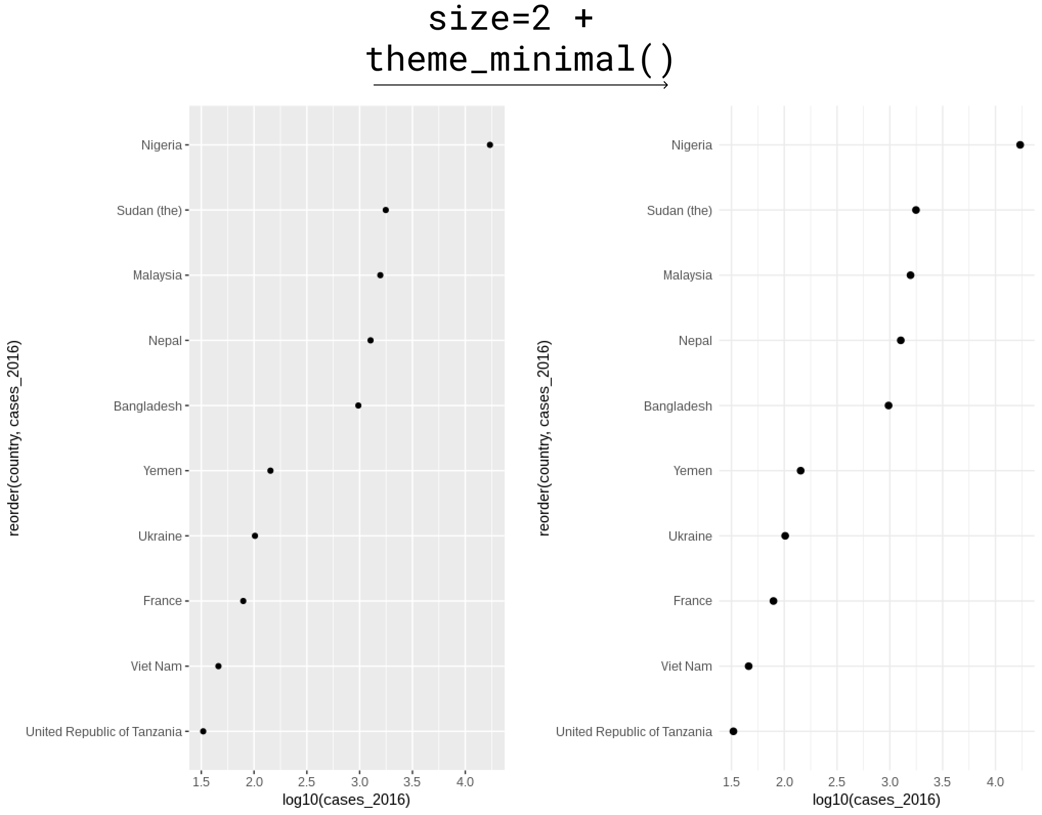
theme_minimal() तुरंत सुधार हैwho_subset %>%
ggplot(aes(y = reorder(country, cases_2016), x = log10(cases_2016))) +
# Point size बढ़ाया गया
geom_point(size = 2) +
# हल्के बैकग्राउंड के लिए theme_minimal
theme_minimal()

R में Visualization की Best Practices