डिस्ट्रिब्यूशन्स की तुलना परिचय

R में Visualization की Best Practices

Nick Strayer

Instructor

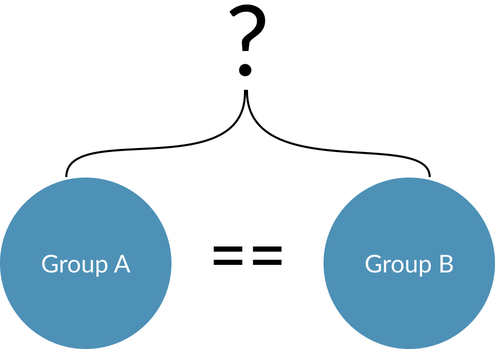
डिस्ट्रिब्यूशन्स की तुलना क्यों?

  • समूह संतुलित हैं, जाँचें
  • निष्पक्ष तुलना के लिए

R में Visualization की Best Practices

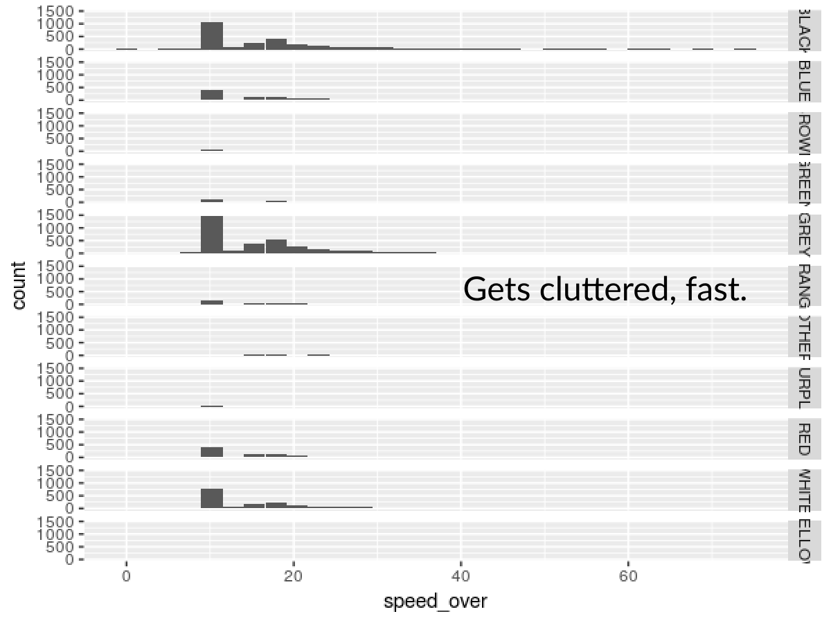
हिस्टोग्राम को facet क्यों न करें?

ggplot(md_speeding, aes(x = speed_over)) + 
  geom_histogram() +
  facet_grid(vehicle_color ~ .)
R में Visualization की Best Practices

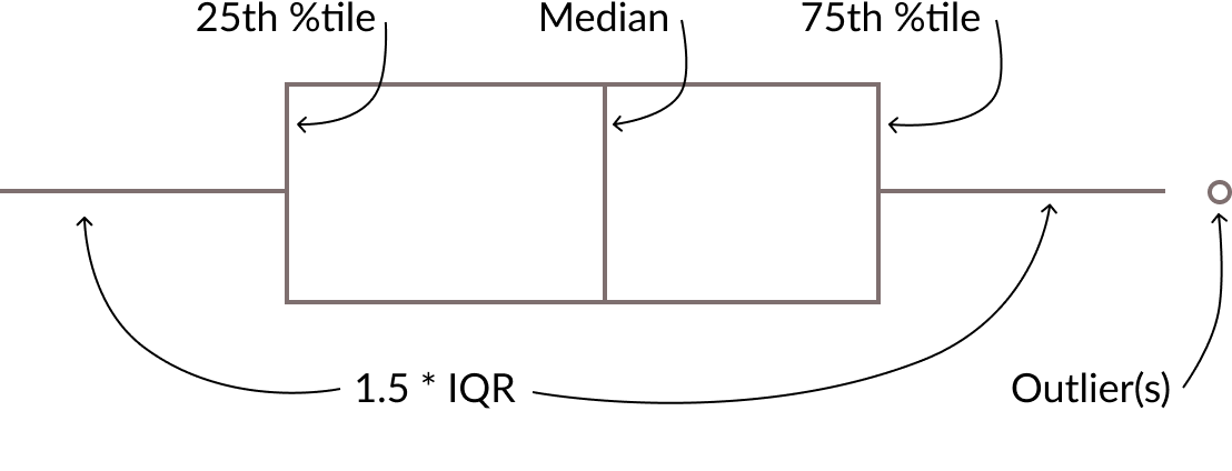
बॉक्सप्लॉट


R में Visualization की Best Practices

बॉक्सप्लॉट के फायदे

  • परिचित
  • कई उपयोगी समरी स्टैटिस्टिक्स

R में Visualization की Best Practices

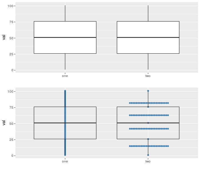
बॉक्सप्लॉट के नुकसान

  • डेटा भी दिखाएँ!

R में Visualization की Best Practices

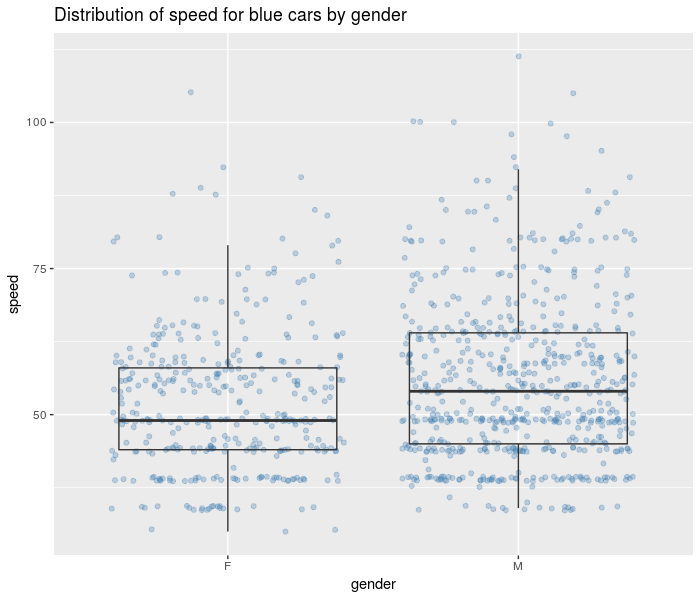
एक सरल जोड़

  • geom_jitter() रॉ पॉइंट्स को ओवरलैप से बचाने के लिए हिला कर दिखाता है.
  • इसे अपने geom_boxplot() के नीचे लेयर करें.
md_speeding %>% 
  filter(vehicle_color == 'BLUE') %>%
  ggplot(aes(x = gender, y = speed)) +
    # Draw points behind 
    geom_jitter(alpha = 0.3, color = 'steelblue') + 
    # Make transparent
    geom_boxplot(alpha = 0) + 
    labs(title = 'Distribution of speed for blue cars by gender')
R में Visualization की Best Practices

R में Visualization की Best Practices

कुछ डिस्ट्रिब्यूशन्स की तुलना करें!

R में Visualization की Best Practices

Preparing Video For Download...