फैक्टर्स का पुन:क्रमण

Tidyverse में Categorical डेटा

Emily Robinson

Data Scientist
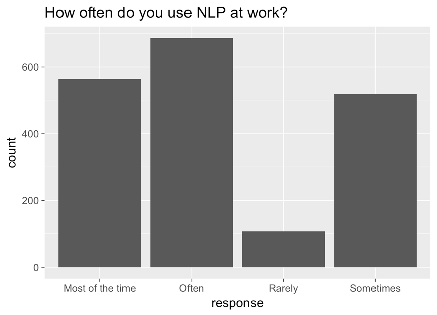
एक बार चार्ट जिसमें x-axis पर response, y-axis पर count है, और शीर्षक "how often do you use NLP at work?" है। बाएँ से दाएँ बार: most of the time, often, rarely, और sometimes.

Tidyverse में Categorical डेटा

सुधारा हुआ ग्राफ़

ggplot(aes(nlp_frequency, 
            x = fct_relevel(response, 
            "Rarely", "Sometimes", "Often", "Most of the time"))) + 
        geom_bar()
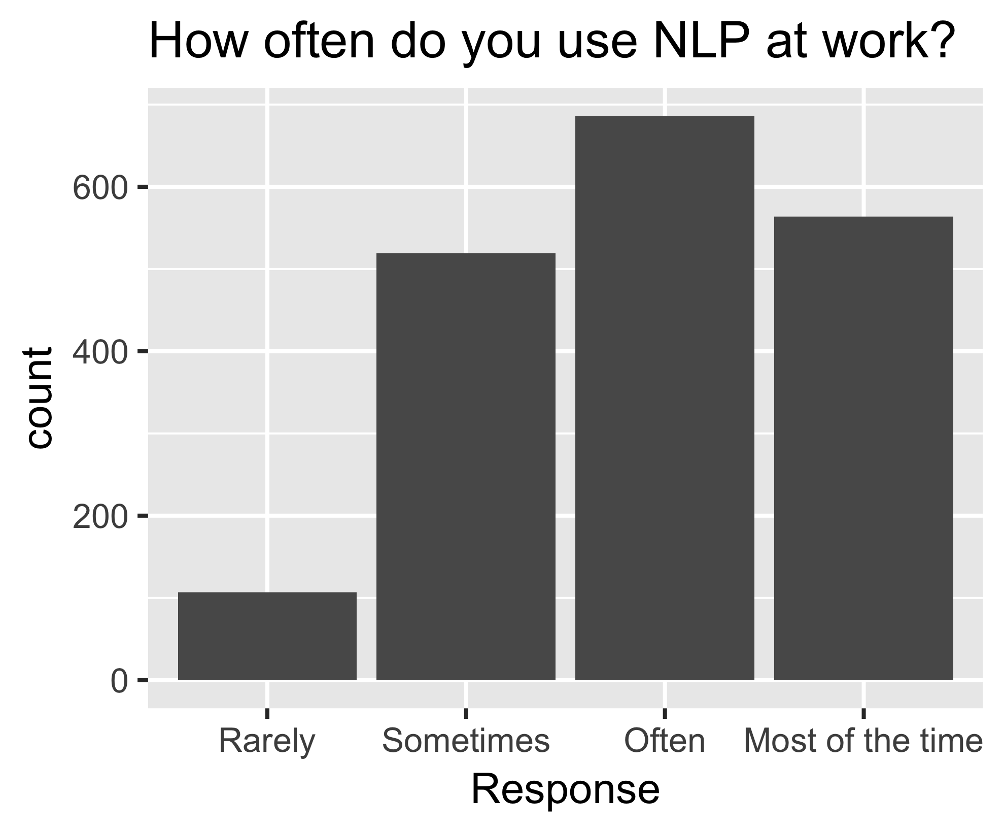
पहले जैसा ही बार चार्ट, अब क्रम में: बाएँ से दाएँ, rarely, sometimes, often, most of the time.

Tidyverse में Categorical डेटा

fct_reorder()

nlp_frequency %>%
    pull(response) %>%
    levels()
[1] "Most of the time" "Often" "Rarely" "Sometimes"       
nlp_frequency %>%
    mutate(response = fct_relevel(response, 
            "Often", "Most of the time")) %>%
    pull(response) %>%
    levels()
[1] "Often" "Most of the time" "Rarely" "Sometimes"
Tidyverse में Categorical डेटा

अतिरिक्त आर्ग्युमेंट्स

nlp_frequency %>%
    mutate(response = fct_relevel(response, 
            "Often", "Most of the time", after = 2)) %>%
            pull(response) %>%
            levels()
nlp_frequency %>%
    mutate(response = fct_relevel(response, 
            "Often", "Most of the time", after = Inf) %>%
    pull(response) %>%
    levels()
[1] "Rarely" "Sometimes" "Often" "Most of the time"
Tidyverse में Categorical डेटा

अभ्यास करते हैं!

Tidyverse में Categorical डेटा

Preparing Video For Download...