ggplot2 के ट्रिक्स

Tidyverse में Categorical डेटा

Emily Robinson

Instructor

जॉब टाइटल डेटा


job_titles_by_perc
# A tibble: 16 x 2
   CurrentJobTitleSelect                perc_w_title
   <chr>                                       <dbl>
 1 Business Analyst                          0.0673 
 2 Computer Scientist                        0.0283 
 3 Data Analyst                              0.103  
 4 Data Miner                                0.00997
 5 Data Scientist                            0.206  
 6 DBA/Database Engineer                     0.0158 
Tidyverse में Categorical डेटा

प्रारंभिक प्लॉट

ggplot(job_titles_by_perc,
        aes(x = CurrentJobTitleSelect,, y = perc_w_title)) + 
    geom_point() 
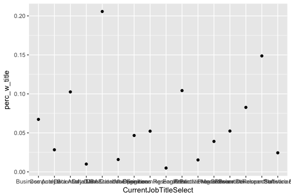
एक स्कैटरप्लॉट जिसमें x-धुरी पर "Current Job Title Select" और y-धुरी पर "Perc w title" है। x-धुरी के टिक आपस में टकरा रहे हैं, इसलिए पढ़ना कठिन है। स्कैटरप्लॉट y-धुरी के अनुसार ऑर्डर नहीं है।

Tidyverse में Categorical डेटा

टिक लेबल का कोण बदलना

ggplot(job_titles_by_perc,
        aes(x = CurrentJobTitleSelect, y = perc_w_title)) + 
    geom_point() + 
    theme(axis.text.x = element_text(angle = 90, hjust = 1))
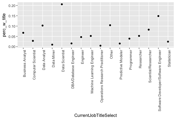
पहले जैसा ही स्कैटरप्लॉट, लेकिन x-धुरी के लेबल अब वर्टिकल हैं, इसलिए पठनीय हैं।

Tidyverse में Categorical डेटा

fct_reorder() का उपयोग

ggplot(job_titles_by_perc, 
   aes(x = fct_reorder(CurrentJobTitleSelect, perc_w_title), 
       y = perc_w_title)) + 
    geom_point() + 
    theme(axis.text.x = element_text(angle = 90, hjust = 1))
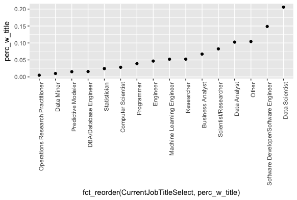
पहले जैसा ही स्कैटरप्लॉट, लेकिन अब बाएँ से दाएँ y-धुरी के बढ़ते क्रम में ऑर्डर किया गया है।

Tidyverse में Categorical डेटा

fct_rev() जोड़ना

ggplot(job_titles_by_perc, 
        aes(x = fct_rev(fct_reorder(CurrentJobTitleSelect, 
        perc_w_title)), y = perc_w_title)) + 
    geom_point() + 
    theme(axis.text.x = element_text(angle = 90, hjust = 1))
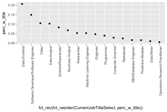
पहले जैसा ही स्कैटरप्लॉट, लेकिन अब बाएँ से दाएँ y-धुरी के घटते क्रम में ऑर्डर किया गया है।

Tidyverse में Categorical डेटा

labs() का उपयोग

ggplot(job_titles_by_perc, 
        aes(x = fct_rev(fct_reorder(CurrentJobTitleSelect, perc_w_title)),
            y = perc_w_title)) + 
    geom_point() + 
    theme(axis.text.x = element_text(angle = 90, hjust = 1)) +
    labs(x = "Job Title", y = "Percent with title")
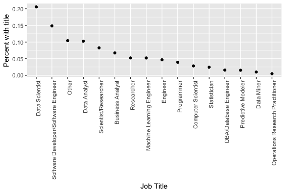
पहले जैसा ही स्कैटरप्लॉट, लेकिन x-धुरी पर "Job Title" और y-धुरी पर "Percent with title" लेबल हैं।

Tidyverse में Categorical डेटा

% स्केल में बदलना

ggplot(job_titles_by_perc, 
       aes(x=fct_rev(fct_reorder(CurrentJobTitleSelect,perc_w_title)),
           y=perc_w_title)) + 
    geom_point() + 
    theme(axis.text.x = element_text(angle = 90, hjust = 1)) +
    labs(x = "Job Title", y = "Percent with title") + 
    scale_y_continuous(labels = scales::percent_format())
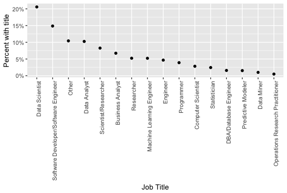
पहले जैसा ही स्कैटरप्लॉट, लेकिन अब y-धुरी के टिक प्रतिशत में हैं। उदाहरण के लिए, .05 अब 5% है।

Tidyverse में Categorical डेटा

अभ्यास करते हैं!

Tidyverse में Categorical डेटा

Preparing Video For Download...