denver_may = pollution.query("city == 'Denver' & month == 8")

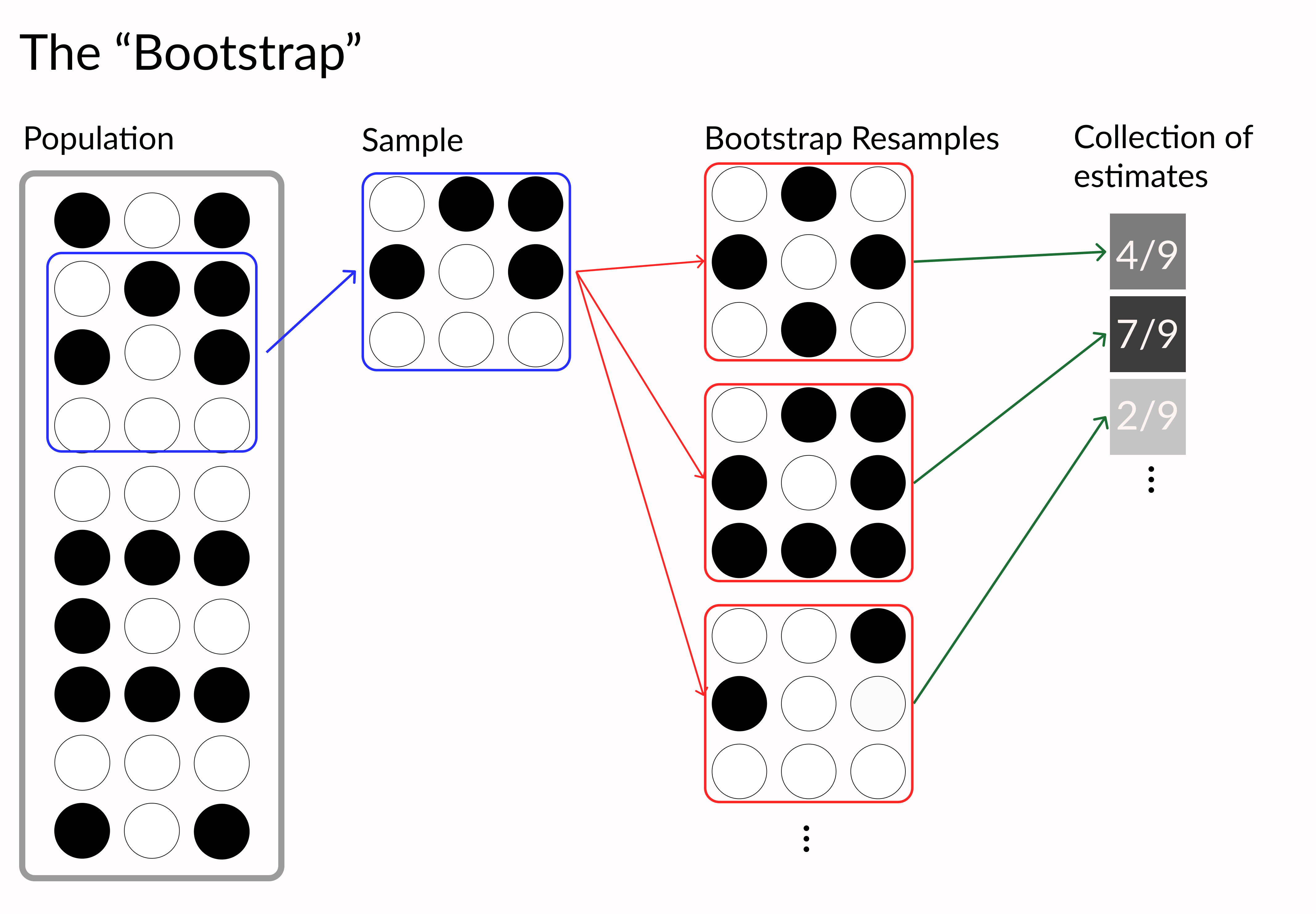
# Perform bootstrapped mean on a vector
def bootstrap(data, n_boots):
    return [np.mean(np.random.choice(data,len(data)))
            for _ in range(n_boots) ]

# Generate 1,000 bootstrap samples
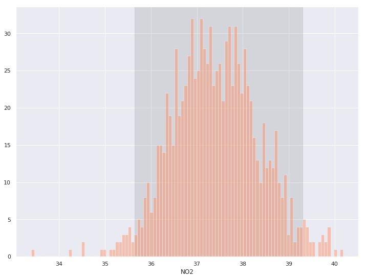
boot_means = bootstrap(denver_may.NO2, 1000)


# Get lower and upper 95% interval bounds
lower, upper = np.percentile(boot_means, [2.5, 97.5])

# Shaded background of interval
plt.axvspan(lower, upper, color='grey', alpha=0.2)

# Plot histogram of samples
sns.histplot(boot_means, bins = 100)
# Make dataframe of bootstraped data
denver_may_boot = pd.concat([
    denver_may.sample(n=len(denver_may), replace=True).assign(sample=i)
    for i in range(100)])

# Plot regressions for each sample
sns.lmplot('CO', 'O3', data=denver_may_boot, scatter=False,

           # Tell seaborn to draw a regression
           # line for each resample's data
           hue='sample',

           # Make lines orange and transparent
           line_kws = {'color': 'coral', 'alpha': 0.2},

           # No confidence intervals
           ci=None, legend = False)
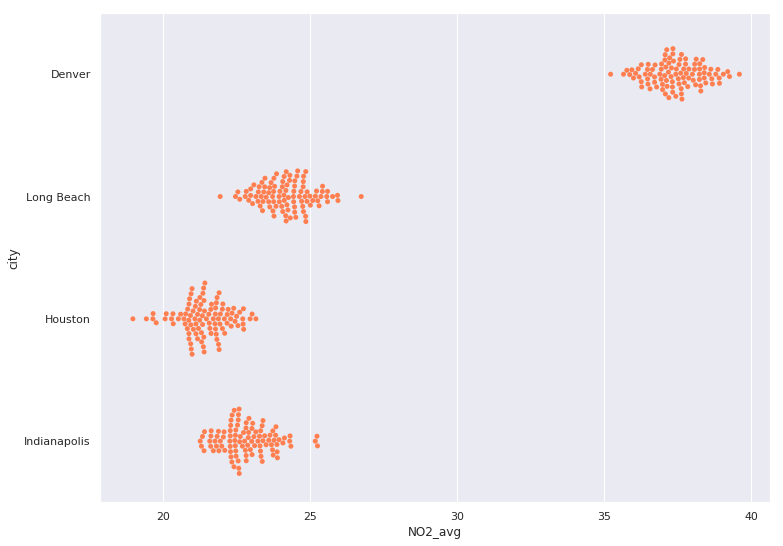
aug_pol = pollution.query("month == 8")

# Holder DataFrame for bootstrap samples
city_boots = pd.DataFrame()

for city in ['Denver', 'Long Beach', 'Houston', 'Indianapolis']:
    # Filter to city's NO2
    city_NO2 = aug_pol[aug_pol.city == city].NO2
    # Perform 100 bootstrap samples of city's NO2 & put in DataFrame
    cur_boot = pd.DataFrame({ 'NO2_avg': bootstrap(city_NO2, 100),
                              'city': city })
    # Append to other city's bootstraps
    city_boots = pd.concat([city_boots,cur_boot])

# Use beeswarm plot to visualize bootstrap samples
sns.swarmplot(y="city", x="NO2_avg", data=city_boots,

              # Set all the colors to be the same
              color='coral')