तुलना के लिए वित्तीय अनुपातों का विज़ुअलाइज़ेशन

Python में Financial Statements का विश्लेषण

Rohan Chatterjee

Risk Modeler

दो कंपनियों के अनुपात प्लॉट करना
sns.set_style("whitegrid")
ax = sns.lineplot(data=current_ratio,
        x="Year",y='current_ratio',
        hue="company", alpha=0.7)
plt.xlabel("Year")
plt.ylabel("Current Ratio")

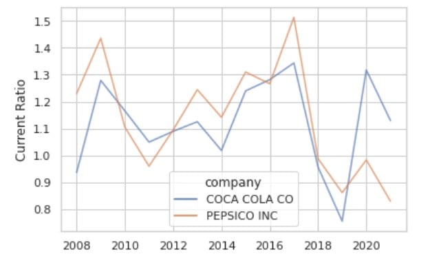
यह इमेज 2008 से 2020 तक Coca-cola और Pepsico का current ratio दिखाती है.

Python में Financial Statements का विश्लेषण

sns.lineplot() के साथ ओवरक्राउडिंग

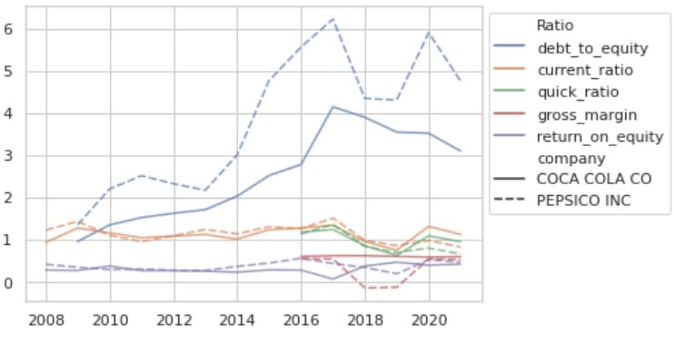
इस ग्राफ़ में कम जगह में बहुत जानकारी है, इसलिए यह भीड़भाड़ वाला है यह इमेज Coca-cola और Pepsico के debt-to-equity, current ratio, quick ratio और gross margin को एक ही इमेज में दिखाती है. इमेज बहुत भीड़भाड़ वाली है.
Python में Financial Statements का विश्लेषण

sns.relplot() का परिचय

  • पहला कदम: longitudinal डेटा पाने के लिए DataFrame को melt करें.

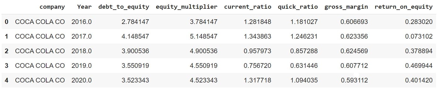
  • "unmelted" DataFrame:

plot_df.head()

इमेज एक wide DataFrame दिखाती है.

Python में Financial Statements का विश्लेषण

अब DataFrame को melt करें

plot_df_melt = plot_df.melt(id_vars = ['company','Year'], var_name = "Ratio")
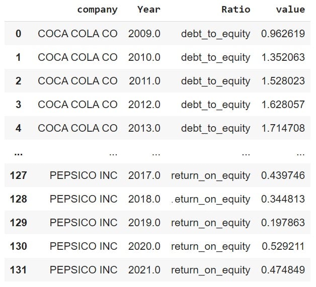
इमेज एक molten DataFrame की शुरुआती कुछ पंक्तियाँ दिखाती है.

Python में Financial Statements का विश्लेषण

sns.relplot() से अनुपात प्लॉट करें

ax = sns.relplot(data=df_melt, x="Year",
                 y="value", hue="Ratio",
                 alpha=0.7,
                 col='company',
                 kind='line')
ax.set_ylabels('')
ax.set_xlabels('')
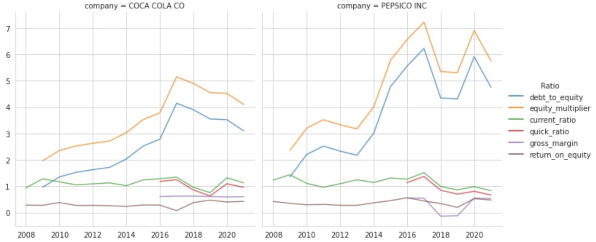
यह इमेज Coca-cola और Pepsico के debt-to-equity, current ratio, quick ratio और gross margin दिखाती है. दोनों कंपनियों के ratio अलग-अलग panes में हैं.

Python में Financial Statements का विश्लेषण

प्लॉट को नज़दीक से देखें

यह इमेज Coca-cola और Pepsico के debt-to-equity, current ratio, quick ratio और gross margin दिखाती है. दोनों कंपनियों के ratio अलग-अलग panes में हैं.

Python में Financial Statements का विश्लेषण

अभ्यास करते हैं!

Python में Financial Statements का विश्लेषण

Preparing Video For Download...