स्प्रेडशीट उपयोगकर्ताओं के लिए Python
Chris Cardillo
Data Scientist
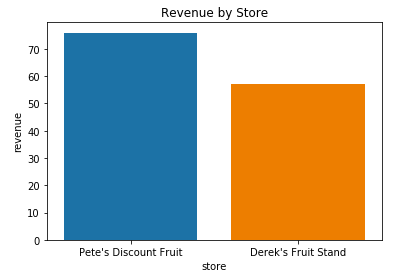
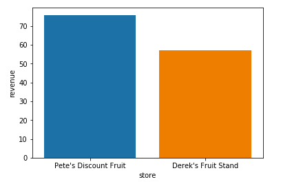
sns.barplot(x='store', y='revenue', data=totals)
plt.show()
sns.barplot(x='store',
y='revenue',
data=totals)
# एक शीर्षक जोड़ें
# x-अक्ष लेबल जोड़ें
# y-अक्ष लेबल जोड़ें
plt.show()

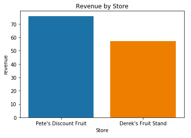
sns.barplot(x='store',
y='revenue',
data=totals)
plt.title('Revenue by Store')
# x-अक्ष लेबल जोड़ें
# y-अक्ष लेबल जोड़ें
plt.show()

sns.barplot(x='store',
y='revenue',
data=totals)
plt.title('Revenue by Store')
plt.xlabel('Store')
# y-अक्ष लेबल जोड़ें
plt.show()

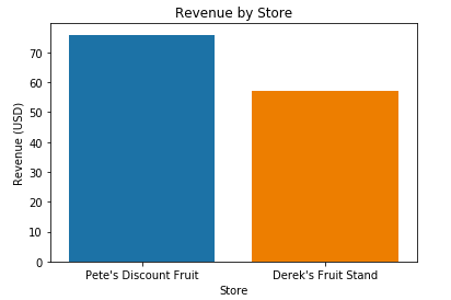
sns.barplot(x='store',
y='revenue',
data=totals)
plt.title('Revenue by Store')
plt.xlabel('Store')
plt.ylabel('Revenue (USD)')
plt.show()

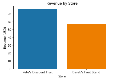
sns.barplot(x='store',
y='revenue',
data=totals)
plt.title('Revenue by Store')
plt.xlabel('Store')
plt.ylabel('Revenue (USD)')
sns.despine()
plt.show()

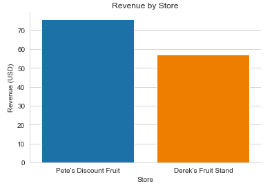
sns.set_style('whitegrid')
sns.barplot(x='store',
y='revenue',
data=totals)
plt.title('Revenue by Store')
plt.xlabel('Store')
plt.ylabel('Revenue (USD)')
sns.despine()
plt.show()


स्प्रेडशीट उपयोगकर्ताओं के लिए Python