R में Trelliscope के साथ बिग डेटा का विज़ुअलाइज़ेशन
Ryan Hafen
Author, TrelliscopeJS
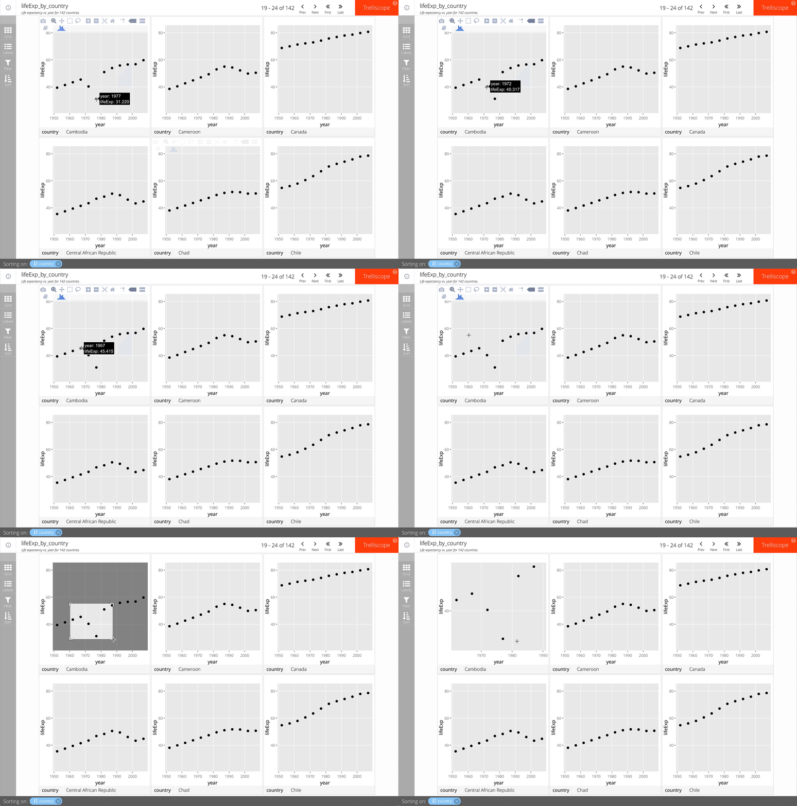
बस facet_trelliscope() में as_plotly = TRUE जोड़ें.
उदाहरण:
gap_life <- select(gapminder, year, lifeExp, country, continent)
ggplot(gap_life, aes(year, lifeExp)) +
geom_point() +
facet_trelliscope(~ country + continent,
name = "lifeExp_by_country",
desc = "Life expectancy vs. year for 142 countries.",
nrow = 2, ncol = 3,
as_plotly = TRUE)

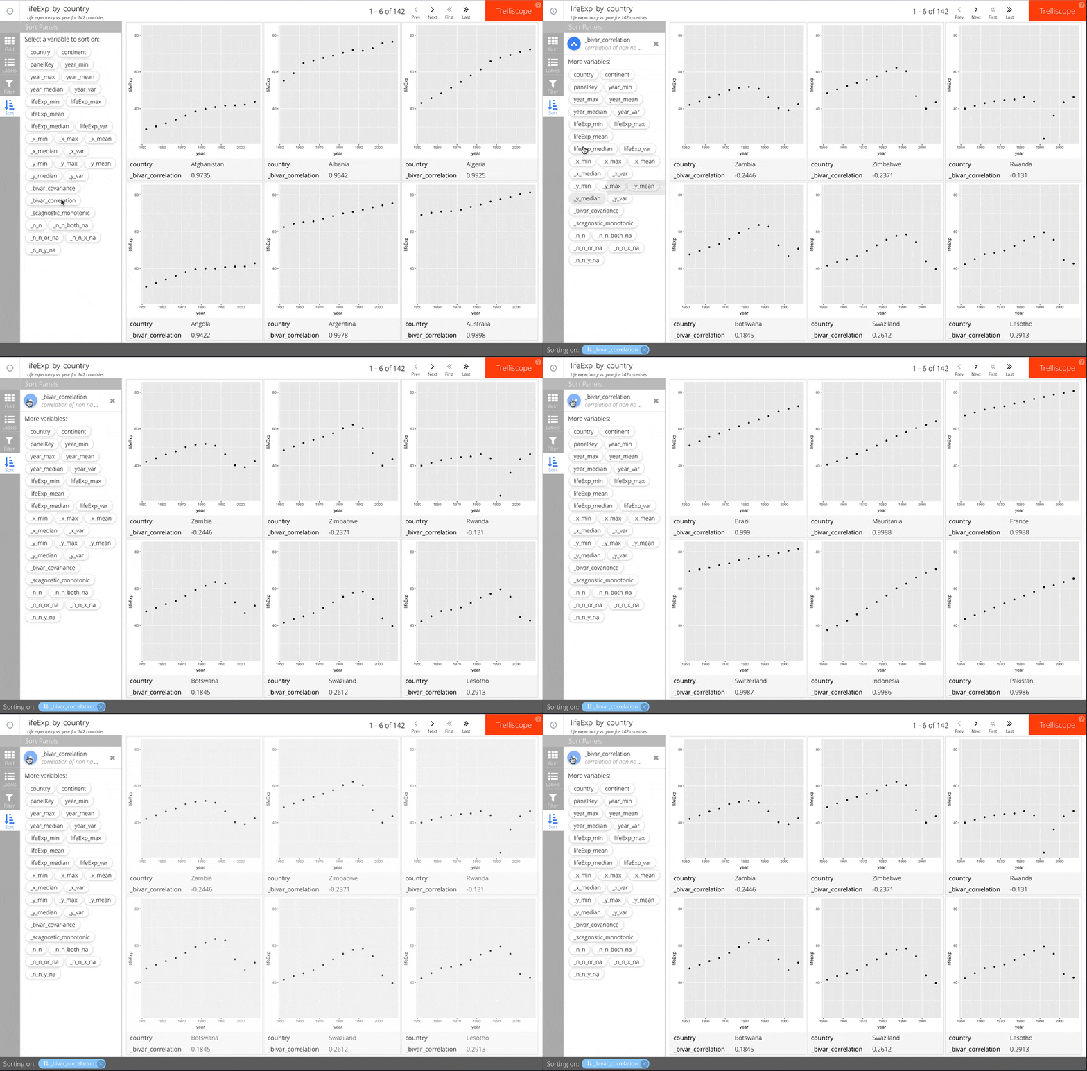
बस facet_trelliscope() में auto_cog = TRUE जोड़ें.
उदाहरण:
ggplot(gap_life, aes(year, lifeExp)) +
geom_point() +
facet_trelliscope(~ country + continent,
name = "lifeExp_by_country",
desc = "Life expectancy vs. year for 142 countries.",
nrow = 2, ncol = 3,
auto_cog = TRUE)
उपलब्ध automatic cognostics के बारे में अधिक जानकारी के लिए autocogs::autocog की help देखें.

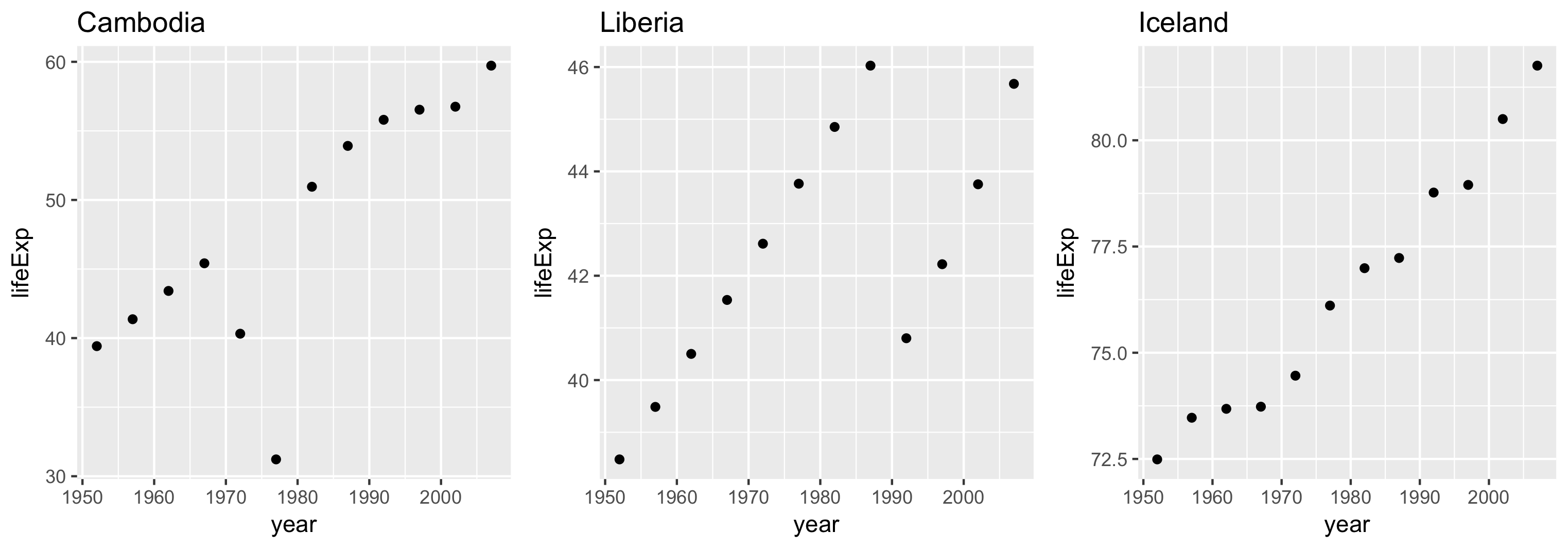
Axis लिमिट रेंज scales आर्ग्युमेंट से कंट्रोल कर सकते हैं.
तीन विकल्प:
"same" (डिफ़ॉल्ट)"sliced""free"हर पैनल की लिमिट समान होती है.
पैनलों के बीच "apples to apples" तुलना सक्षम करता है.
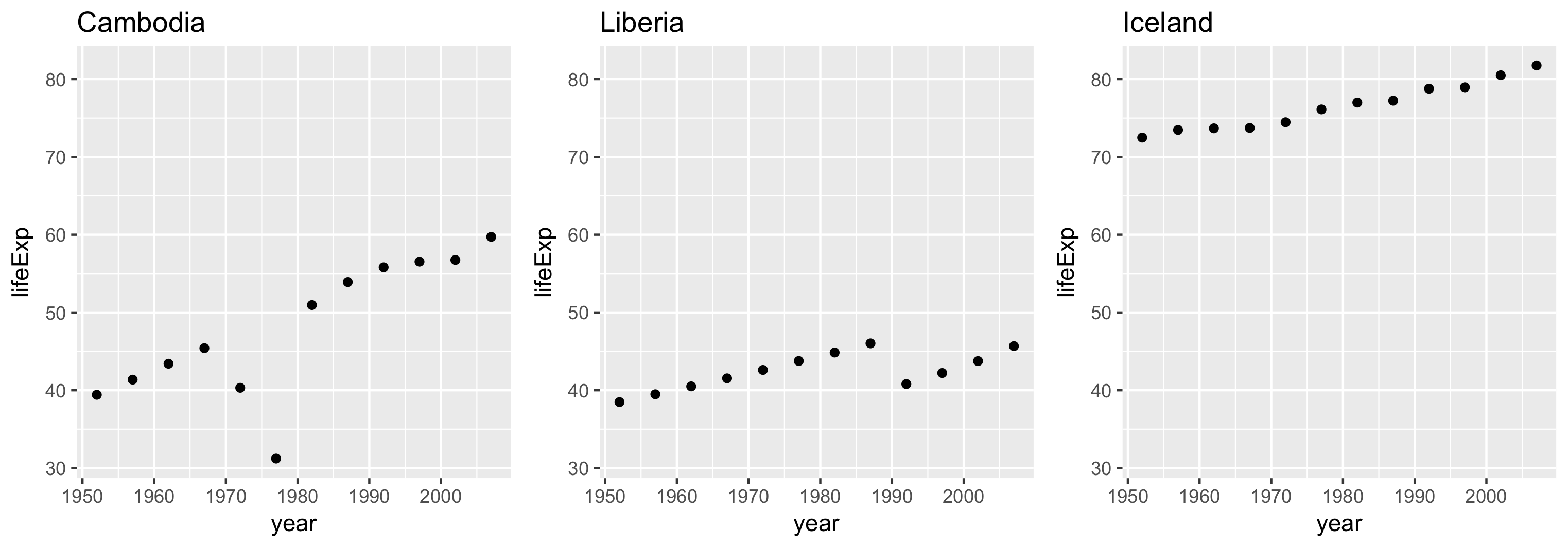
हर पैनल की लिमिट समान रेंज कवर करती है, पर शुरुआत एक जैसी ज़रूरी नहीं.
स्केल के फ़र्क़ों की तुलना के लिए उपयोगी.
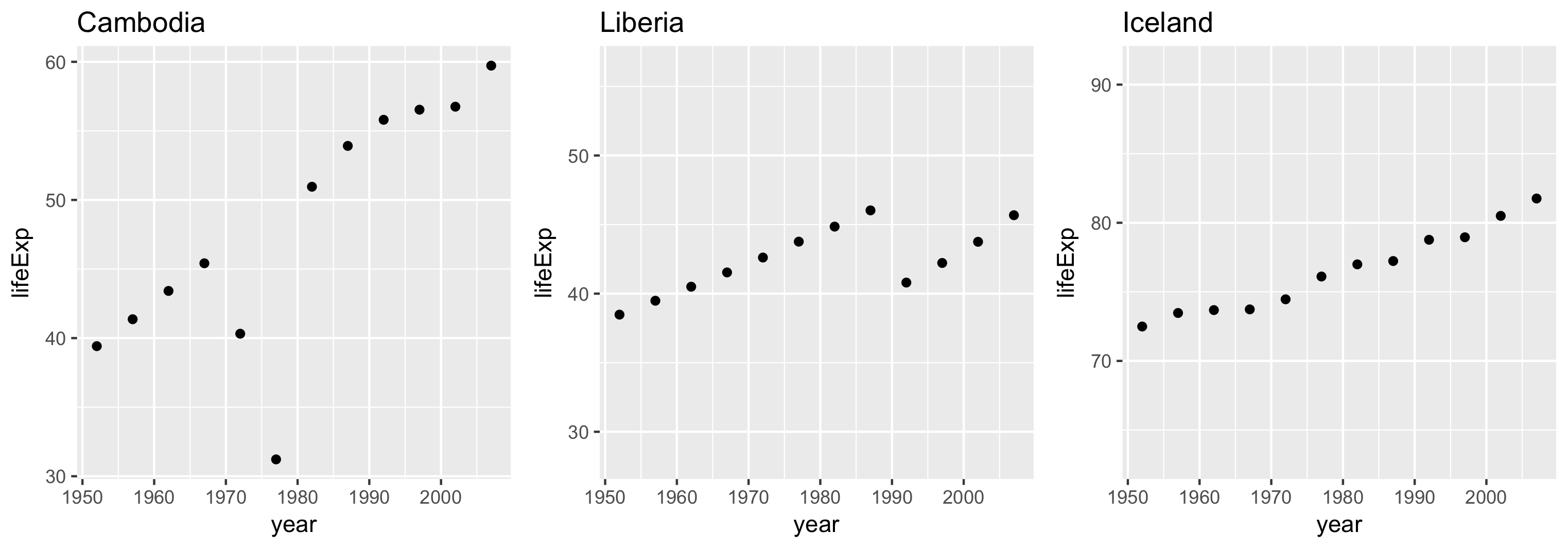
हर पैनल की लिमिट उसके अपने डेटा की बाउंड्स पर आधारित होती है.
R में Trelliscope के साथ बिग डेटा का विज़ुअलाइज़ेशन