DataFrames से कई प्लॉट

Julia के साथ डेटा विज़ुअलाइज़ेशन परिचय

Gustavo Vieira Suñe

Data Analyst

एक प्लॉट में कई वैरिएबल
# Violin plot
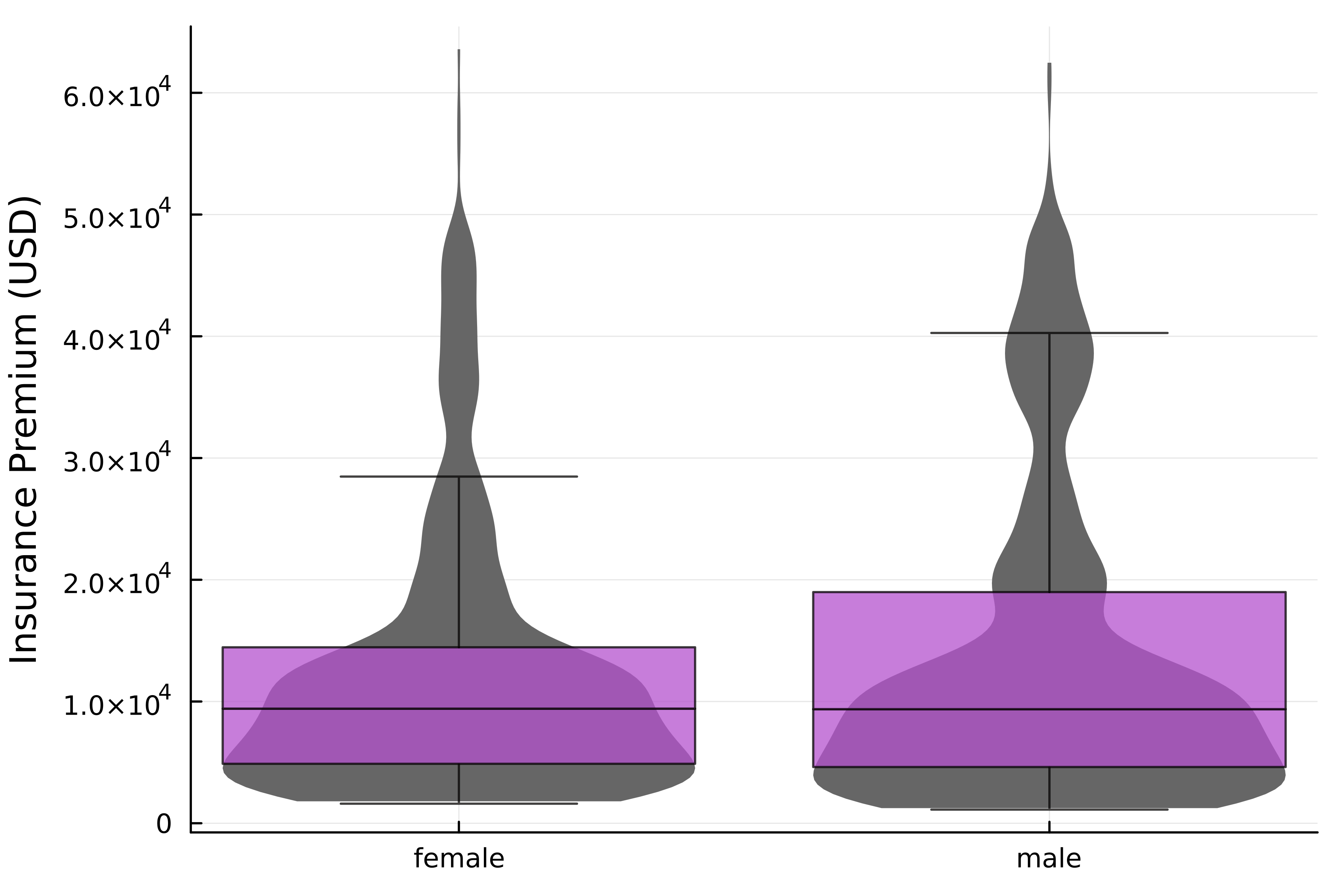
@df insurance violin(
    :Sex, :Charges,
    label=false, linewidth=0,
    fillcolor=:grey40
)

# Add box plot @df insurance boxplot!( :Sex, :Charges, label=false, alpha=0.75, fillcolor=:mediumorchid3, outliers=false, ) ylabel!("Insurance Premium (USD)")

सेक्स के अनुसार इंश्योरेंस चार्ज का वितरण दिखाते हुए, ओवरले किए गए बॉक्स प्लॉट और वायलिन प्लॉट।

Julia के साथ डेटा विज़ुअलाइज़ेशन परिचय

Categorical डेटा और लेआउट

  • insurance DataFrame
Age Sex BMI Children Smoker Region Charges
19 female 27.90 0 yes southwest 16884.90
18 male 33.77 1 no southeast 1725.55
28 male 33.00 3 no southeast 4449.46
... ... ... ... ... ... ...
  • श्रेणीबद्ध कॉलम → साथ-साथ प्लॉट दिखाएँ
    • @df रेसिपी layout आर्ग्युमेंट के साथ संगत है!
Julia के साथ डेटा विज़ुअलाइज़ेशन परिचय

DataFrames के साथ लेआउट

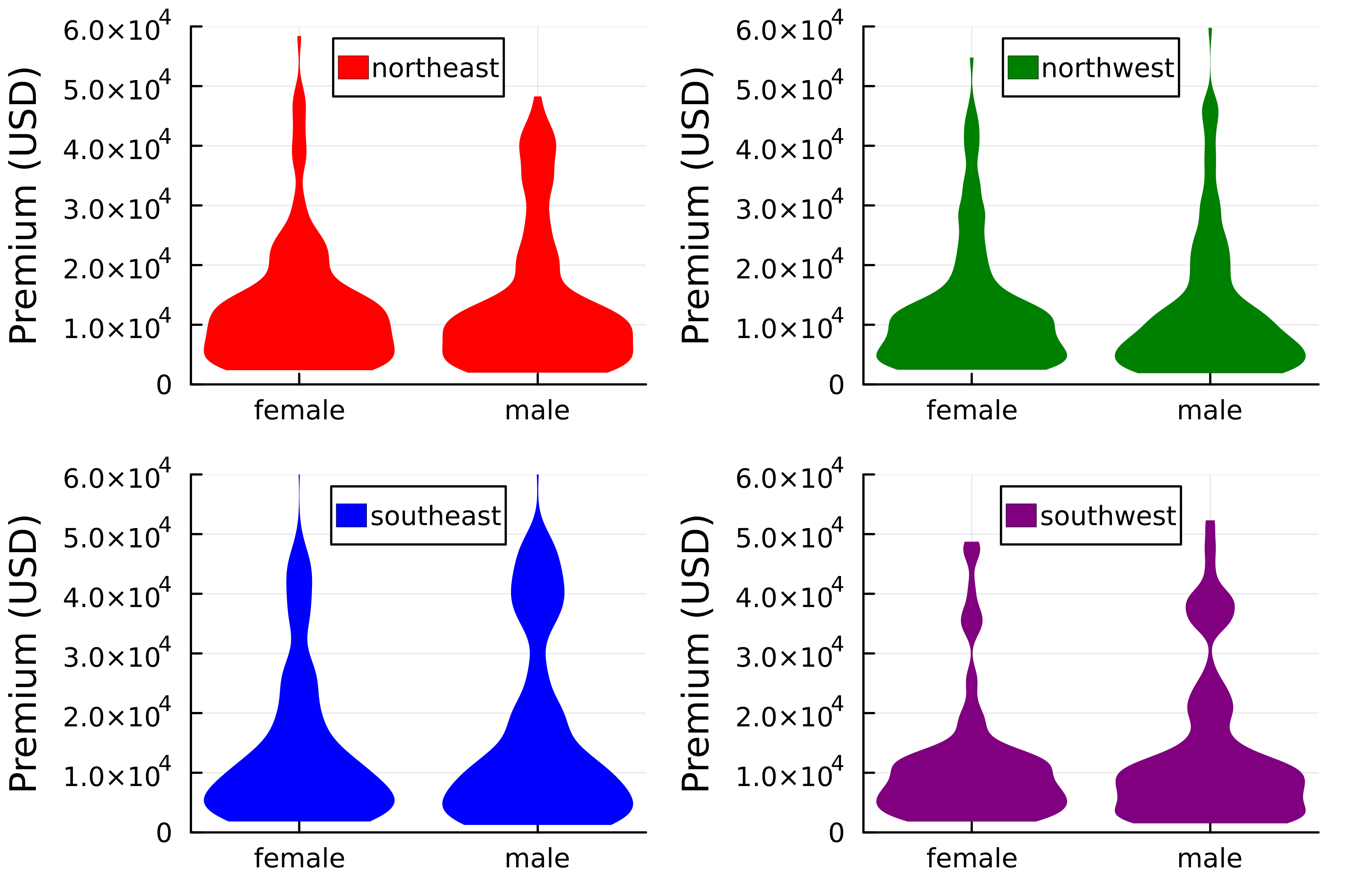
@df insurance violin(
    :Sex,
    :Charges,
    group=:Region,
    linewidth=0,
    color=[:red :green :blue :purple],
    legend_position=:top,

# Set layout layout=(2,2)
) ylims!(0, 6*10^4) ylabel!("Premium (USD)")

प्रत्येक रीजन के लिए सेक्स के अनुसार इंश्योरेंस चार्ज के वितरण दिखाते हुए, 2x2 ग्रिड में बॉक्स प्लॉट।

Julia के साथ डेटा विज़ुअलाइज़ेशन परिचय

चेन्स जोड़ना

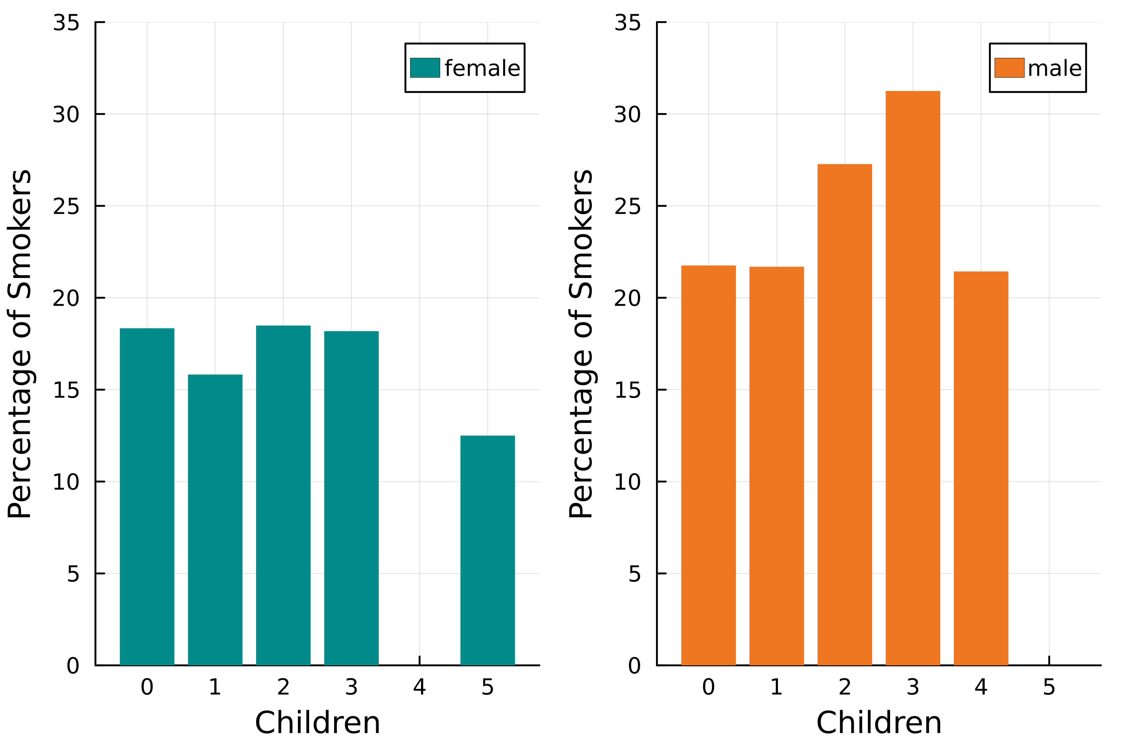
@chain insurance begin
    # Smoker column to numeric
    transform(:Smoker
        => ByRow(x -> x == "yes" ? 100 : 0)
        => :Smoker)

groupby([:Sex, :Children]) combine(:Smoker => mean)
@df bar(:Children, :Smoker_mean, group=:Sex, linewidth=0, fillcolor=[:cyan4 :chocolate2], # Set layout layout=2)
end ylims!(0, 35) xlabel!("Children") ylabel!("Percentage of Smokers")

वन-बाय-टू ग्रिड में बार चार्ट: बच्चों की संख्या के अनुसार स्मोकर्स का प्रतिशत।

Julia के साथ डेटा विज़ुअलाइज़ेशन परिचय

Correlation मैट्रिक्स प्लॉट

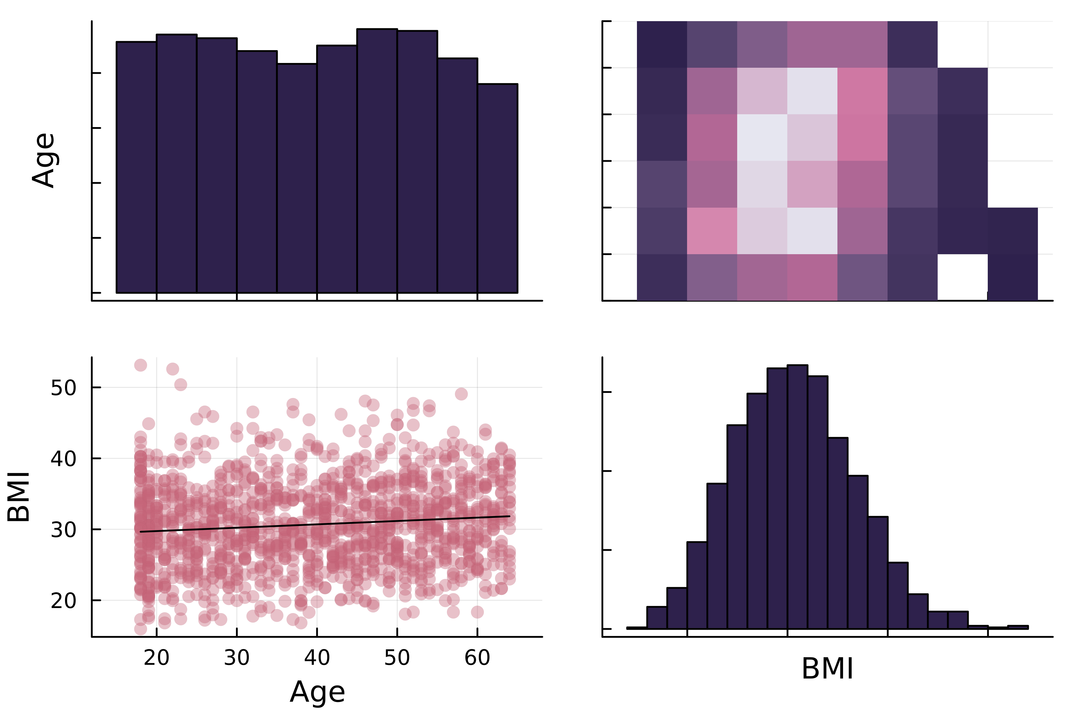
2x2 ग्रिड: डायगोनल पर age और BMI के हिस्टोग्राम। मुख्य डायगोनल के ऊपर age बनाम BMI का 2D हिस्टोग्राम, नीचे वही स्कैटर प्लॉट।

Julia के साथ डेटा विज़ुअलाइज़ेशन परिचय

Correlation मैट्रिक्स प्लॉट

2x2 ग्रिड: डायगोनल पर age और BMI के हिस्टोग्राम। मुख्य डायगोनल के ऊपर age बनाम BMI का 2D हिस्टोग्राम, नीचे वही स्कैटर प्लॉट।

  • डायगोनल्स

    • वैरिएबल वितरण के हिस्टोग्राम
  • डायगोनल के ऊपर

    • द्वि-आयामी हिस्टोग्राम
  • डायगोनल के नीचे

    • रिग्रेशन लाइनों के साथ स्कैटर प्लॉट
Julia के साथ डेटा विज़ुअलाइज़ेशन परिचय

StatsPlots.jl में Correlation मैट्रिक्स प्लॉट
# Using DataFrames recipe
@df insurance corrplot(

# Numerical columns [:Age :BMI],
# Customize markercolor=:thermal, fillcolor=:acton )

2x2 ग्रिड: डायगोनल पर age और BMI के हिस्टोग्राम। मुख्य डायगोनल के ऊपर age बनाम BMI का 2D हिस्टोग्राम, नीचे वही स्कैटर प्लॉट।

1 https://docs.juliaplots.org/latest/generated/colorschemes/
Julia के साथ डेटा विज़ुअलाइज़ेशन परिचय

StatsPlots.jl में Correlation मैट्रिक्स प्लॉट

# Using DataFrames recipe
@df insurance corrplot(
    # Numerical columns
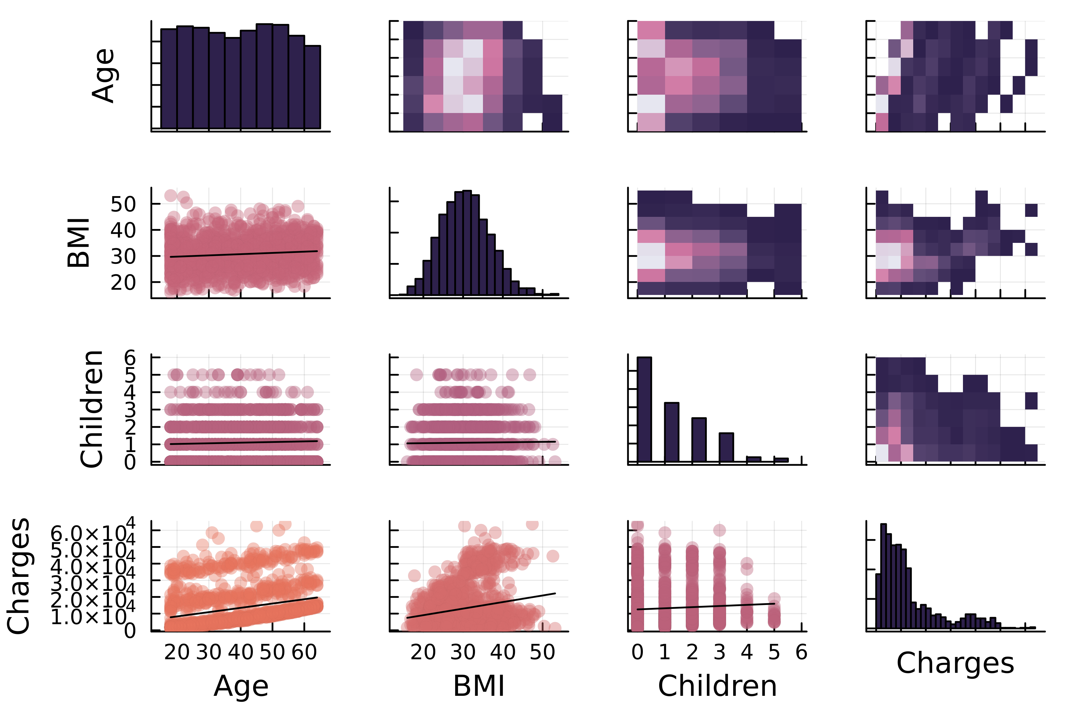
    [:Age :BMI :Children :Charges],

# Customize markercolor=:thermal, fillcolor=:acton )

age, BMI, बच्चों की संख्या और इंश्योरेंस चार्ज का correlation मैट्रिक्स प्लॉट।

Julia के साथ डेटा विज़ुअलाइज़ेशन परिचय

अभ्यास करते हैं!

Julia के साथ डेटा विज़ुअलाइज़ेशन परिचय

Preparing Video For Download...