DataFrames में डेटा प्लॉट करना

Julia के साथ डेटा विज़ुअलाइज़ेशन परिचय

Gustavo Vieira Suñe

Data Analyst

Insurance डेटासेट

  • insurance DataFrame
Age Sex BMI Children Smoker Region Charges
19 female 27.90 0 yes southwest 16884.90
18 male 33.77 1 no southeast 1725.55
28 male 33.00 3 no southeast 4449.46
... ... ... ... ... ... ...


  • सारणीबद्ध डेटा के लिए DataFrames लचीले और तेज हैं
    • StatsPlots में DataFrames के डेटा को प्लॉट करने की रेसिपी है
    • @df नोटेशन से मिलिए!
Julia के साथ डेटा विज़ुअलाइज़ेशन परिचय

DataFrame से arrays निकालना

  • Region और Smoker के अनुसार mean charges
# Group by region and smoker
grouped = groupby(insurance, [:Region, :Smoker])

# Calculate mean charges grouped_mean_charges = combine(grouped, :Charges => mean)
  • हर कॉलम डेटा की एक array देता है
    • उदाहरण के लिए, grouped_mean_charges.Region regions को strings में देने वाली array निकालता है.
Julia के साथ डेटा विज़ुअलाइज़ेशन परिचय

Arrays में डेटा प्लॉट करना

# Grouped bar chart
groupedbar(

# arrays बतौर आर्ग्युमेंट पास करें grouped_mean_charges.Region, grouped_mean_charges.Charges_mean, group=grouped_mean_charges.Smoker,
color=[:teal :orangered2], linewidth=0, legend_title="Smoker", legend_position=:outertopright) xlabel!("Region") ylabel!("Insurance Premium (USD)")

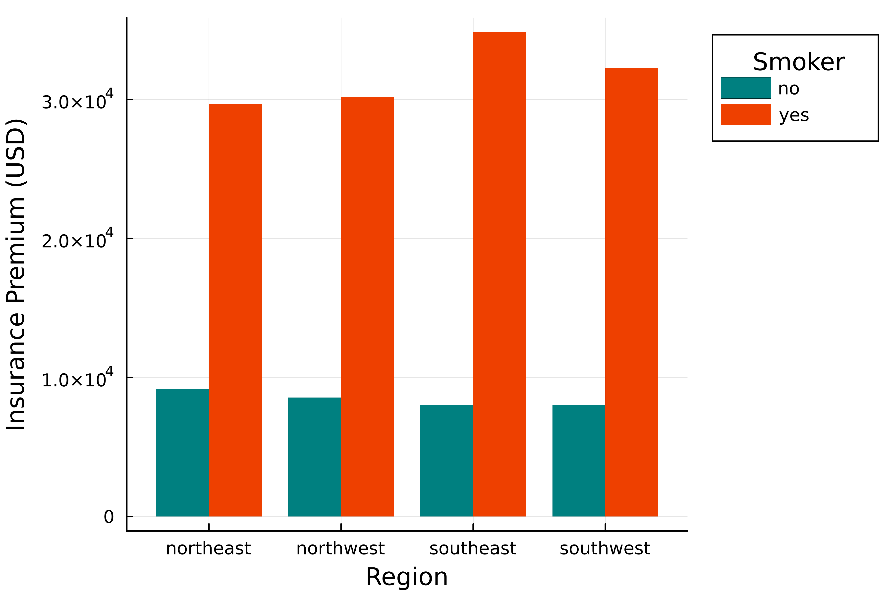
एक grouped bar chart जो प्रत्येक region के लिए smoker status के अनुसार insurance premium charges दिखाता है.

Julia के साथ डेटा विज़ुअलाइज़ेशन परिचय

सीधे DataFrames से प्लॉट करना

# Plot from DataFrame
@df grouped_mean_charges groupedbar(

# कॉलम नाम पास करें :Region, :Charges_mean,
group=:Smoker,
color=[:teal :orangered2], linewidth=0, legend_title="Smoker", legend_position=:outertopright) xlabel!("Region") ylabel!("Insurance Premium (USD)")

एक grouped bar chart जो प्रत्येक region के लिए smoker status के अनुसार insurance premium charges दिखाता है.

Julia के साथ डेटा विज़ुअलाइज़ेशन परिचय

साइड-बाय-साइड तुलना

# Grouped bar chart
groupedbar(

# arrays बतौर आर्ग्युमेंट पास करें grouped_mean_charges.Region, grouped_mean_charges.Charges_mean, group=grouped_mean_charges.Smoker,
color=[:teal :orangered2], linewidth=0, legend_title="Smoker", legend_position=:outertopright) xlabel!("Region") ylabel!("Insurance Premium (USD)")
# Plot from DataFrame
@df grouped_mean_charges groupedbar(

# कॉलम नाम पास करें :Region, :Charges_mean, group=:Smoker,
color=[:teal :orangered2], linewidth=0, legend_title="Smoker", legend_position=:outertopright) xlabel!("Region") ylabel!("Insurance Premium (USD)")
Julia के साथ डेटा विज़ुअलाइज़ेशन परिचय

DataFrame commands को chain करना

  • पहले जैसा

    # Group by region and smoker
    grouped = groupby(insurance, [:Region, :Smoker])
    # Calculate mean charges
    grouped_mean_charges = combine(grouped, :Charges => mean)
    
  • इसकी जगह chaining इस्तेमाल करें

    using Chain
    # Chain groupby and combine
    grouped_mean_charges = @chain insurance begin
      groupby([:Region, :Smoker])
      combine(:Charges => mean)
    end
    
Julia के साथ डेटा विज़ुअलाइज़ेशन परिचय

Plotting chain

# Plotting chain
@chain insurance begin
    # डेटा को manipulate करें
    groupby([:Region, :Smoker])
    combine(:Charges => mean)

# डेटा प्लॉट करें @df groupedbar(:Region, :Charges_mean, group=:Smoker, color=[:teal :orangered2], linewidth=0, legend_title="Smoker", legend_position=:outertopright)
end xlabel!("Region") ylabel!("Insurance Premium (USD)")

एक grouped bar chart जो प्रत्येक region के लिए smoker status के अनुसार insurance premium charges दिखाता है.

Julia के साथ डेटा विज़ुअलाइज़ेशन परिचय

अभ्यास करते हैं!

Julia के साथ डेटा विज़ुअलाइज़ेशन परिचय

Preparing Video For Download...