การแสดงผลข้อมูลด้วย Plotly ใน Python
Alex Scriven
Data Scientist
วิธีปรับแต่งกราฟ:
color)update_layout()fig.update_layout({"title":{"text":"A New Title"}})
การปรับแต่งสีช่วยให้:

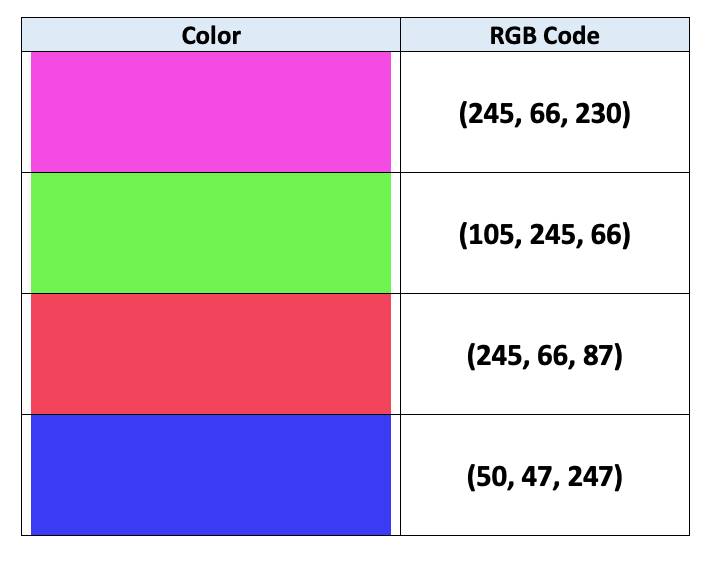
คอมพิวเตอร์ใช้การเข้ารหัส RGB เพื่อระบุสี:
$$
$$
ดูเพิ่มเติมในบทความนี้

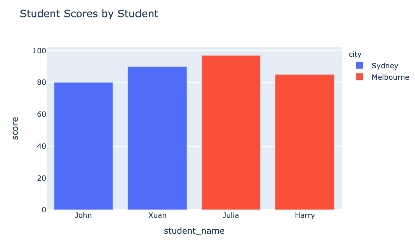
color (คอลัมน์ใน DataFrame)
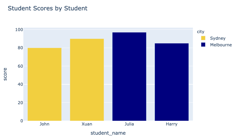
fig = px.bar(data_frame=student_scores,
x="student_name",
y="score",
title="Student Scores by Student"
color="city")
fig.show()
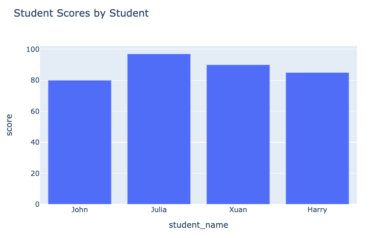
กราฟก่อนหน้า:

กราฟหลังจากปรับแต่ง:

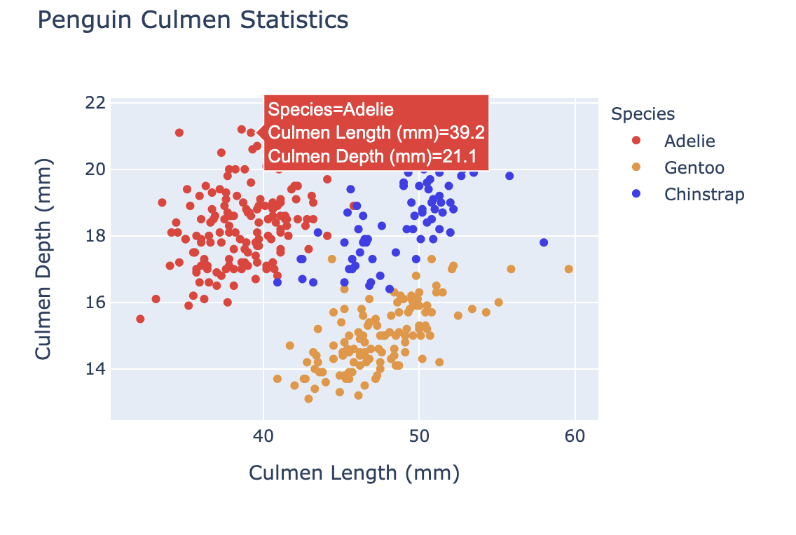
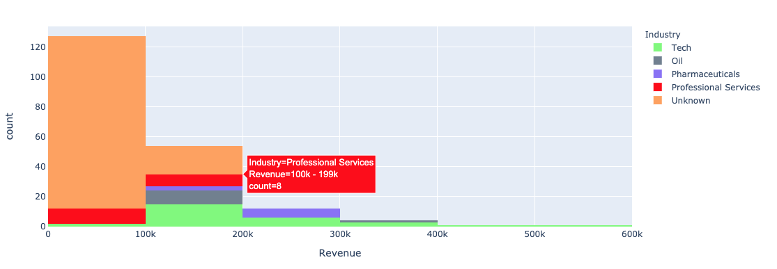
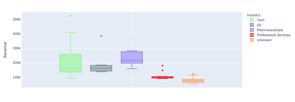
การใช้ argument color ของ plotly.express กับกราฟ univariate (bar, histogram):


color_discrete_map: dictionary ที่แมปค่าหมวดหมู่กับสีที่ต้องการ"red", "green" เป็นต้น$$
fig = px.bar( data_frame=student_scores, x="student_name", y="score", title="Student Scores by Student",color_discrete_map={ "Melbourne": "rgb(0,0,128)", "Sydney": "rgb(235, 207, 52)"},color="city")


$$
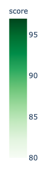
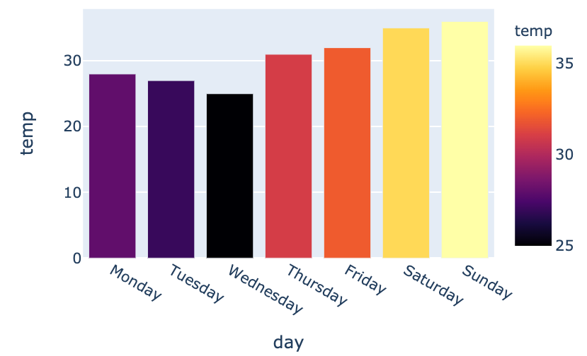
color_continuous_scale สำหรับสเกลสี
fig = px.bar(data_frame=weekly_temps,
x="day", y="temp",
color="temp",
color_continuous_scale="inferno")
fig.show()
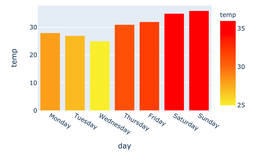
$$

my_scale=[("rgb(242, 238, 10)"), ("rgb(242, 95, 10)"), ("rgb(255,0,0)")]fig = px.bar(data_frame=weekly_temps, x="day", y="temp",color_continuous_scale=my_scale, color="temp")

การแสดงผลข้อมูลด้วย Plotly ใน Python