Вступ до візуалізації даних з Plotly у Python
Alex Scriven
Data Scientist
Як налаштовувати графіки:
color)update_layout()fig.update_layout({"title":{"text":"A New Title"}})
Налаштування кольору допомагає:

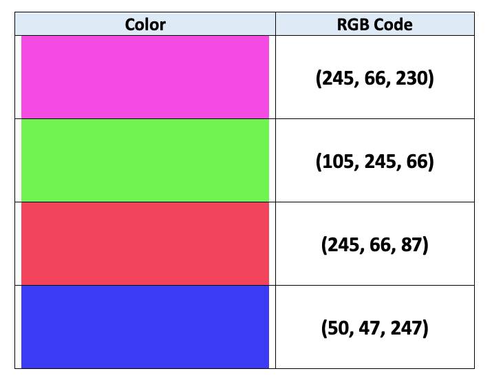
Комп'ютери задають кольори через кодування RGB:
$$
$$
Деталі в цій статті

color (стовпець DataFrame)
fig = px.bar(data_frame=student_scores,
x="student_name",
y="score",
title="Student Scores by Student"
color="city")
fig.show()
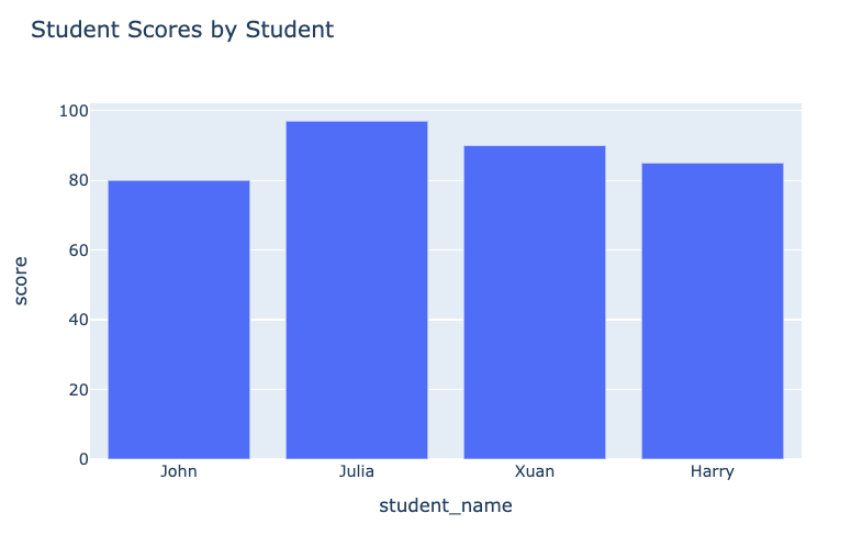
Графік до:

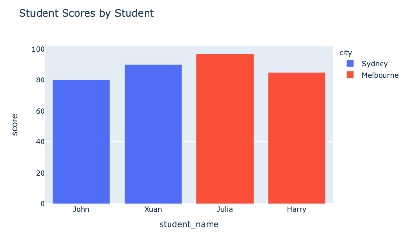
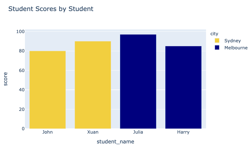
Наш графік після:

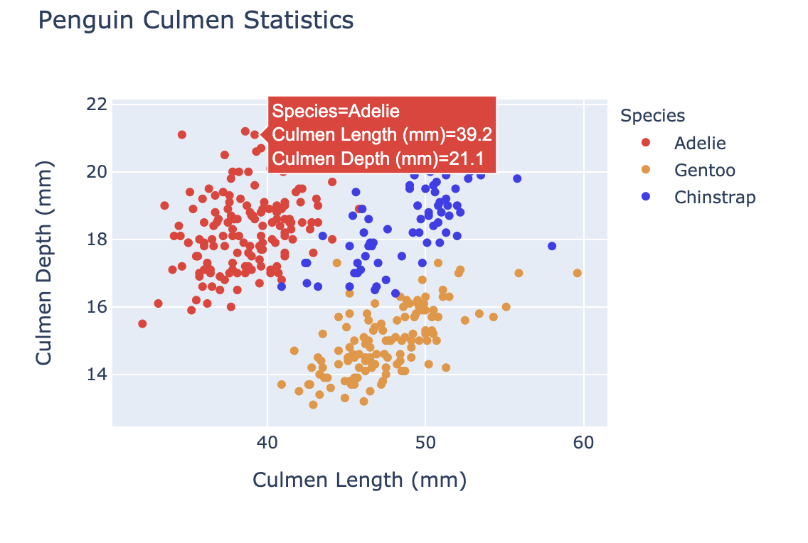
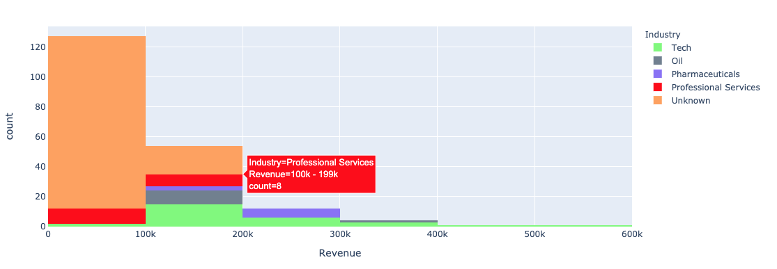
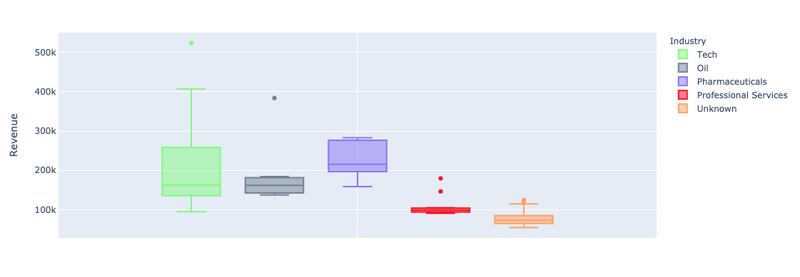
Використання аргументу plotly.express color в унівариативних (bar, histogram) графіках:


color_discrete_map: словник, що відображає категорії у кольори"red", "green" тощо$$
fig = px.bar( data_frame=student_scores, x="student_name", y="score", title="Student Scores by Student",color_discrete_map={ "Melbourne": "rgb(0,0,128)", "Sydney": "rgb(235, 207, 52)"},color="city")


$$
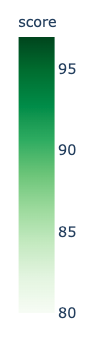
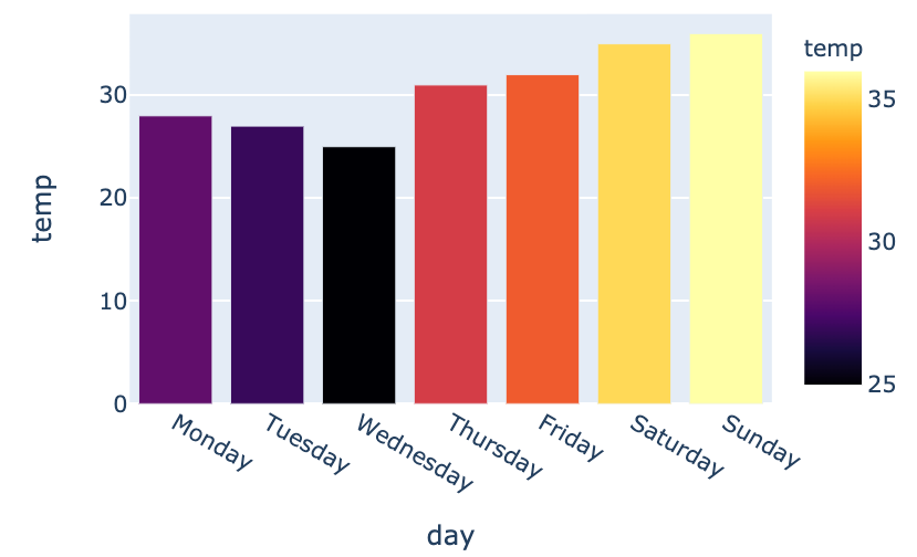
color_continuous_scale для шкал кольору.
fig = px.bar(data_frame=weekly_temps,
x="day", y="temp",
color="temp",
color_continuous_scale="inferno")
fig.show()
$$

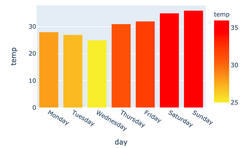
my_scale=[("rgb(242, 238, 10)"), ("rgb(242, 95, 10)"), ("rgb(255,0,0)")]fig = px.bar(data_frame=weekly_temps, x="day", y="temp",color_continuous_scale=my_scale, color="temp")

Вступ до візуалізації даних з Plotly у Python