สีเด่นในภาพ

การวิเคราะห์กลุ่มข้อมูลใน Python

Shaumik Daityari

Business Analyst

สีเด่นในภาพ

  • ภาพทุกภาพประกอบด้วยพิกเซล
  • แต่ละพิกเซลมีค่าสามค่า: Red, Green และ Blue
  • สีของพิกเซล: ผสมผสานจากค่า RGB เหล่านี้
  • ใช้ k-means กับค่า RGB ที่ปรับมาตรฐานแล้วเพื่อหาจุดศูนย์กลางคลัสเตอร์
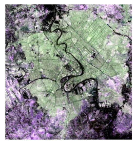
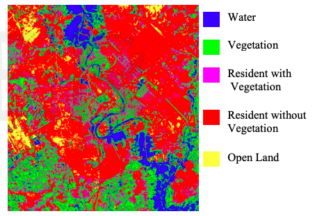
  • การใช้งาน: ระบุลักษณะเด่นในภาพถ่ายดาวเทียม
การวิเคราะห์กลุ่มข้อมูลใน Python

การระบุลักษณะเด่นในภาพถ่ายดาวเทียม

การวิเคราะห์กลุ่มข้อมูลใน Python

เครื่องมือสำหรับหาสีเด่น

  • แปลงภาพเป็นพิกเซล: matplotlib.image.imread
  • แสดงสีของจุดศูนย์กลางคลัสเตอร์: matplotlib.pyplot.imshow
การวิเคราะห์กลุ่มข้อมูลใน Python

การวิเคราะห์กลุ่มข้อมูลใน Python

แปลงภาพเป็นเมทริกซ์ RGB

import matplotlib.image as img
image = img.imread('sea.jpg')
image.shape
(475, 764, 3)
r = []
g = []
b = []

for row in image:
    for pixel in row:
        # A pixel contains RGB values
        temp_r, temp_g, temp_b = pixel
        r.append(temp_r)
        g.append(temp_g)
        b.append(temp_b)
การวิเคราะห์กลุ่มข้อมูลใน Python

DataFrame ที่เก็บค่า RGB

pixels = pd.DataFrame({'red': r,
                       'blue': b,
                       'green': g})
pixels.head()
red blue green
252 255 252
75 103 81
... ... ...
การวิเคราะห์กลุ่มข้อมูลใน Python

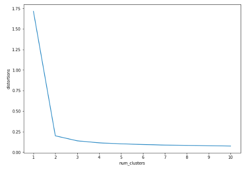
สร้าง Elbow Plot

distortions = []
num_clusters = range(1, 11)

# Create a list of distortions from the kmeans method
for i in num_clusters:
    cluster_centers, _ = kmeans(pixels[['scaled_red', 'scaled_blue', 
                                        'scaled_green']], i)
    distortions.append(distortion)

# Create a DataFrame with two lists - number of clusters and distortions
elbow_plot = pd.DataFrame({'num_clusters': num_clusters, 
                           'distortions': distortions})

# Creat a line plot of num_clusters and distortions
sns.lineplot(x='num_clusters', y='distortions', data = elbow_plot)
plt.xticks(num_clusters)
plt.show()
การวิเคราะห์กลุ่มข้อมูลใน Python

Elbow Plot

การวิเคราะห์กลุ่มข้อมูลใน Python

ค้นหาสีเด่น

cluster_centers, _ = kmeans(pixels[['scaled_red', 'scaled_blue', 
                                    'scaled_green']], 2)
colors = []

# Find Standard Deviations
r_std, g_std, b_std = pixels[['red', 'blue', 'green']].std()

# Scale actual RGB values in range of 0-1
for cluster_center in cluster_centers:
    scaled_r, scaled_g, scaled_b = cluster_center
    colors.append((
        scaled_r * r_std/255,
        scaled_g * g_std/255,
        scaled_b * b_std/255
    ))
การวิเคราะห์กลุ่มข้อมูลใน Python

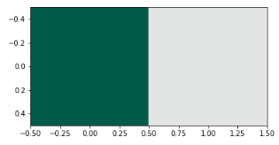
แสดงสีเด่น

#Dimensions: 2 x 3 (N X 3 matrix)
print(colors)
[(0.08192923122023911, 0.34205845943857993, 0.2824002984155429),
 (0.893281510956742, 0.899818770315129, 0.8979114272960784)]
#Dimensions: 1 x 2 x 3 (1 X N x 3 matrix)
plt.imshow([colors]) 
plt.show()
การวิเคราะห์กลุ่มข้อมูลใน Python

มาฝึกกันเถอะ!

การวิเคราะห์กลุ่มข้อมูลใน Python

Preparing Video For Download...