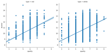
กราฟ Regression ใน Seaborn
การสร้างภาพข้อมูลระดับกลางด้วย Seaborn

Chris Moffitt
Instructor
แนะนำ regplot
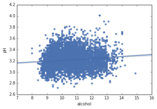
- ฟังก์ชัน
regplotสร้าง scatter plot พร้อมเส้น regression - ใช้งานคล้ายกับ
displot - ต้องกำหนด
data,xและy
sns.regplot(data=df, x="alcohol", y="pH" )
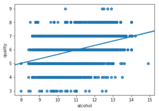
lmplot() สร้างต่อยอดจาก regplot()
regplot- ระดับล่าง
sns.regplot(data=df,
            x="alcohol",
            y="quality")
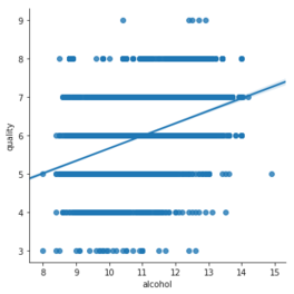
lmplot- ระดับสูง
sns.lmplot(data=df,
           x="alcohol",
           y="quality")
การแบ่ง facet ด้วย lmplot
- จัดกลุ่มข้อมูลด้วยสี (
hue)
sns.lmplot(data=df,
           x="quality",
           y="alcohol",
           hue="type")
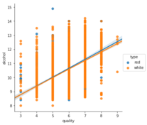
- จัดกลุ่มข้อมูลด้วยคอลัมน์ (
col)
sns.lmplot(data=df,
           x="quality",
           y="alcohol",
           col="type")