Matrix Plots
การสร้างภาพข้อมูลระดับกลางด้วย Seaborn

Chris Moffitt
Instructor
จัดรูปแบบข้อมูลให้พร้อมใช้งาน
- ฟังก์ชัน
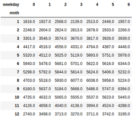
heatmap()ของ Seaborn ต้องการข้อมูลในรูปแบบกริด crosstab()ของ pandas ใช้จัดรูปแบบข้อมูลบ่อยครั้ง
pd.crosstab(df["mnth"], df["weekday"],
values=df["total_rentals"],aggfunc="mean").round(0)
สร้าง heatmap
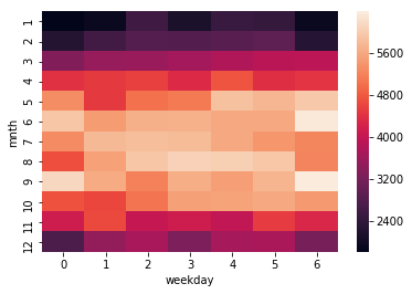
sns.heatmap(pd.crosstab(df["mnth"], df["weekday"],
            values=df["total_rentals"], aggfunc="mean")
)
ปรับแต่ง heatmap
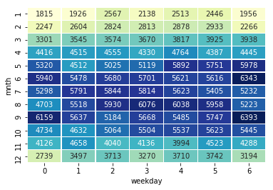
sns.heatmap(df_crosstab, annot=True, fmt="d",
            cmap="YlGnBu", cbar=False, linewidths=.5)
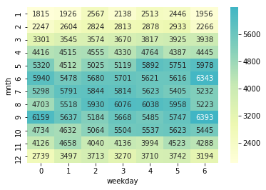
การกำหนดจุดกึ่งกลางของ heatmap
- Seaborn รองรับการกำหนดจุดกึ่งกลางของสีใน heatmap
sns.heatmap(df_crosstab, annot=True, fmt="d",
            cmap="YlGnBu", cbar=True,
            center=df_crosstab.loc[9, 6])
การพล็อต correlation matrix
- ฟังก์ชัน
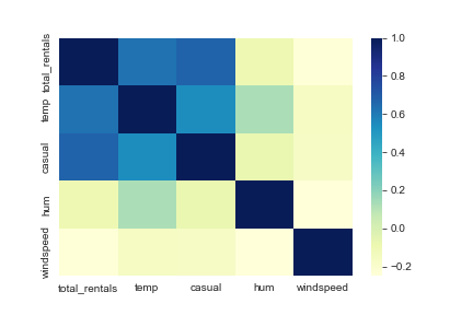
corrของ pandas คำนวณค่าสหสัมพันธ์ระหว่างคอลัมน์ใน DataFrame - นำผลลัพธ์มาแสดงเป็น heatmap ด้วย Seaborn ได้
cols = ['total_rentals', 'temp', 'casual', 'hum', 'windspeed']
sns.heatmap(df[cols].corr(), cmap='YlGnBu')