การปรับแต่งด้วย matplotlib

การสร้างภาพข้อมูลระดับกลางด้วย Seaborn

Chris Moffitt

Instructor

Matplotlib Axes

  • การปรับแต่งส่วนใหญ่ทำผ่านออบเจกต์ Axes ของ matplotlib
  • ส่งผ่าน Axes ให้ฟังก์ชัน seaborn ได้
fig, ax = plt.subplots()
sns.histplot(df['Tuition'], ax=ax)
ax.set(xlabel='Tuition 2013-14')
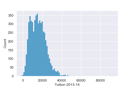
ตัวอย่างกราฟ axes

การสร้างภาพข้อมูลระดับกลางด้วย Seaborn

การปรับแต่งเพิ่มเติม

  • ออบเจกต์ axes รองรับการปรับแต่งทั่วไปหลายอย่าง
fig, ax = plt.subplots()
sns.histplot(df['Tuition'], ax=ax)
ax.set(xlabel="Tuition 2013-14",
       ylabel="Distribution", xlim=(0, 50000), 
title="2013-14 Tuition and Fees Distribution")
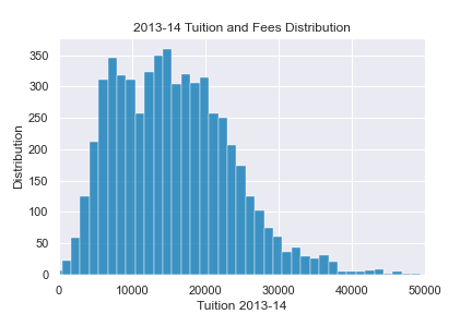
ตัวอย่าง axes เพิ่มเติม

การสร้างภาพข้อมูลระดับกลางด้วย Seaborn

การรวมกราฟ

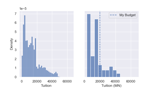
  • สามารถรวมและกำหนดค่ากราฟหลายกราฟพร้อมกันได้
fig, (ax0, ax1) = plt.subplots(nrows=1, ncols=2, 
                               sharey=True, figsize=(7,4))

sns.histplot(df['Tuition'], stat='density', ax=ax0)
sns.histplot(df.query('State == "MN"')['Tuition'], stat='density', ax=ax1)

ax1.set(xlabel='Tuition (MN)', xlim=(0, 70000))
ax1.axvline(x=20000, label='My Budget', linestyle='--')
ax1.legend()
การสร้างภาพข้อมูลระดับกลางด้วย Seaborn

การรวมกราฟ

กราฟแบบเคียงข้างกัน

การสร้างภาพข้อมูลระดับกลางด้วย Seaborn

มาฝึกกันเถอะ!

การสร้างภาพข้อมูลระดับกลางด้วย Seaborn

Preparing Video For Download...