การแสดงแนวโน้มด้วยกราฟ

การวิเคราะห์ข้อมูลแบบสอบถามใน R

Kelly McConville

Assistant Professor of Statistics

Scatter plot

Scatterplot ของอายุเทียบกับเส้นรอบศีรษะ โดยความโปร่งใสแทนค่าน้ำหนัก

การวิเคราะห์ข้อมูลแบบสอบถามใน R

เส้นที่เหมาะสมที่สุดแบบถ่วงน้ำหนักตามการสำรวจ

ggplot(data = babies, mapping = aes(x = AgeMonths, y = HeadCirc,
                                    alpha = WTMEC4YR)) + 
  geom_jitter(width = 0.3, height = 0) + guides(alpha = "none") +
  geom_smooth(method = "lm", se = FALSE, mapping = aes(weight = WTMEC4YR))

Scatterplot พร้อมเส้นแนวโน้มของอายุเทียบกับเส้นรอบศีรษะ โดยความโปร่งใสแทนค่าน้ำหนัก

การวิเคราะห์ข้อมูลแบบสอบถามใน R
babies <- filter(NHANESraw, AgeMonths <= 6) %>%
  select(AgeMonths, HeadCirc, WTMEC4YR, Gender)
babies
# A tibble: 484 x 4
   AgeMonths HeadCirc WTMEC4YR Gender
       <int>    <dbl>    <dbl> <fct> 
 1         3     42.7   12915. male  
 2         4     42.8   12791. female
 3         2     38.8    2359. female
 4         0     36.0    4306. female
 5         5     42.7    2922. female
 6         2     41.9    5561. male  
 7         6     44.3   10416. female
 8         3     42.0    9957. female
 9         2     41.3    4503. male  
10         1     38.9    3718. female
# ... with 474 more rows
การวิเคราะห์ข้อมูลแบบสอบถามใน R

เส้นแนวโน้ม

ggplot(data = babies, mapping = aes(x = AgeMonths, y = HeadCirc,
                                    alpha = WTMEC4YR, color = Gender)) + 
  geom_jitter(width = 0.3, height = 0) + guides(alpha = "none") +
  geom_smooth(method = "lm", se = FALSE, mapping = aes(weight = WTMEC4YR))
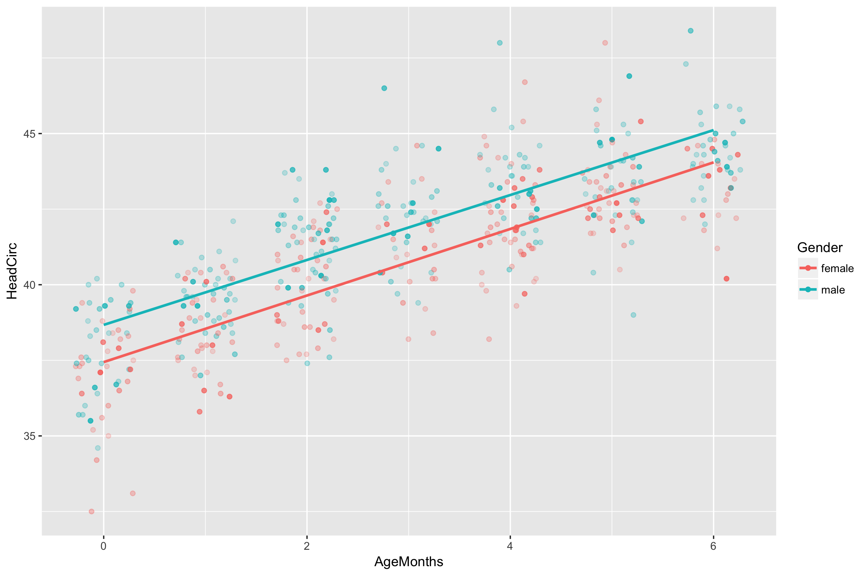
Scatterplot และเส้นแนวโน้มของอายุเทียบกับเส้นรอบศีรษะ โดยสีแทนเพศและความโปร่งใสแทนค่าน้ำหนัก

การวิเคราะห์ข้อมูลแบบสอบถามใน R

มาฝึกกันเถอะ!

การวิเคราะห์ข้อมูลแบบสอบถามใน R

Preparing Video For Download...