Перевпорядкування факторів

Категоріальні дані в Tidyverse

Emily Robinson

Data Scientist
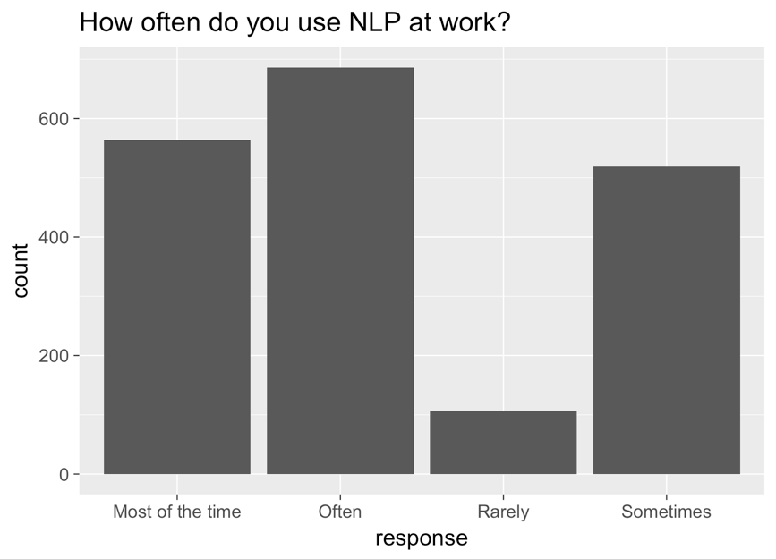
Стовпчикова діаграма з відповіддю на осі x, кількістю на осі y та заголовком «how often do you use NLP at work?». Стовпчики зліва направо: most of the time, often, rarely, sometimes.

Категоріальні дані в Tidyverse

Виправлений графік

ggplot(aes(nlp_frequency, 
            x = fct_relevel(response, 
            "Rarely", "Sometimes", "Often", "Most of the time"))) + 
        geom_bar()
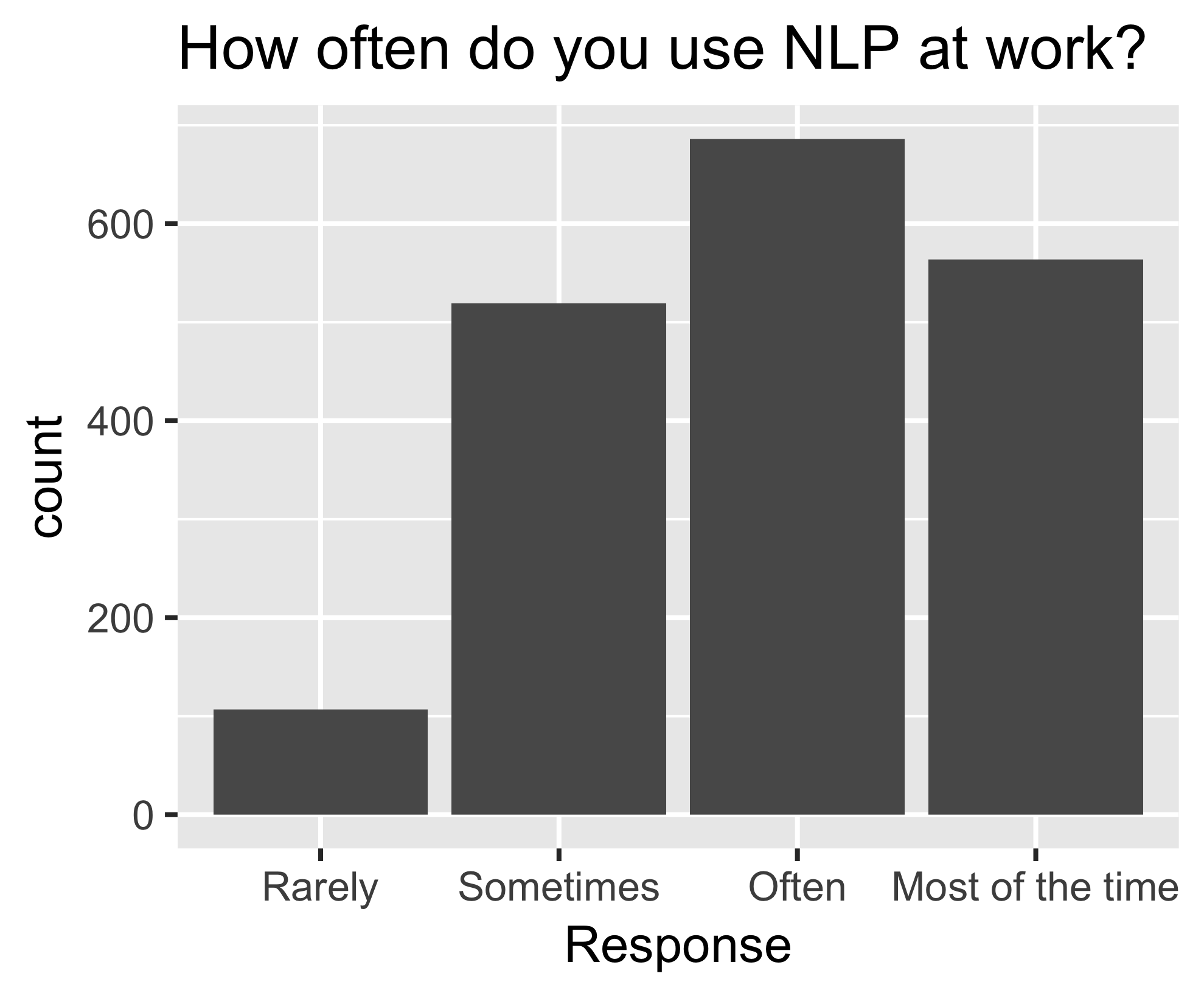
Та сама діаграма, тепер упорядкована зліва направо: rarely, sometimes, often, most of the time.

Категоріальні дані в Tidyverse

fct_reorder()

nlp_frequency %>%
    pull(response) %>%
    levels()
[1] "Most of the time" "Often" "Rarely" "Sometimes"       
nlp_frequency %>%
    mutate(response = fct_relevel(response, 
            "Often", "Most of the time")) %>%
    pull(response) %>%
    levels()
[1] "Often" "Most of the time" "Rarely" "Sometimes"
Категоріальні дані в Tidyverse

Додаткові аргументи

nlp_frequency %>%
    mutate(response = fct_relevel(response, 
            "Often", "Most of the time", after = 2)) %>%
            pull(response) %>%
            levels()
nlp_frequency %>%
    mutate(response = fct_relevel(response, 
            "Often", "Most of the time", after = Inf) %>%
    pull(response) %>%
    levels()
[1] "Rarely" "Sometimes" "Often" "Most of the time"
Категоріальні дані в Tidyverse

Давайте потренуємось!

Категоріальні дані в Tidyverse

Preparing Video For Download...