การแสดงภาพการแทนค่าในข้อมูลอนุกรมเวลา

การจัดการข้อมูลที่หายไปใน Python

Suraj Donthi

Deep Learning & Computer Vision Learning

กราฟอนุกรมเวลาของคุณภาพอากาศ

airquality['Ozone'].plot(title='Ozone', marker='o', figsize=(30, 5))
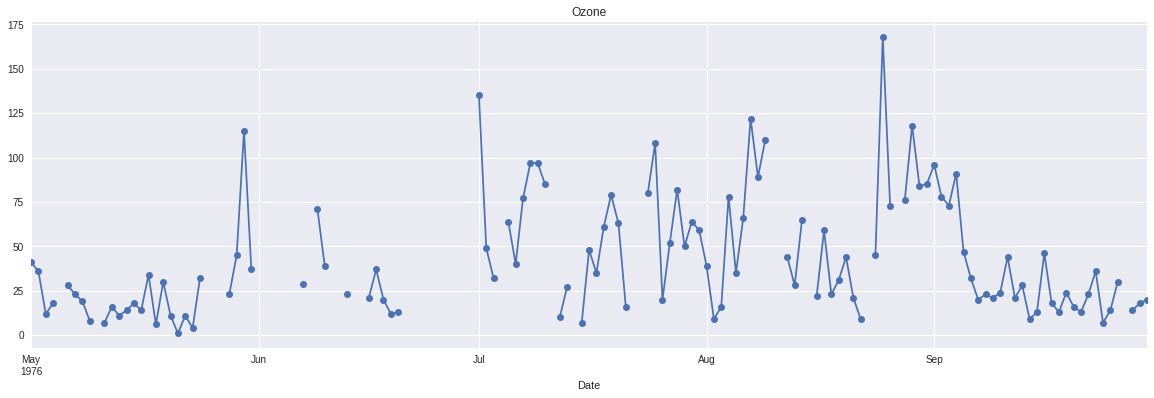
กราฟอนุกรมเวลาของชุดข้อมูลคุณภาพอากาศ

การจัดการข้อมูลที่หายไปใน Python

การแทนค่าแบบ Ffill

ffill_imp['Ozone'].plot(color='red', marker='o', linestyle='dotted', figsize=(30, 5))

airquality['Ozone'].plot(title='Ozone', marker='o')
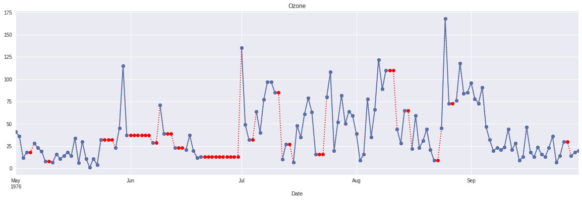
กราฟอนุกรมเวลาของชุดข้อมูลคุณภาพอากาศแบบ forward fill

การจัดการข้อมูลที่หายไปใน Python

การแทนค่าแบบ Bfill

bfill_imp['Ozone'].plot(color='red', marker='o', linestyle='dotted', figsize=(30, 5))
airquality['Ozone'].plot(title='Ozone', marker='o')
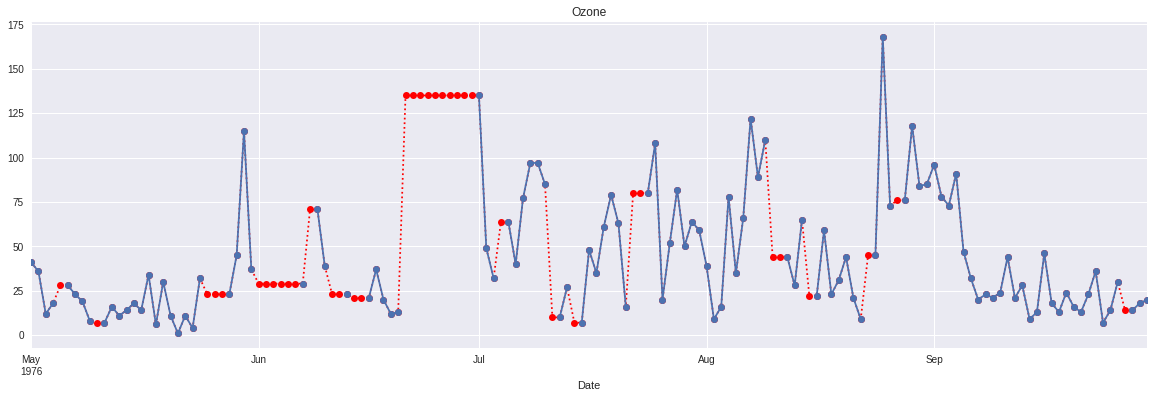
กราฟอนุกรมเวลาของชุดข้อมูลคุณภาพอากาศแบบ backward fill

การจัดการข้อมูลที่หายไปใน Python

Linear Interpolation

linear_interp['Ozone'].plot(color='red', marker='o', linestyle='dotted', figsize=(30, 5))
airquality['Ozone'].plot(title='Ozone', marker='o')
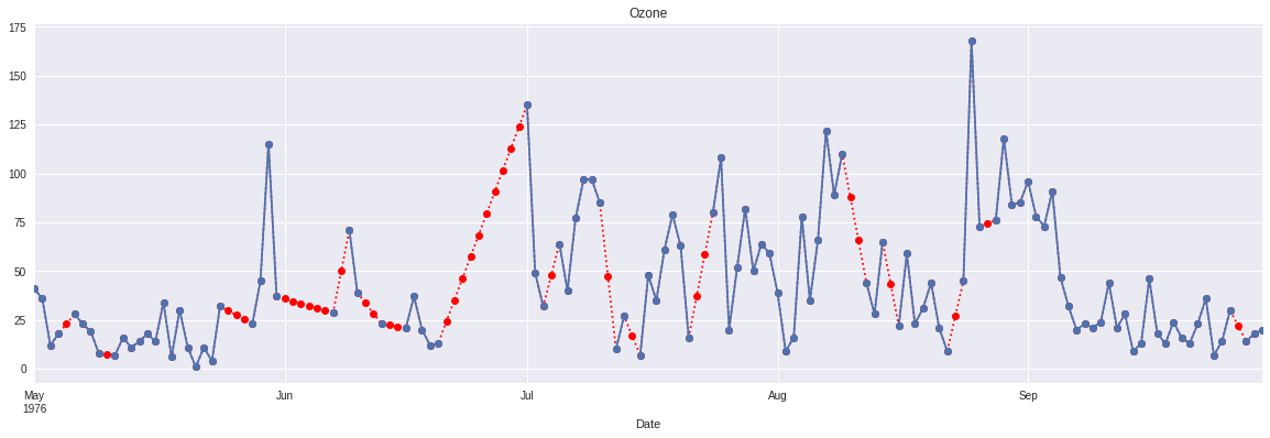
กราฟอนุกรมเวลาของชุดข้อมูลคุณภาพอากาศแบบ linear interpolation

การจัดการข้อมูลที่หายไปใน Python

Quadratic Interpolation

quadratic_interp['Ozone'].plot(color='red', marker='o', linestyle='dotted', figsize=(30, 5))
airquality['Ozone'].plot(title='Ozone', marker='o')
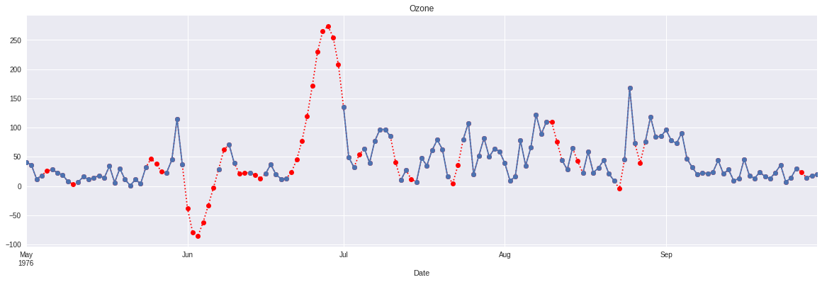
กราฟอนุกรมเวลาของชุดข้อมูลคุณภาพอากาศแบบ quadratic interpolation

การจัดการข้อมูลที่หายไปใน Python

Nearest Interpolation

nearest_interp['Ozone'].plot(color='red', marker='o', linestyle='dotted', figsize=(30, 5))
airquality['Ozone'].plot(title='Ozone', marker='o')
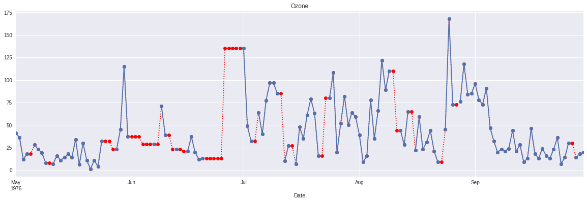
กราฟอนุกรมเวลาของชุดข้อมูลคุณภาพอากาศแบบ nearest interpolation

การจัดการข้อมูลที่หายไปใน Python

การเปรียบเทียบวิธี interpolation

# Create subplots
fig, axes = plt.subplots(3, 1, figsize=(30, 20))

# Create interpolations dictionary
interpolations = {'Linear Interpolation': linear_interp, 
                         'Quadratic Interpolation': quadratic_interp, 
                         'Nearest Interpolation': nearest_interp}

# Visualize each interpolation
for ax, df_key in zip(axes, interpolations):
            interpolations[df_key].Ozone.plot(color='red', marker='o', 
                                              linestyle='dotted', ax=ax)
            airquality.Ozone.plot(title=df_key + ' - Ozone', marker='o', ax=ax)
การจัดการข้อมูลที่หายไปใน Python

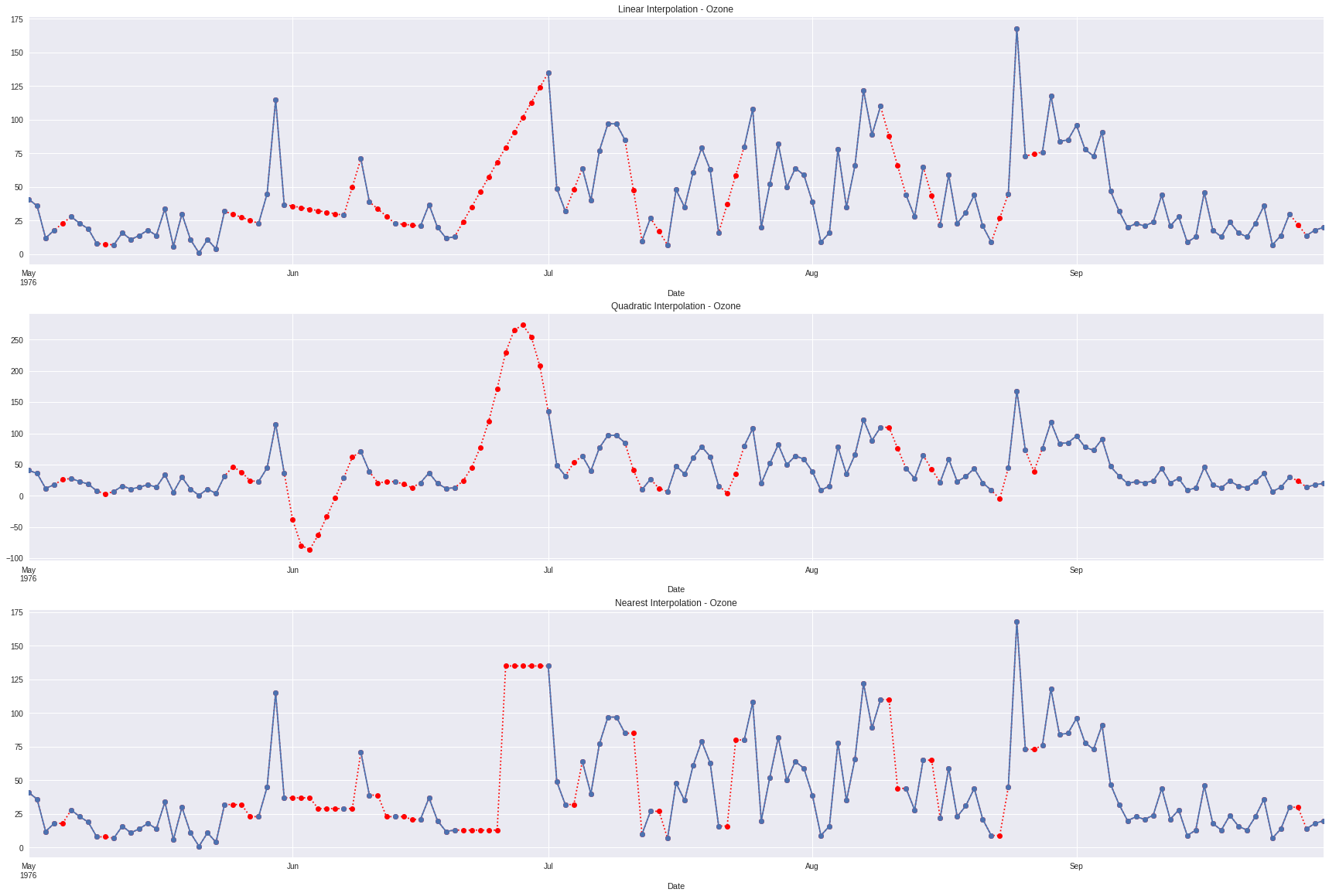
การเปรียบเทียบวิธี interpolation

การเปรียบเทียบ DataFrame ที่ใช้ interpolation กับชุดข้อมูลคุณภาพอากาศ

การจัดการข้อมูลที่หายไปใน Python

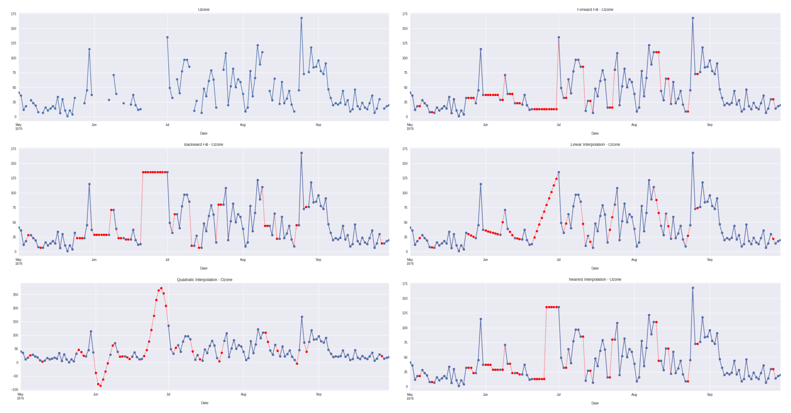
การเปรียบเทียบวิธีการแทนค่า

การเปรียบเทียบชุดข้อมูลคุณภาพอากาศที่ผ่านการแทนค่าทุกวิธี

การจัดการข้อมูลที่หายไปใน Python

สรุป

  • กราฟอนุกรมเวลาของ DataFrame ที่แทนค่าแล้ว
  • การเปรียบเทียบวิธีการแทนค่า
การจัดการข้อมูลที่หายไปใน Python

มาฝึกกันเถอะ!

การจัดการข้อมูลที่หายไปใน Python

Preparing Video For Download...