กราฟแบบโต้ตอบด้วย plotly

การสร้างแดชบอร์ดด้วย shinydashboard

Png Kee Seng

Researcher

ตัวอย่าง: รายการ Airbnb ในลอนดอน

  • สมมติว่าเราทำงานที่บริษัทท่องเที่ยวแห่งหนึ่งในลอนดอน
  • มีการร่วมมือกับ Airbnb
    library(tidyverse)
    listings <- read_csv("../data/listings.csv")
    
...
 $ host_name                     : chr [1:69351] "Susie" "Alina" "Luca" "Simon" ...
 $ neighbourhood_group           : logi [1:69351] NA NA NA NA NA NA ...
 $ neighbourhood                 : chr [1:69351] "Tower Hamlets" "Islington" "Tower Hamlets" "Islington" ...
 $ latitude                      : num [1:69351] 51.5 51.6 51.5 51.5 51.5 ...
 $ longitude                     : num [1:69351] -0.054 -0.1127 -0.0743 -0.1048 -0.2 ...
 $ room_type                     : chr [1:69351] "Private room" "Private room" "Entire home/apt" "Private room" ...
 $ price                         : num [1:69351] 55 50 90 180 297 75 204 379 90 30 ...
 $ minimum_nights                : num [1:69351] 3 1 5 4 14 3 2 4 3 7 ...
 $ number_of_reviews             : num [1:69351] 65 30 42 493 6 89 581 51 104 32 ...
 $ last_review                   : Date[1:69351], format: "2016-06-10" "2022-07-15" "2022-01-04" "2022-09-02" ...
 $ reviews_per_month             : num [1:69351] 0.47 0.2 0.34 3.59 0.05 0.57 4.26 0.36 0.86 0.29 ...
 $ calculated_host_listings_count: num [1:69351] 1 2 1 5 1 1 1 5 1 1 ...
 $ availability_365              : num [1:69351] 74 343 222 236 180 70 193 249 318 251 ...
...
การสร้างแดชบอร์ดด้วย shinydashboard

เริ่มต้นใช้งาน plotly

  • นำเข้าไลบรารี plotly

    library(plotly)
    
  • สร้าง plotly object โดยวาง ggplot object ไว้ใน ggplotly()

    ggplotly(<ggplot object>)
    
การสร้างแดชบอร์ดด้วย shinydashboard

Bubble plot ด้วย ggplot

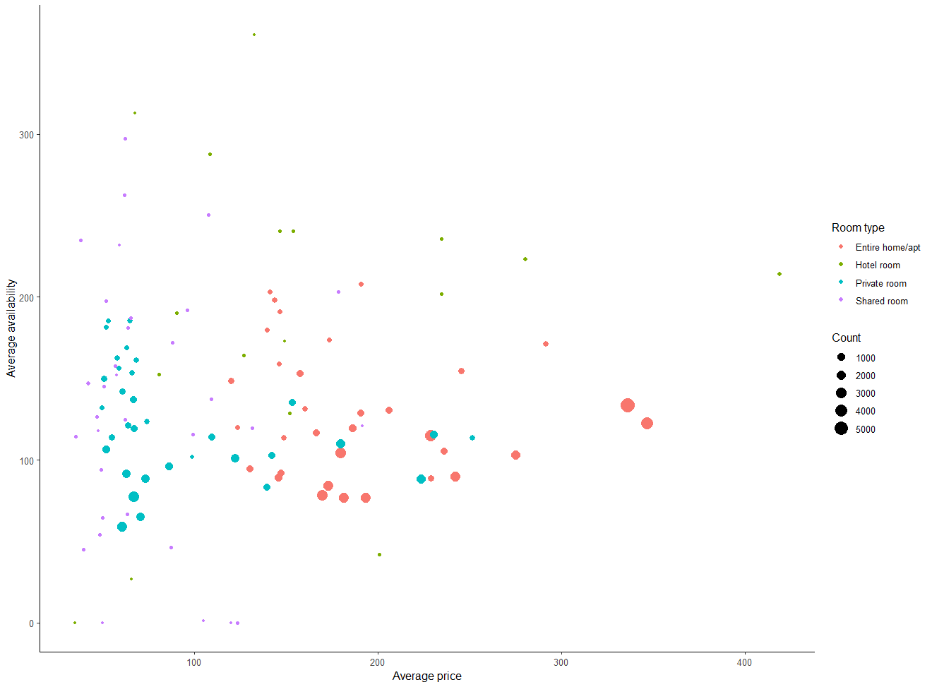
  • สร้าง bubble plot และบันทึกไว้เป็น bubble
    • แสดงความสัมพันธ์ระหว่าง price เฉลี่ยกับ availability_365
    • ฟองแต่ละสีแทน room_type ที่ต่างกัน
    • ขนาดของฟองสัดส่วนกับจำนวนรายการ
    • เพิ่ม layer สำหรับตกแต่งกราฟ
bubble <- listings %>%

group_by(room_type, neighbourhood) %>% summarise(avg_price = mean(price, na.rm=TRUE), avg_availability = mean(availability_365, na.rm=TRUE),
Count = n(), .groups = "drop") %>%
ggplot(aes(x = avg_price, y = avg_availability,
color = room_type,
size = Count)) +
geom_point() +
labs(x = "Average price", y = "Average availability", color = "Room type") + theme_classic()
การสร้างแดชบอร์ดด้วย shinydashboard

Bubble plot ด้วย ggplot แบบเรนเดอร์แล้ว

bubble plot ที่สร้างด้วย ggplot

การสร้างแดชบอร์ดด้วย shinydashboard

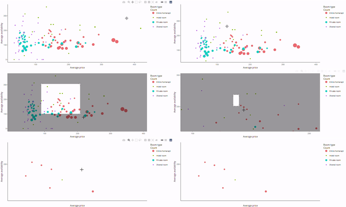
Bubble plot แบบโต้ตอบด้วย plotly

  • ครอบ bubble ด้วย ggplotly()
ggplotly(bubble)

Bubble plot แบบโต้ตอบด้วย plotly

การสร้างแดชบอร์ดด้วย shinydashboard

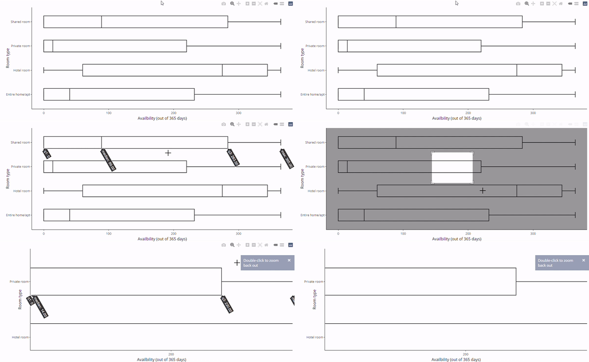
Boxplot แนวนอนด้วย plotly

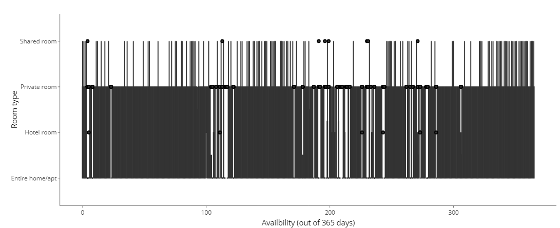
  • บางกราฟไม่สามารถแปลงได้อย่างถูกต้อง

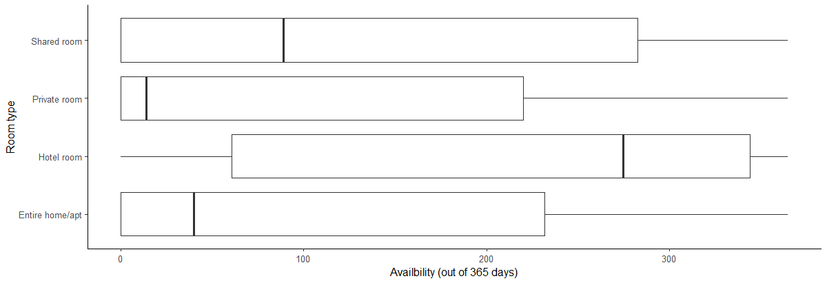
  • สร้าง boxplot แนวนอนหลายชุด

    • แสดงการกระจายของ availability_365 ตาม room_type
  • การแปลงด้วย ggplotly() ไม่ทำงาน
boxH <- listings %>%

ggplot(aes(x = availability_365, y=room_type)) +
geom_boxplot() +
labs(x="Availbility (out of 365 days)", y="Room type") + theme_classic()
ggplotly(boxH)

Boxplot แนวนอนที่สร้างด้วย ggplot

Boxplot แนวนอนที่แปลงด้วย ggplotly

การสร้างแดชบอร์ดด้วย shinydashboard

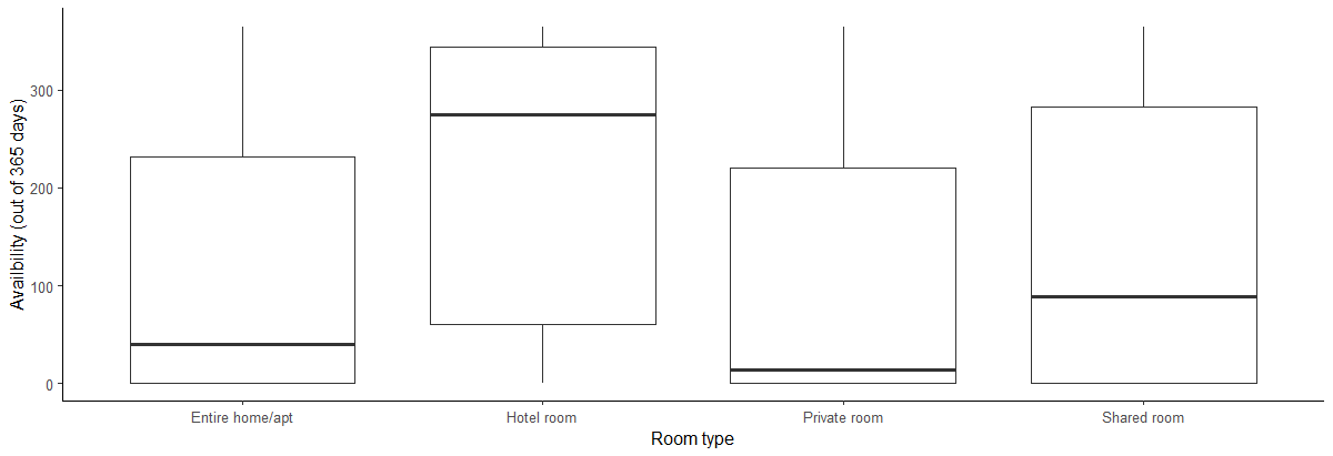
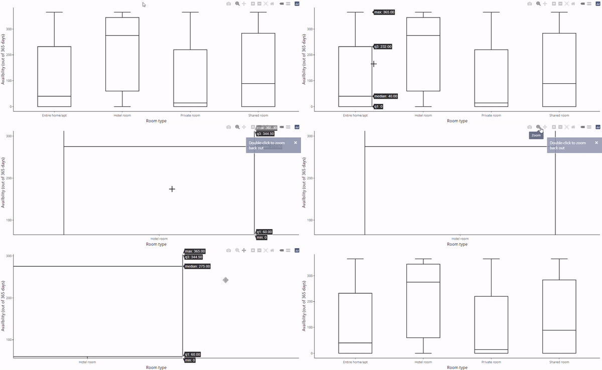
Boxplot แนวตั้งด้วย plotly

  • สลับ x และ y ใน aes()
  • การแปลงด้วย plotly จะทำงานได้
boxV <- listings %>%

ggplot(aes(y = availability_365, x=room_type)) + geom_boxplot() + labs(y="Availbility (out of 365 days)", x="Room type") + theme_classic()
ggplotly(boxV)

Boxplot แนวตั้งด้วย ggplot

Boxplot แนวตั้งด้วย ggplotly

การสร้างแดชบอร์ดด้วย shinydashboard

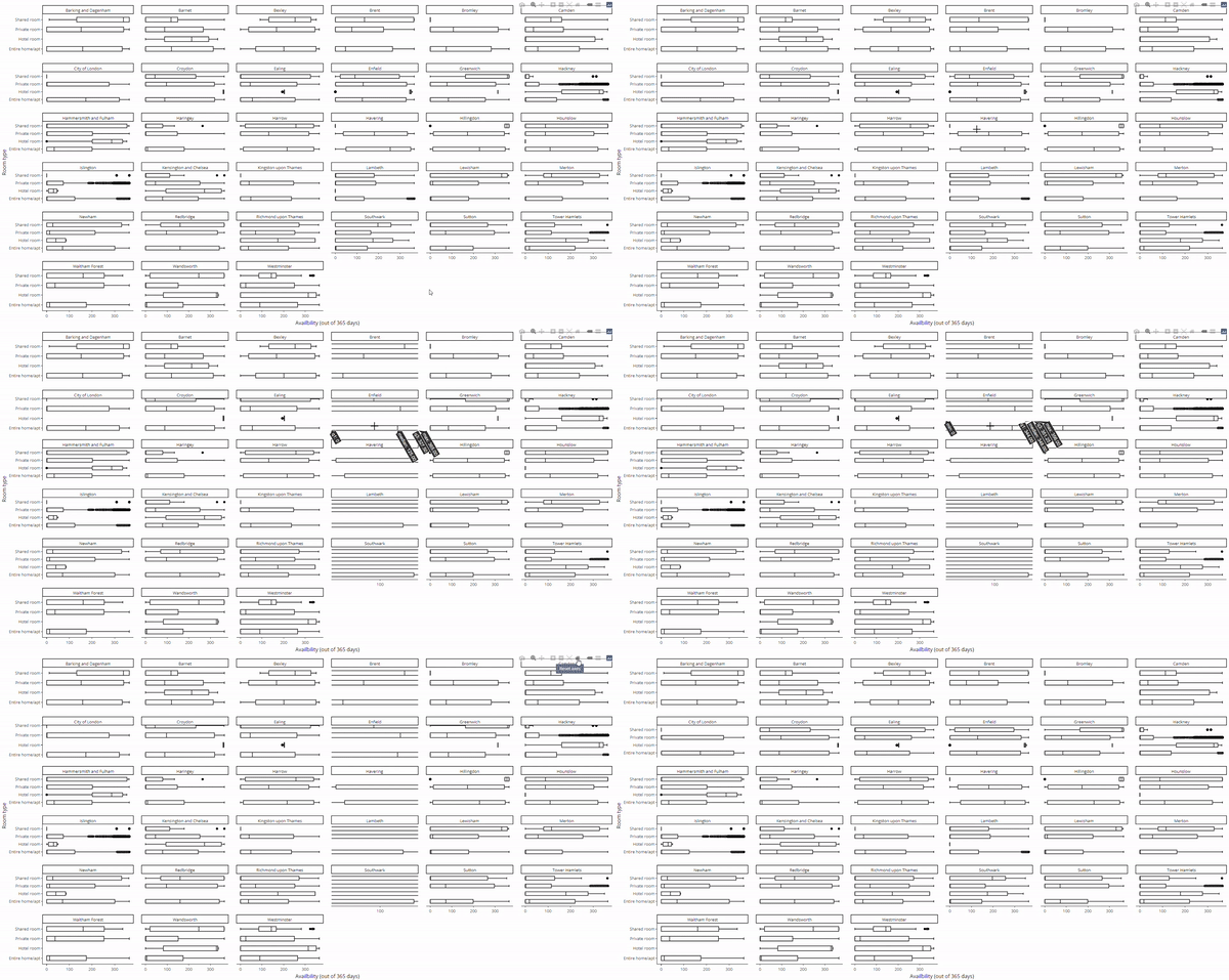
แก้ปัญหา boxplot แนวนอนด้วย plotly

  • ถ้าต้องการ boxplot แนวนอน?
    • เพิ่ม coord_flip()
  • ใช้ facet_wrap() ได้ด้วย
    • แต่ละ panel ต้องมีขนาดใหญ่พอ
ggplotly(boxV + coord_flip())
ggplotly(boxV + coord_flip() + 
    facet_wrap(~neighbourhood))

Boxplot แนวตั้งที่พลิกแนวด้วย plotly

Boxplot plotly แบบ facet

การสร้างแดชบอร์ดด้วย shinydashboard

มาฝึกกันเถอะ!

การสร้างแดชบอร์ดด้วย shinydashboard

Preparing Video For Download...