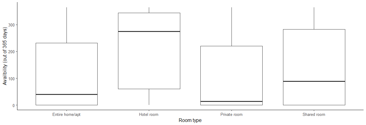
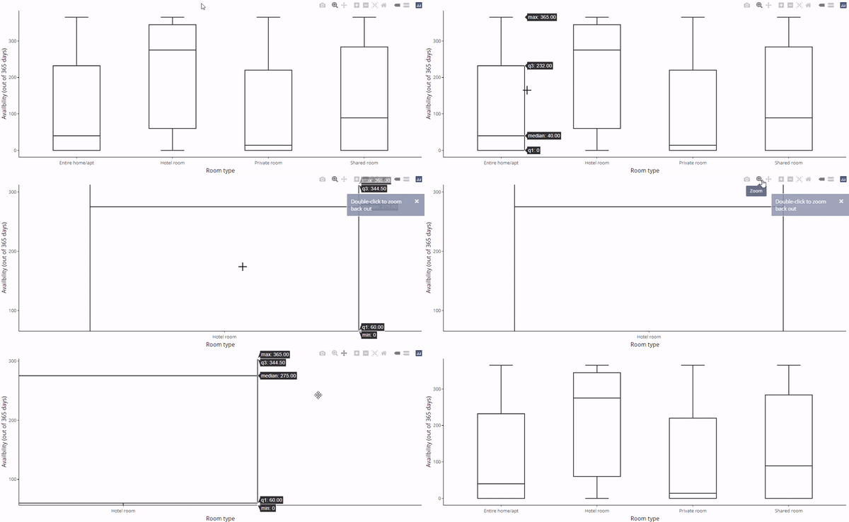
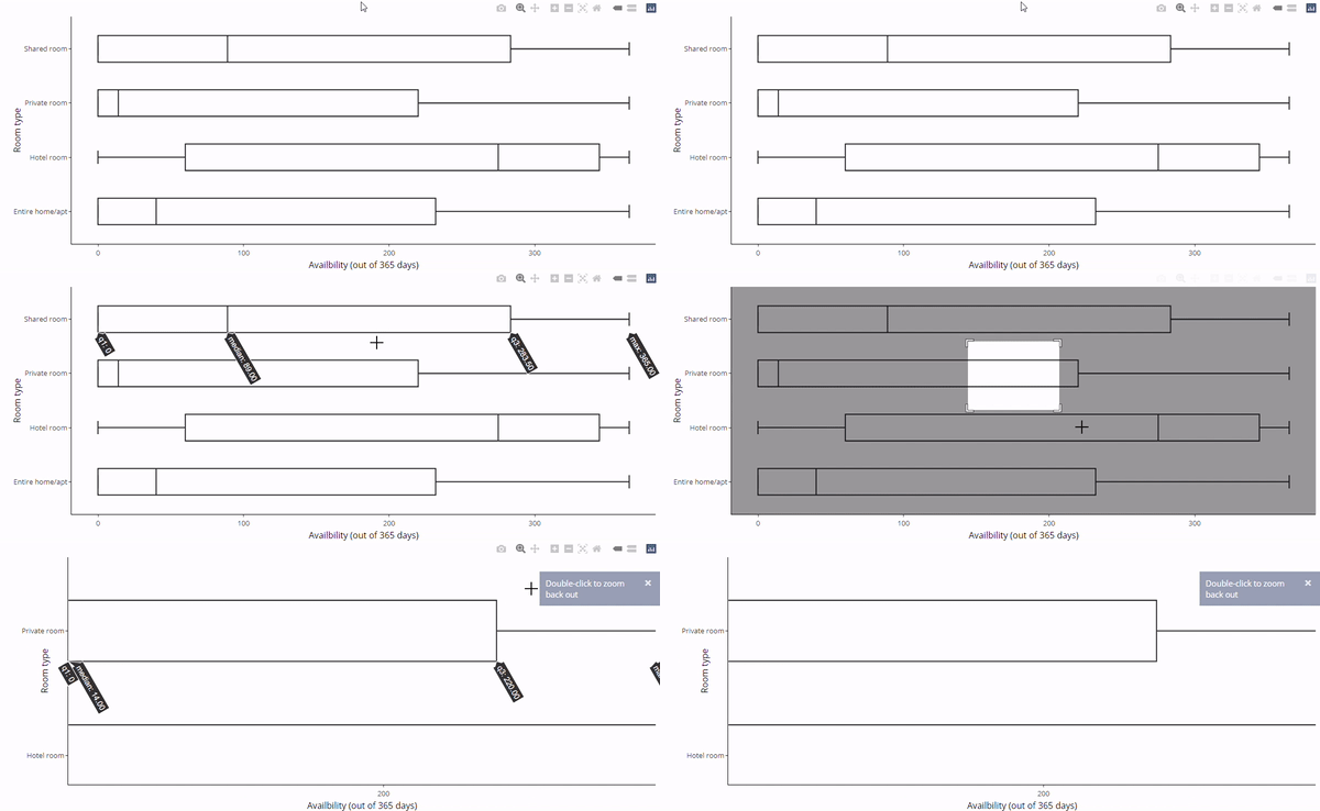
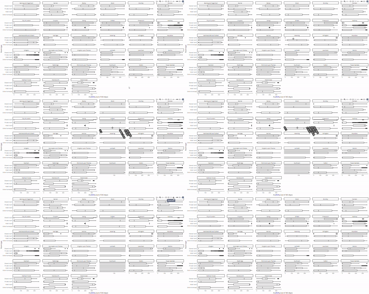
Приклад: оголошення Airbnb у Лондоні
...
 $ host_name                     : chr [1:69351] "Susie" "Alina" "Luca" "Simon" ...
 $ neighbourhood_group           : logi [1:69351] NA NA NA NA NA NA ...
 $ neighbourhood                 : chr [1:69351] "Tower Hamlets" "Islington" "Tower Hamlets" "Islington" ...
 $ latitude                      : num [1:69351] 51.5 51.6 51.5 51.5 51.5 ...
 $ longitude                     : num [1:69351] -0.054 -0.1127 -0.0743 -0.1048 -0.2 ...
 $ room_type                     : chr [1:69351] "Private room" "Private room" "Entire home/apt" "Private room" ...
 $ price                         : num [1:69351] 55 50 90 180 297 75 204 379 90 30 ...
 $ minimum_nights                : num [1:69351] 3 1 5 4 14 3 2 4 3 7 ...
 $ number_of_reviews             : num [1:69351] 65 30 42 493 6 89 581 51 104 32 ...
 $ last_review                   : Date[1:69351], format: "2016-06-10" "2022-07-15" "2022-01-04" "2022-09-02" ...
 $ reviews_per_month             : num [1:69351] 0.47 0.2 0.34 3.59 0.05 0.57 4.26 0.36 0.86 0.29 ...
 $ calculated_host_listings_count: num [1:69351] 1 2 1 5 1 1 1 5 1 1 ...
 $ availability_365              : num [1:69351] 74 343 222 236 180 70 193 249 318 251 ...
...