การแจกแจงตามหมวดหมู่ด้วย seaborn

การนำเข้าและจัดการข้อมูลทางการเงินใน Python

Stefan Jansen

Instructor

การแจกแจงตามหมวดหมู่

  • ส่วนที่แล้ว: สถิติสรุป
  • จำนวนข้อมูลและค่าเฉลี่ยแต่ละหมวดหมู่
  • ต่อไป: แสดงการแจกแจงของตัวแปรตามระดับของตัวแปรหมวดหมู่เพื่อเปรียบเทียบ
  • ตัวอย่าง: การแจกแจง Market Cap ตาม Sector หรือปีที่ IPO
  • ให้รายละเอียดมากกว่าสถิติสรุป
การนำเข้าและจัดการข้อมูลทางการเงินใน Python

ทำความสะอาดข้อมูล: กำจัด outlier

nasdaq = pd.read_excel('listings.xlsx', sheet_name='nasdaq', 
                        na_values='n/a')
nasdaq['market_cap_m'] = nasdaq['Market Capitalization'].div(1e6)

nasdaq = nasdaq[nasdaq.market_cap_m > 0] # Active companies only
outliers = nasdaq.market_cap_m.quantile(.9) # Outlier threshold
nasdaq = nasdaq[nasdaq.market_cap_m < outliers] # Remove outliers
การนำเข้าและจัดการข้อมูลทางการเงินใน Python

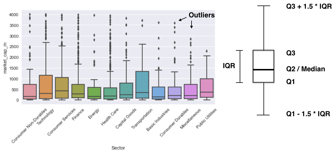
Boxplot: ควอร์ไทล์และ outlier

import seaborn as sns
sns.boxplot(x='Sector', y='market_cap_m', data=nasdaq)
plt.xticks(rotation=75);
quartiles.png

การนำเข้าและจัดการข้อมูลทางการเงินใน Python

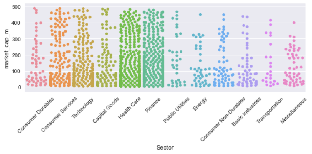
รูปแบบอื่น: SwarmPlot

sns.swarmplot(x='Sector', y='market_cap_m', data=nasdaq)
plt.xticks(rotation=75)
plt.show()
swarmplot.png

การนำเข้าและจัดการข้อมูลทางการเงินใน Python

มาฝึกกันเถอะ!

การนำเข้าและจัดการข้อมูลทางการเงินใน Python

Preparing Video For Download...