พลังของ hue

Python สำหรับผู้ใช้สเปรดชีต

Chris Cardillo

Data Scientist

Bar chart ที่สวยงาม

กราฟ
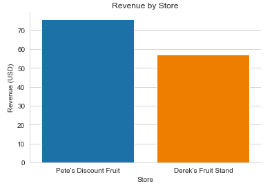
Revenue by Store Final.png

ข้อมูลที่ใช้สร้างกราฟ

The Data that Powers the basic plot.png

Python สำหรับผู้ใช้สเปรดชีต

Bar chart ที่ละเอียดขึ้น

ข้อมูลเบื้องหลังกราฟใหม่
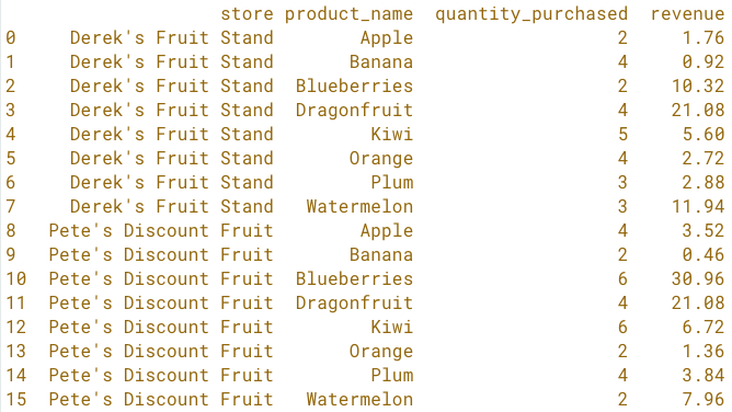
by fruit store sorted by store and name.png

Python สำหรับผู้ใช้สเปรดชีต

Bar chart ที่ละเอียดขึ้น

ข้อมูลเบื้องหลังกราฟใหม่

by fruit store sorted by store and name.png

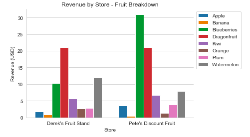
กราฟใหม่

Revenue by Store - Fruit Breakdown.png

Python สำหรับผู้ใช้สเปรดชีต

Hue

sns.barplot(x='store',
            y='revenue',
            data=fruit_store_summary,
            hue='product_name')

Revenue by Store - Fruit Breakdown.png

Python สำหรับผู้ใช้สเปรดชีต

plt.legend()

sns.barplot(x='store',
            y='revenue',
            data=fruit_store_summary,
            hue='product_name')

plt.legend(bbox_to_anchor=(1, 1))

Revenue by Store - Fruit Breakdown.png

Python สำหรับผู้ใช้สเปรดชีต

รวมทุกอย่างเข้าด้วยกัน

sns.set_style('whitegrid')

sns.barplot(x='store',
            y='revenue',
            data=fruit_store_summary,
            hue='product_name')

plt.legend(bbox_to_anchor=(1, 1))

plt.title('Revenue by Store - Fruit Breakdown')
plt.xlabel('Store')
plt.ylabel('Revenue (USD)')
sns.despine()
plt.show()

Revenue by Store - Fruit Breakdown.png

Python สำหรับผู้ใช้สเปรดชีต

มาฝึกกันเถอะ!

Python สำหรับผู้ใช้สเปรดชีต

Preparing Video For Download...