Genomtänkt färganvändning
Interaktiv datavisualisering med plotly i R

Adam Loy
Statistician, Carleton College
Lägga till en tredje variabel
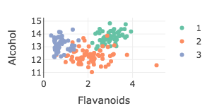
wine %>%
  plot_ly(x = ~Flavanoids, y = ~Alcohol, color = ~Type) %>%
  add_markers()
Lägga till en kvantitativ variabel
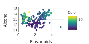
wine %>%
  plot_ly(x = ~Flavanoids, y = ~Alcohol, color = ~Color) %>%
  add_markers()
RColorBrewer-paletter
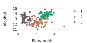
wine %>%
  plot_ly(x = ~Flavanoids, y = ~Alcohol, color = ~Type) %>%
  add_markers(colors = "Dark2")
Manuella paletter
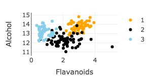
wine %>%
  plot_ly(x = ~Flavanoids, y = ~Alcohol, color = ~Type) %>%
add_markers(colors = c("orange", "black", "skyblue"))

