Feature Engineering in R
Jorge Zazueta
Research Professor and Head of the Modeling Group at the School of Economics, UASLP
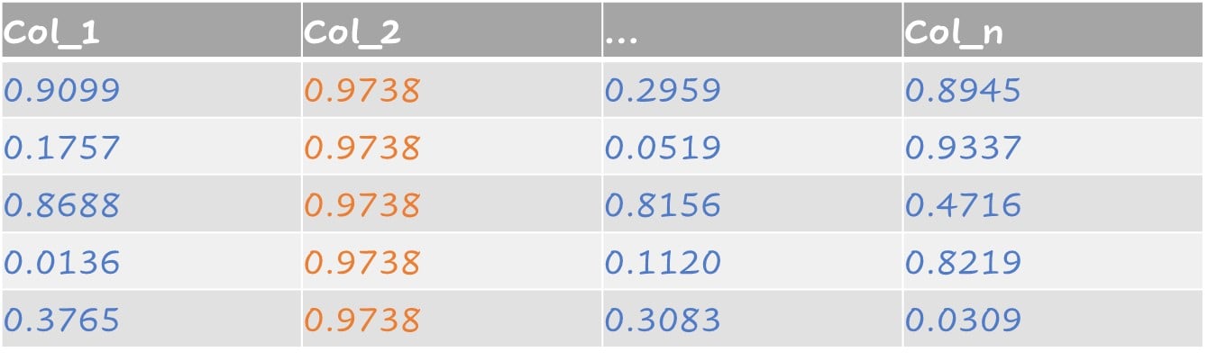
บางชุดข้อมูลมีคอลัมน์ที่มีค่าคงที่หรือมีความแปรปรวนเป็นศูนย์ เราสามารถกรองฟีเจอร์เหล่านั้นออกได้โดยเพิ่ม step_zv() ลงใน recipe()

ฟีเจอร์ที่มีความแปรปรวนใกล้ศูนย์ ได้แก่ ตัวทำนายที่มีค่าเดียว และ ตัวทำนายที่มีลักษณะดังต่อไปนี้ครบทั้งสองข้อ:
จำนวนค่าที่ไม่ซ้ำกันน้อยมากเมื่อเทียบกับจำนวนตัวอย่าง
อัตราส่วนของความถี่ค่าที่พบบ่อยที่สุดต่อค่าที่พบบ่อยรองลงมามีค่าสูงมาก
ตัวอย่างความแปรปรวนใกล้ศูนย์:
step_nzv() ระบุและลบตัวทำนายที่มีลักษณะเหล่านี้ออก
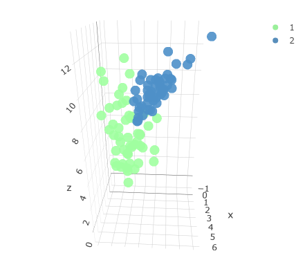
ชุดข้อมูลสามมิติดั้งเดิมที่มีสองคลาส

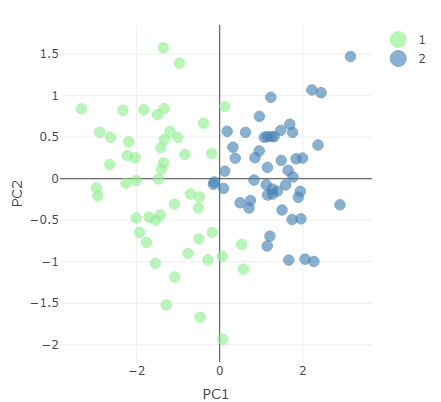
ชุดข้อมูลที่ลดมิติแล้ว แสดงข้อมูลด้วย principal component สองตัวแรก
สร้าง recipe สำหรับทำ PCA และดึงผลลัพธ์ออกมาด้วย prep()
pc_recipe <-
recipe(~., data = loans_num) %>%
step_nzv(all_numeric()) %>%
step_normalize(all_numeric()) %>%
step_pca(all_numeric())
pca_output <- prep(pc_recipe)
ดูข้อมูลที่มีได้โดยเรียก names() บน pca_output
names(pca_output)
[1] "var_info" "term_info"
[3] "steps" "template"
[5] "levels" "retained"
[7] "requirements" "tr_info"
[9] "orig_lvls" "last_term_info"
ดึงค่าเบี่ยงเบนมาตรฐานจากออบเจกต์ pca_output และคำนวณความแปรปรวนที่อธิบายได้
stdv <- pca_output$steps[[3]]$res$sdev
var_explained <- stdv^2/sum(stdv^2)
PCA = tibble(PC = 1:length(stdv),
var_explained = var_explained,
cumulative = cumsum(var_explained))
ตารางแสดงความแปรปรวนที่อธิบายได้แยกตาม principal component
# A tibble: 5 × 3
PC var_explained cumulative
<int> <dbl> <dbl>
1 1 0.315 0.315
2 2 0.214 0.529
3 3 0.202 0.730
4 4 0.198 0.928
5 5 0.0722 1
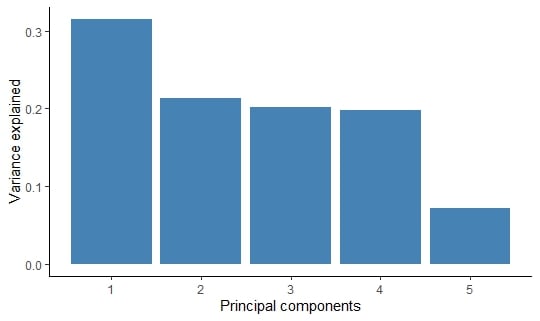
สร้างกราฟผลลัพธ์เป็น column chart ด้วย ggplot2
PCA %>%
ggplot(aes(x = PC,
y = var_explained)) +
geom_col(fill = "steelblue") +
xlab("Principal components") +
ylab("Variance explained")
ความแปรปรวนที่อธิบายได้แยกตาม principal component

Feature Engineering in R