Visualisering av big data med Trelliscope i R
Ryan Hafen
Author, TrelliscopeJS
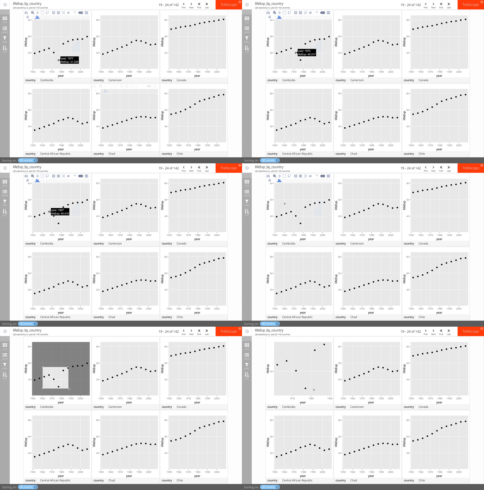
Lägg till as_plotly = TRUE i facet_trelliscope().
Till exempel:
gap_life <- select(gapminder, year, lifeExp, country, continent)
ggplot(gap_life, aes(year, lifeExp)) +
geom_point() +
facet_trelliscope(~ country + continent,
name = "lifeExp_by_country",
desc = "Life expectancy vs. year for 142 countries.",
nrow = 2, ncol = 3,
as_plotly = TRUE)

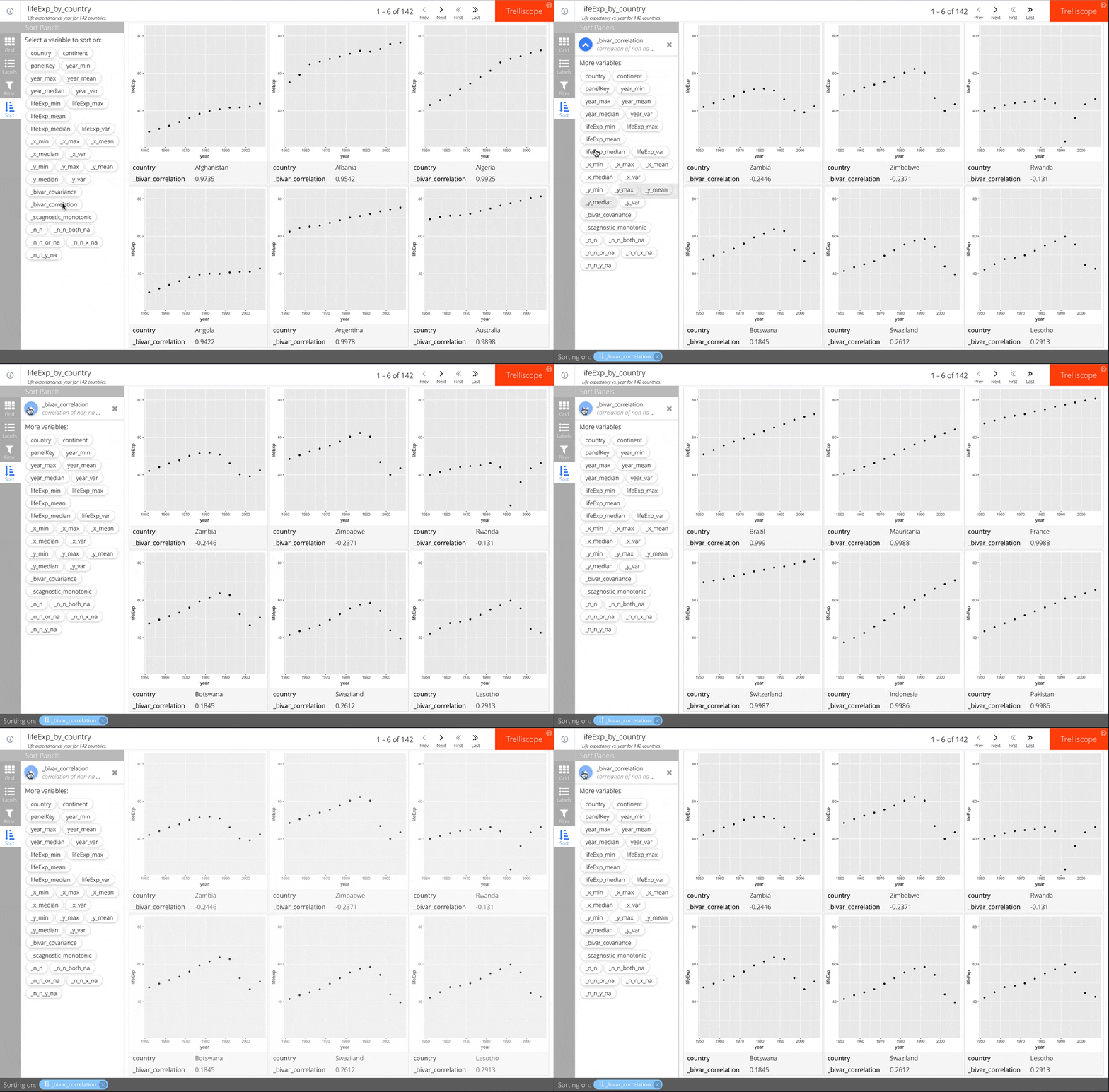
Lägg till auto_cog = TRUE i facet_trelliscope().
Till exempel:
ggplot(gap_life, aes(year, lifeExp)) +
geom_point() +
facet_trelliscope(~ country + continent,
name = "lifeExp_by_country",
desc = "Life expectancy vs. year for 142 countries.",
nrow = 2, ncol = 3,
auto_cog = TRUE)
Se hjälpen för autocogs::autocog för mer information om tillgängliga automatiska kognostiker.

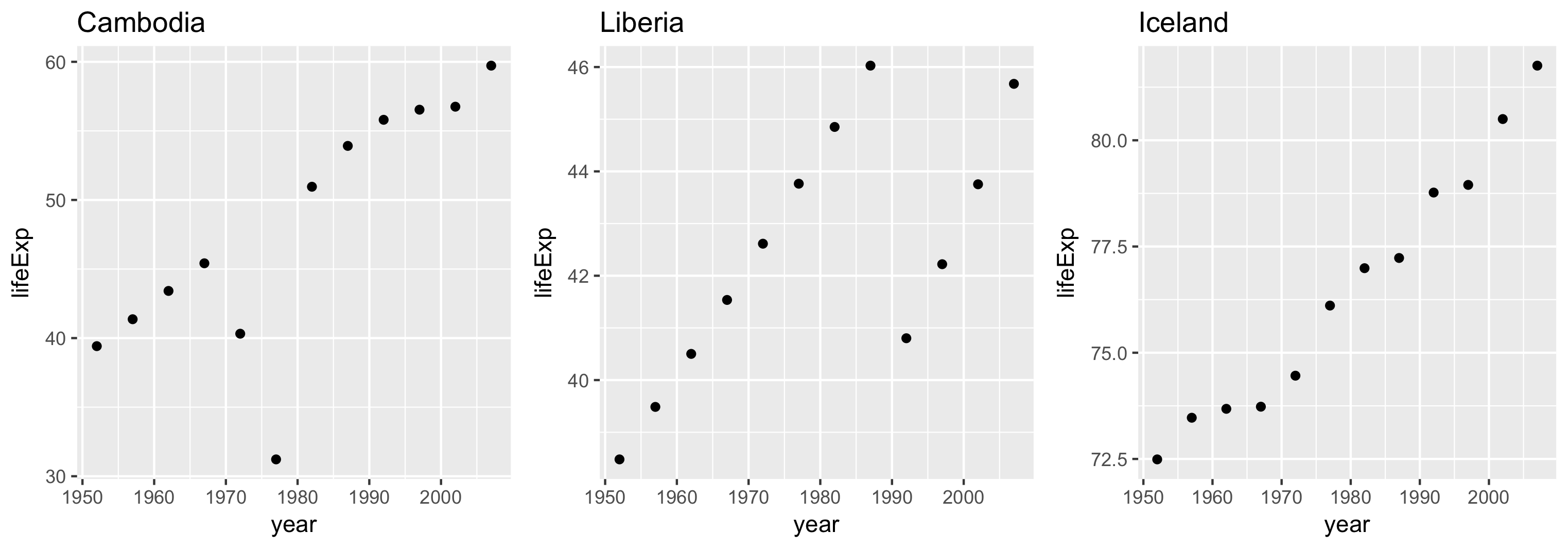
Axelgränsernas intervall styrs med argumentet scales.
Tre alternativ:
"same" (standard)"sliced""free"Varje panels gränser är identiska.
Möjliggör jämförelser på lika villkor mellan paneler.
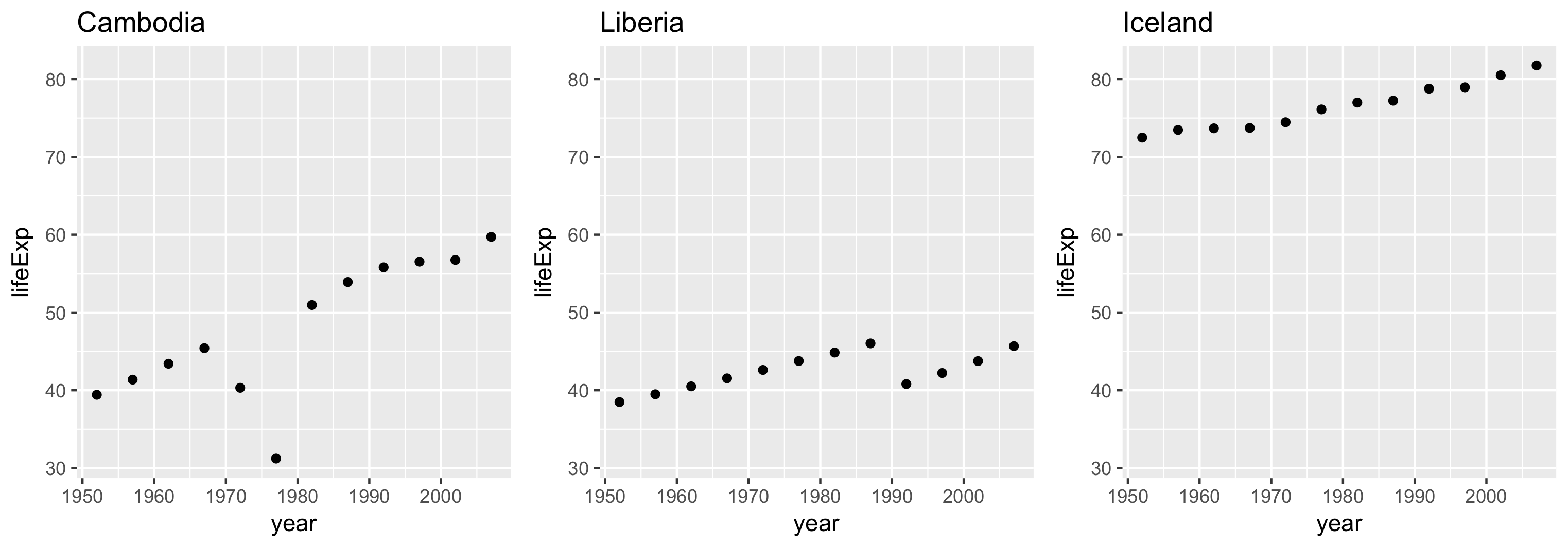
Varje panels gränser täcker samma intervall men börjar inte nödvändigtvis på samma ställe.
Användbart för att jämföra skillnader i skala.
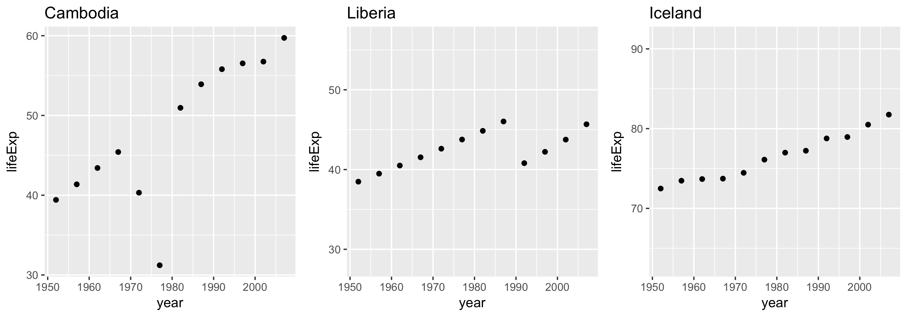
Varje panels gränser baseras på den egna datans omfång.
Visualisering av big data med Trelliscope i R