Interpreting your test results
Customer Analytics and A/B Testing in Python

Ryan Grossman
Data Scientist, EDO
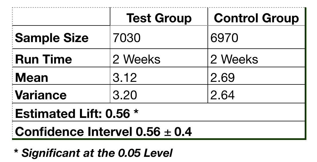
Factors to communicate
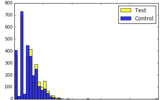
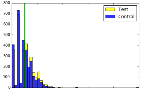
Visualizing your results
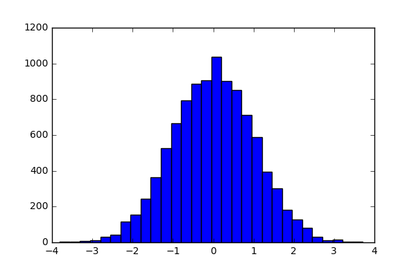
Generating a histogram
Annotating our plot
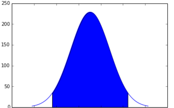
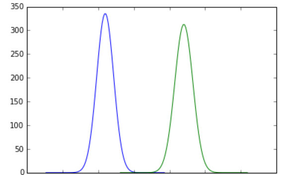
Plotting a distribution
norm.pdf(): Converts values to probabilities from Normal distribution
Plotting the difference of conversion rates
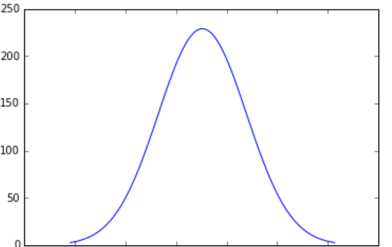
Plotting the confidence interval
np.arange(): Generate points in an intervalplt.fill_between(): Fill in an interval