Events and releases
Customer Analytics and A/B Testing in Python

Ryan Grossman
Data Scientist, EDO
Exploratory analysis - issues in our ecosystem
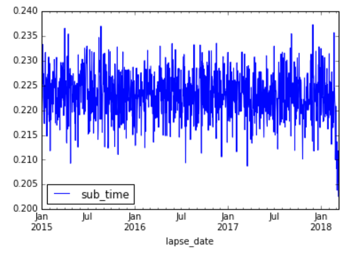
Visualizing the drop in conversion rate (3 Years)
# Plot our conversion rate over time
conversion_data.plot()
plt.show()
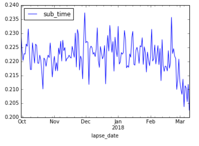
Visualizing the drop in conversion rate (6 Months)
conv_data_filt.plot(x='lapse_date', y='sub_time')
plt.show()
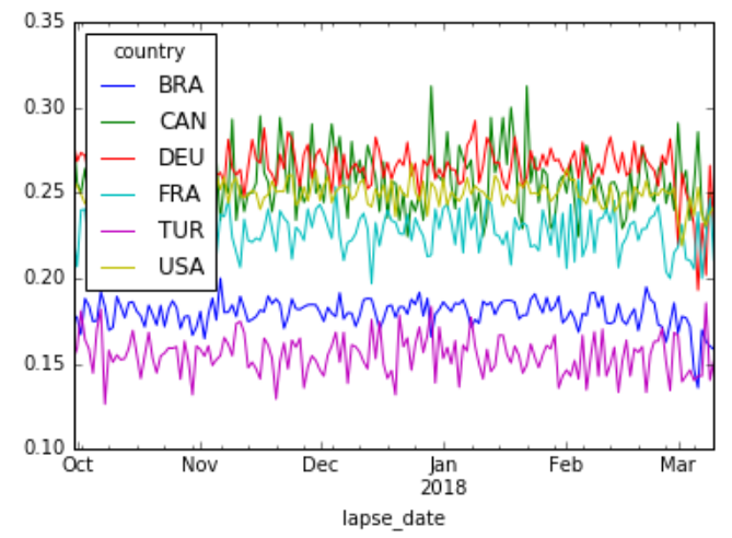
Breaking out by Country
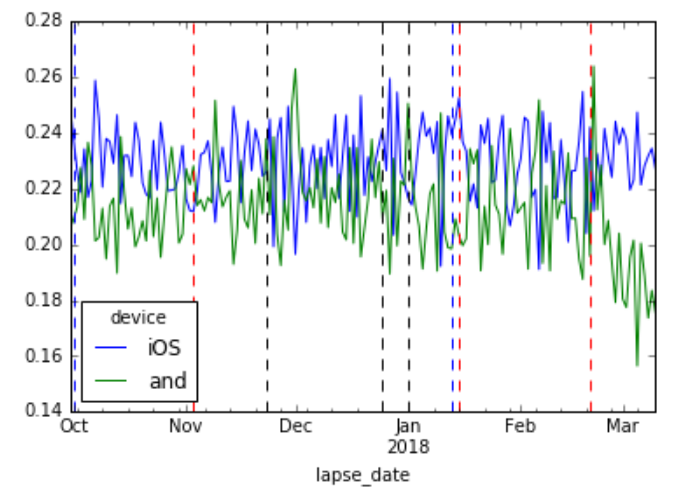
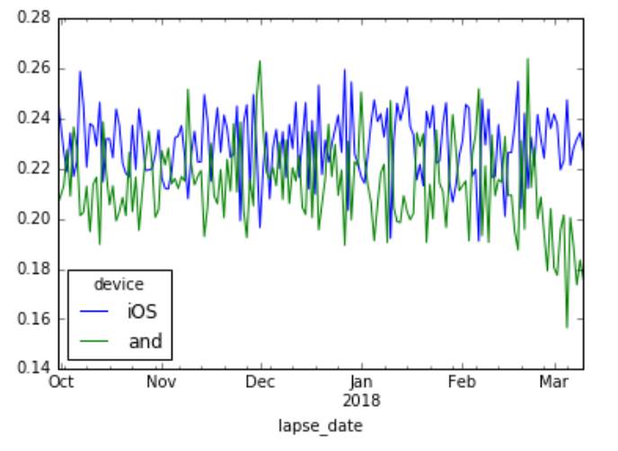
Breaking out by Device
Annotated conversion rate graphs