วาดกราฟ time series แรกของคุณ

การแสดงภาพข้อมูล Time Series ด้วย Python

Thomas Vincent

Head of Data Science, Getty Images

ไลบรารี Matplotlib

  • ใน Python matplotlib เป็นแพ็กเกจที่ใช้สำหรับพล็อตข้อมูลอย่างครอบคลุม
  • โดยปกติจะ import submodule pyplot ของ matplotlib โดยใช้ alias ว่า plt
import matplotlib.pyplot as plt
การแสดงภาพข้อมูล Time Series ด้วย Python

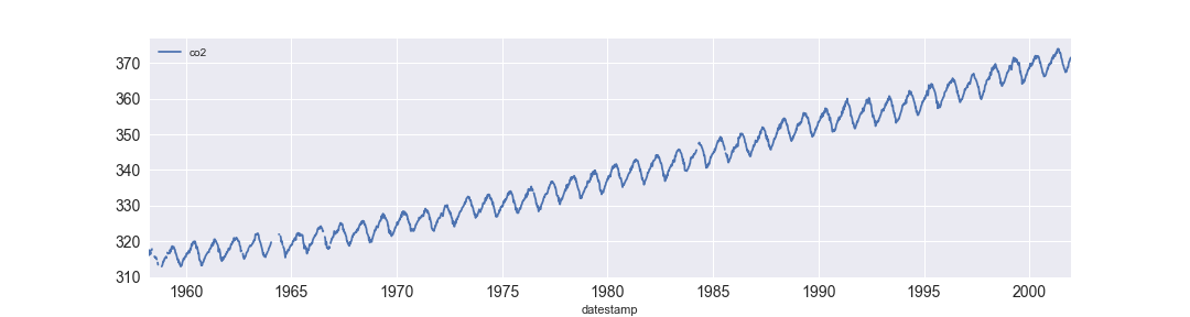
การพล็อตข้อมูล time series

time series แรกของคุณ

การแสดงภาพข้อมูล Time Series ด้วย Python

การพล็อตข้อมูล time series

import matplotlib.pyplot as plt
import pandas as pd

df = df.set_index('date_column')
df.plot()
plt.show()
การแสดงภาพข้อมูล Time Series ด้วย Python

เพิ่มสไตล์ให้กราฟ

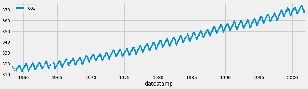
plt.style.use('fivethirtyeight')
df.plot()
plt.show()
การแสดงภาพข้อมูล Time Series ด้วย Python

สไตล์ FiveThirtyEight

ตัวอย่างการใช้สไตล์ fivethirtyeight

การแสดงภาพข้อมูล Time Series ด้วย Python

สไตล์ชีตของ Matplotlib

print(plt.style.available)
['seaborn-dark-palette', 'seaborn-darkgrid', 
'seaborn-dark', 'seaborn-notebook', 
'seaborn-pastel', 'seaborn-white', 
'classic', 'ggplot', 'grayscale', 
'dark_background', 'seaborn-poster', 
'seaborn-muted', 'seaborn', 'bmh', 
'seaborn-paper', 'seaborn-whitegrid', 
'seaborn-bright', 'seaborn-talk', 
'fivethirtyeight', 'seaborn-colorblind', 
'seaborn-deep', 'seaborn-ticks']

การแสดงภาพข้อมูล Time Series ด้วย Python

อธิบายกราฟด้วยป้ายกำกับ

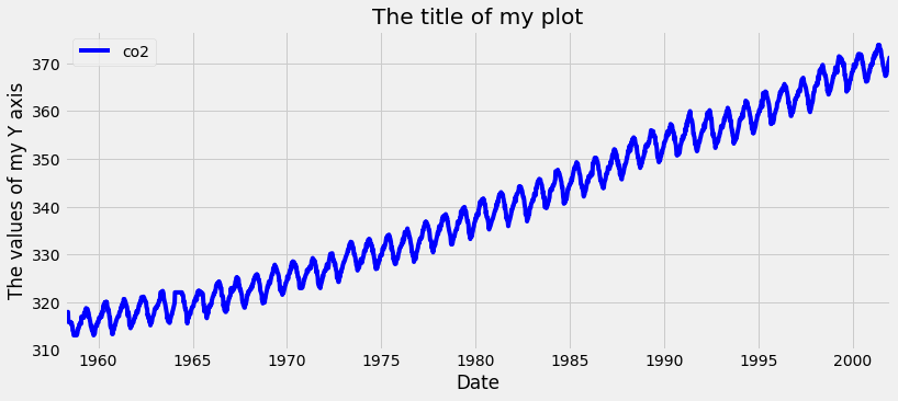
ax = df.plot(color='blue')
ax.set_xlabel('Date')
ax.set_ylabel('The values of my Y axis')
ax.set_title('The title of my plot')
plt.show()

การเพิ่มป้ายกำกับให้กราฟ

การแสดงภาพข้อมูล Time Series ด้วย Python

ขนาดรูป, linewidth, linestyle และ fontsize
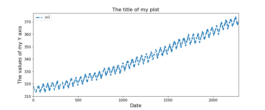
ax = df.plot(figsize=(12, 5), fontsize=12,
             linewidth=3, linestyle='--')
ax.set_xlabel('Date', fontsize=16)
ax.set_ylabel('The values of my Y axis', fontsize=16)
ax.set_title('The title of my plot', fontsize=16)
plt.show()

การแสดงภาพข้อมูล Time Series ด้วย Python

มาฝึกกันเถอะ!

การแสดงภาพข้อมูล Time Series ด้วย Python

Preparing Video For Download...