ปรับแต่งกราฟอนุกรมเวลา

การแสดงภาพข้อมูล Time Series ด้วย Python

Thomas Vincent

Head of Data Science, Getty Images

การสไลซ์ข้อมูลอนุกรมเวลา

discoveries['1960':'1970']
discoveries['1950-01':'1950-12']
discoveries['1960-01-01':'1960-01-15']
การแสดงภาพข้อมูล Time Series ด้วย Python

การพล็อตข้อมูลอนุกรมเวลาแบบย่อย

import matplotlib.pyplot as plt
plt.style.use('fivethirtyeight')
df_subset = discoveries['1960':'1970']
ax = df_subset.plot(color='blue', fontsize=14)
plt.show()

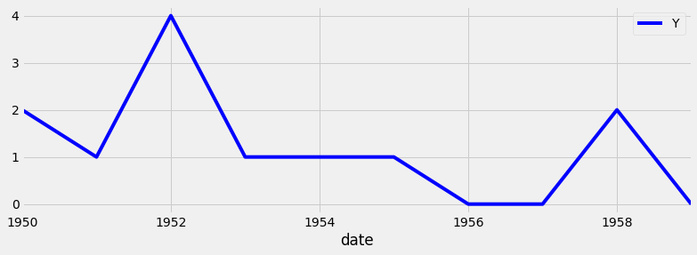
ตัวอย่างกราฟอนุกรมเวลาแบบย่อย

การแสดงภาพข้อมูล Time Series ด้วย Python

การเพิ่มเส้นอ้างอิง

ax.axvline(x='1969-01-01', 
           color='red', 
           linestyle='--')
ax.axhline(y=100, 
           color='green', 
           linestyle='--')
การแสดงภาพข้อมูล Time Series ด้วย Python

การใช้เส้นอ้างอิง: โค้ดเต็ม

ax = discoveries.plot(color='blue')
ax.set_xlabel('Date')
ax.set_ylabel('Number of great discoveries')

ax.axvline('1969-01-01', color='red', linestyle='--') ax.axhline(4, color='green', linestyle='--')
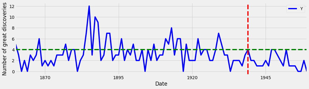
การเพิ่มเส้นอ้างอิงลงในกราฟ

การแสดงภาพข้อมูล Time Series ด้วย Python

การไฮไลต์ช่วงที่สนใจ

ax.axvspan('1964-01-01', '1968-01-01', 
           color='red', alpha=0.5)
ax.axhspan(8, 6, color='green',
           alpha=0.2)
การแสดงภาพข้อมูล Time Series ด้วย Python

การไฮไลต์ช่วงที่สนใจ: โค้ดเต็ม

ax = discoveries.plot(color='blue')
ax.set_xlabel('Date')
ax.set_ylabel('Number of great discoveries')
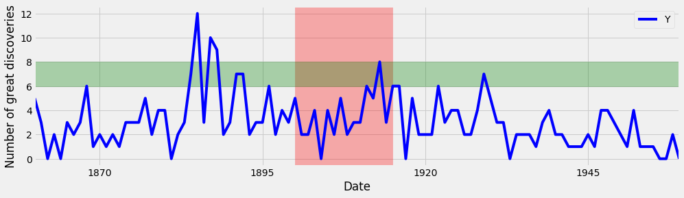
ax.axvspan('1964-01-01', '1968-01-01', color='red',
alpha=0.3)
ax.axhspan(8, 6, color='green', alpha=0.3)

การเพิ่มช่วงที่สนใจลงในกราฟ

การแสดงภาพข้อมูล Time Series ด้วย Python

มาฝึกกันเถอะ!

การแสดงภาพข้อมูล Time Series ด้วย Python

Preparing Video For Download...